
Recently, Adobe Systems Incorporated released a new product. Not an update to its existing suite, which include tools of the online trade such as Photoshop, Acrobat Reader and Flash, or some new software to fulfill ever-evolving creative needs. Instead, it is an online destination for viewing digital art entitled the Adobe Museum of Digital Media (AMDM).
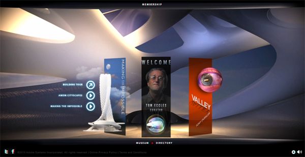
After waiting for the museum to load, you are greeted by a tour guide with a peculiar accent, whose likeness resembles a cross between a jellyfish and an eyeball. The museum has one current exhibit, a specially-commissioned piece by internationally acclaimed artist Tony Oursler, who is best known for his disconcerting projection installation works. As the museum has just launched, there is a limited amount to see: plans for the “building”, a chat with the curator, Tom Eccles, more chatter from the jellyfish-eyeball, the commissioned artwork by Oursler, and a comments section.
Before getting into the details of the museum itself, it is worth interrogating why it is considered by its creators to be a museum at all. The press release states the mission of the museum to be “...an interactive venue to present and preserve groundbreaking digital media works, inspire creative ideas and experimentation, and provide a forum for expert commentary on how digital media influences culture and society”. The mission is sound, but except for the word “preserve” there is little in it that specifically invokes the mantle of “museum”. As the AMDM is an obvious marketing exercise which promotes the use of digital tools (that Adobe happens to create), it’s a short leap of logic to conclude that “museum” was simply decided on as a word with greater impact than “gallery” or “showcase”.
If we take the naming of this online venture seriously for a moment, the natural initial impulse is to look at how definitions have been crafted by people working in the field. The International Council of Museums (ICOM) states that a museum is a “non-profitmaking, permanent institution in the service of society and of its development, and open to the public, which acquires, conserves, researches, communicates and exhibits, for purposes of study, education and enjoyment, material evidence of people and their environment.” Even more succinctly, the first page of the Canadian Association of Museums’ website simply asserts that museums are “institutions created in the public interest.”
While Adobe’s museum would be disqualified from membership by the American Association of Museums (AAM) because it exists only online, this particular point is not just a bit old fashioned, but perhaps defeating of the public service aim. If museums are meant to provide access to cultural heritage, then museums which exist solely online clearly provide a greater level of access than a building which is only open at certain times, and which is likely incapable of showcasing an entire collection to the public at one time.
As an answer to the predicament of providing unfettered public access, online museums make a great deal of sense, and projects such as the Canadian government’s Virtual Museums of Canada took advantage of this positive property of the web. Similarly, Google's recent venture simply entitled “Art Project” gives anyone with the time, inclination, and bandwidth the ability to browse some of the world's finest museum collections. Zooming in on a high-resolution image of Van Gogh's The Starry Night might even surpass the experience of seeing it in person in some ways, as seeing it at MoMA will inevitably involve competing for a view with masses of people and suffering the glare of a museum guard for getting just an inch too close. Given that the public interest is paramount, a museum which exists only online, or online versions of currently-existing museums are not merely unproblematic, but provide compelling practical solutions to issues of access.
What is unquestionably a problem, however, is bestowing the responsibility of being a museum (in other words, a steward of public intellectual heritage), onto a profit-making corporation such as Adobe, no matter how commendable their corporate conduct, or how laudable their corporate responsibility program. The point about preservation in AMDM’s mission statement is also a problematic claim, considering how long forever is, and how short financial quarters are. A profit-minded corporation is simply incapable of making a long-term commitment to access and preservation.
One is also left with the impression, especially after browsing the site, that using the term museum in this case is not just divergent from the conventional definition in several ways, but it is also arrogant. Museum curators carefully consider acquisitions to collections precisely because the act of adding an object to a collection gives it significance. Deciding which types of objects to include is also a key decision, and the preservation of intangible cultural heritage emerged as a concept in recent decades to recognize the importance of preserving oral traditions, performance, and other fragile forms, and is now a priority of the United Nations (specifically, UNESCO). In their words: “Cultural heritage does not end at monuments and collections of objects.” It’s natural to extend this to online media, considering the range and depth of creative expression online, and difficulty in preserving it in a form that will work years later. The decision by the Library of Congress to archive tweets indicates a step towards acknowledging the importance of online expression as intangible cultural heritage.
If the Library of Congress finds these public tweets, a collection within which the banal must far outweigh the noteworthy, Adobe could have followed a similar path, but with far richer material. A more humble act (though less interesting as a subtle marketing campaign), would have been for Adobe to open a genuine online museum, and started its collection with work from the beginnings of net.art, instead of generating its own exclusive commissions, the critical value of which remains unproven. Even Google's gesture of bringing Street View technology into the museum is more self-aware and constructive, acknowledging the fact that the world is already filled with cultural treasures that should be reaching more people.
All of that said, I would be remiss if I failed to note that there are funny and charming museums online which playfully engage a more elastic sense of the word and encourage us to think about the definition of a museum rather than accept the ICOM definition and leave it at that. Coudal Partners, a Chicago-based design firm which is a bit online-famous for their witty website, produced the MoOM – Museum of Online Museums – which catalogs online collections ranging from the highly serious (the aforementioned Virtual Museums of Canada, which disseminates Canadian art and culture from dozens of mostly physical collections) to the delightfully quirky (such as the Treasury of Macrame Owls hosted by Bill Davenport). The MoOM cleverly and irreverently invokes the M-word, which makes for much mirth as we browse a genuinely charming online collection of grocery lists. Combining the highbrow and lowbrow relieves the tension of self-seriousness, and makes it possible to honestly consider if grocery lists will be the Minoan pottery of our age. One browses the MoOM and asks: how are we able to judge the long-term significance of any of the items within the tonnage of physical and virtual objects and bits of information produced today?
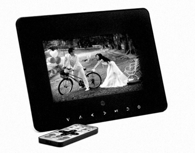
Another example of wit and warmth applied to the concept of a museum is Domenico Quaranta’s MINI Museum. This museum is a 7'' digital photo frame accompanied by 4 GB of storage space. The museum travels from artist to artist, with each artist adding their own “solo exhibition” to the museum until the 4 GB capacity of the Museum is reached, at which point it will go back to the Director. Instead of mobilizing around the word “museum” as a concept frozen in time but ported to the internet, this project intelligently probes at the significance of the sought-after museum solo show for an artist. The MINI Museum also draws attention to the limited capacity of most museums, who do not exhibit their entire collections at once (they simply wouldn’t have the space) and also have limited budgets and curatorial expertise. The fact that the MINI Museum deals with these issues on a small scale doesn’t make the questions that it poses less real or important.
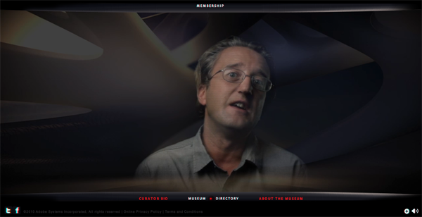
Regardless of whether Adobe’s online venture deserves to be called a museum or not, it could serve as an interesting online gallery or venue. The experience of the AMDM as it currently stands, however, is long on potential and short on everything else. The jellyfish-eyeball mentioned previously is your guide, though it is an unneeded construct, given that the layout of the site is clear and easy to use, and there is only one artwork to see. Front and center is an invitation to click and view a video statement by curator Tom Eccles, which serves as a short welcome. It’s fortunate that the videos throughout the site are simple and mostly brief, especially when they have been processed with clichéd fake video glitches, which ultimately distract from the content (but probably demonstrate an After Effects™ filter). Other stylistic choices throughout the site are reminiscent of an 80s, this-is-what-The-Future-looks-like aesthetic. One develops a faint hopeful expectation that Max Headroom will eventually be introduced by the jellyfish-eyeball as the Museum Director.
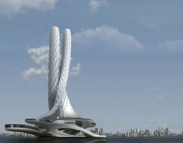
Another main point on the jellyfish-eyeball’s tour is a fly-through of a museum “building”. The team behind the project has commissioned an architect to create a “building” for the museum, and visitors can go on a virtual tour of this building, or watch a red herring of a video where the virtual building is made to appear in several famous cityscapes around the world. Even after watching all the material, it remains unclear what prompted Adobe or the designers involved to include a design for a physical building by a real architect in a virtual museum. In the video describing the development of the virtual building, it is acknowledged by the Creative Director of the project that the desired outcome was for the visitors to the AMDM to feel the familiarity of physical museum space, even though it has to be clear that a video showing this building hulking just beyond a Venetian canal doesn’t accomplish that. Perhaps it was intended to underscore the importance of the overall undertaking by showing what its imposing physical presence could look like. In any case, it strikes me as the same failure of imagination that was rife in Second Life at the peak of its popularity: given the possibility to define as anything at all, many chose a disappointingly cartoonish human form. In the Adobe Museum of Digital Media’s case, given all the possibilities of representation online, they in the end chose to engage an architect to design a building that looks like a futuristic cactus, which is also absolutely unnecessary.
There are few risks taken within the virtual walls of this museum. The commissioned works are by well-known names, the first being Oursler, soon to be followed by art superstar Mariko Mori and design guru John Maeda. Tom Eccles, the first curator of this museum, has considerable contemporary art credibility, and is the Executive Director of The Center for Curatorial Studies at Bard College, one of finest brand names in curatorial education. The PR team behind the project also knew to pitch this as a story to Rhizome, indicating that they have done their homework and know where information about the project could and should appear. This star-studded cast is ultimately a mistake, however. Contemporary art credibility is just not enough. If anything, these safe choices are the strongest resemblance between this virtual museum and the worst of bricks-and-mortar museums.
Tony Oursler’s work, Valley, is inspired by Masahiro Mori's theory that the closer machines come to resembling real humans, the more repulsive and disturbing they are to us. “The Uncanny Valley” is the dip in the graph where revulsion occurs. The official AMDM press states: “Oursler's Valley extends and deepens this theory to suggest the Internet, a mirror of human consciousness, is fast approaching The Uncanny Valley. In this artwork, the artist has divided the Internet into 17 interrelated zones in an attempt to frame the mercurial system.”
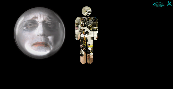
Valley suffers from some of the same tonal problems that affect the rest of the site. Visiting the section on “language”, for example, generates a glowing tower of code and a pop-up face intoning “this is breaking down all the time”, hardly an insightful or interesting commentary. Other sections are better: “Automaton”, for example, rewards viewer’s clicks with some beautiful archival images (which wouldn’t be out of place in a science museum, ironically). The piece is frayed at the edges by the incessant prompts to click on the pop-up faces along the sides of the screen area. The faces, which bear a strong resemblance to the curator in bad make-up, often reward your click with insights such as “click me click me click me”, and despite this uninteresting verbiage you continue to click, because this is the only form of interaction offered, and occasionally the poorly made-up Mr. Eccles says something with more room for interpretation, such as “take me apart… wait, take the whole place apart.” If one applies Mori’s uncanny valley theory to this quip, it could be a desperate plea to get rid of the virtual building that is freaking out visitors because it’s tried too hard to be a real museum, but is not a real museum.
As philosopher Alain de Botton said in a recent article questioning the role of museums in society: “Curators should dare to reinvent their spaces so that they can be more than dead libraries for the creations of the past.” New conceptions of what museums could be, including ideas for entities existing solely online, will form a key part of future thinking around how we express the fundamentals of human creativity to subsequent generations through our preserved heritage, both tangible and intangible. Clearly, the Adobe Museum of Digital Media will not function as the lever to open up the question of the future of museums, nor provide a radical platform for creativity by the generations who grew up with Photoshop as a verb. That task is up to us.
Michelle Kasprzak is a writer and curator based in Amsterdam, the Netherlands. She is currently Project Director at McLuhan in Europe 2011, a cultural network project that will celebrate the legacy of Marshall McLuhan as a media and telecommunications visionary across Europe in 2011, the 100th anniversary of his birth. More about Michelle: http://michelle.kasprzak.ca


Indeed it seems more of an imitation of a real thing than a real thing itself. And by that I don't even mean the built museum, but rather the idea of a museum of web art (they don't even use this name, nor net art, as if they wouldn't want to use copyrighted terms nor give someone else the least credit for doing for a generation what they are pretending to do now).
The fake glitches are particularely embarassing, as it is the idea of a cactus-building. It seems there was not much effort in creating something new, edgy (of course, something new and edgy will not please so many people, will not be comprehended by the majority and innovation attempt can be a flop).
But if it plays safely with a new idea of preservation and a museum (thus, making it flop), it also flops with the works of art displayed: the inventors of Flash could not come up, even, with an interactive work of art. I clicked 'Sex' an a pie-chart was dancing in the screen… no interaction of any sort, unless if you count the curator making a fool out of himself with what seems to be a measure to engage the viewer and make it easier for him to understand what that is.
Sometimes you can gather the best cast in the world: it just won't work if you don't let the right people to do their thing. It seems that in 20th century organizations the vertical thinking still creates those idiosyncratic barriers, obliging programmers to build silly softwares to please the 'biggest number of people'.
Reminds me a bit of the Guggenheim's Virtual Museum project back in the '90s.
With the rise of Flash Media Server, I'm surprised Adobe didn't work with the artists, curators, creative directors, etc. to develop the space in tandem with REAL face-to-face events.
There's no virtual without the real. Virtuality is simply 'potential.' Why is this word so often confused with 'nowhereland.' We carry potential with us EVERYWHERE. The virtual may be hard to pin down . . . but it's definitely somewhere.
This is one thing that's totally lacking in so many online art and arts related projects. Either offer something that adds to the online discourse, like a valuable collection, unheard of and probably impossible in the 'real' world, http://ubuweb.com/ , or something that's in an 'augmented reality,' in its loosest definition . . . a thing that Amazon mastered early on . . . you type some words on a screen and SHAZAM! a book is at your doorstep. Want to think about architecture and online virtual space? Don't build slick graphic fly throughs with Flash. Think Amazon's shipping network and business services!
[youtubehttp://www.youtube.com/watch?v=SYRL9FwApHQ][/youtube]O