2010, Francesco Bonami and Gary Carrion-Murayari’s Whitney Biennial, is essentially a Whitney Biennial calibrated for the times: small at 55 artists and altogether humble. This humility, and the fact that one needn’t contend with an overwrought curatorial concept, allows viewers a more cogent experience than past, sprawling, thesis-driven Biennials could offer. Several works, rooms and motifs make good impressions. Not many are impressive enough to make an indelible impact—but a few are. Judging by the past couple decades, the task of this biennial of American art seems insurmountable, and there is no urgency to fault this edition for hitting the target and missing the bulls-eye. While the levelness here is exciting as an indicator of a playing field for post-boom artistic production, the devil’s advocate wonders, perhaps unfairly, if there isn’t something ultimately more exciting about a splashy Biennial that fails stupendously.
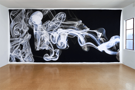
In the absence of an overarching conceit, why not start with a premise that did precede itself a bit: the third floor as a dedicated space for film and video. Considering the continued expansion of film and video practices throughout the art world, the idea seemed gimmicky at best—easily the curators could fill a floor, but why ghettoize? Then, come February 25, visitors stepping off the elevator and onto floor three were greeted by a tapestry by Pae White, freezing a frame of interlaced wisps of smoke in a vast expanse of fabric. Mercifully this is not a plain LCD screen (as it turns out, the floor showcases a variety of mediums), but as a piece that meditates on materiality, medium and time, it serves as an excellent banner to welcome visitors to the area of the exhibition that is most concentrated on media. The projects therein attending to these matters soar.
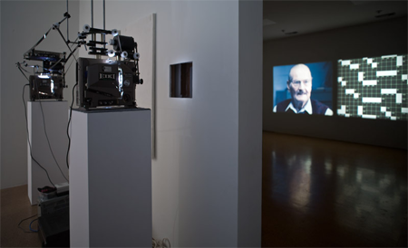
Among them is Erika Vogt’s Secret Traveler Navigator, a small dark room featuring a 16mm projector and two abstract, figurative drawings reminiscent of the images that manifest in the film. Onscreen, silhouetted players gesture with ambiguous instruments both blunt (wands and other prostheses) and delicate (a drawing compass). They are recorded, projected and re-recorded, back and forth between video and film. Other simple deviations—for instance, a mirror held before the camera during a joint recording/playback session, thus reflecting projected light onto the shadow cast by the mirror—collapse layers of ritualized mark-making and physical processing into the finished film, which imparts a heavy, hollow feeling of magic.

Another standout work is Kerry Tribe’s H.M., a double-projection of a single film about a man whose memory was truncated to 20 seconds after an experimental 1950s brain surgery. The two loops run 20 seconds out of sync, mimicking the patient’s synaptic handicap. Tribe masters this rhythm and finds in it the generative potential to blur the lines of perception and memory.
Other works misappropriate qualities of moving image mediums via their simplicity, to ends that are not subversive but dull. Kate Gilmore’s bird’s-eye-view video of the artist busting into and then through, up and out of a drywall column lacks contemporary relevance and formal excitement (the retrograde feminist interpretation provided in the wall text adds insult to injury). To make his videos, Rashaad Newsome removes vogue dancers from their rich, cultural contexts, choreographs and records them voguing in an empty, silent room. While the attempt is to isolate and abstract the dancers’ motions, perhaps strip them down to a new level of intimacy, the videos do not dodge feeling flat and, plucked from the club and dropped into the museum, benignly ethnographic. Though more considered, Kelly Nipper’s video is another performance-for-camera piece following a minimal aesthetic that also feels underwhelming. While these works don’t give enough, some on the second floor give way too much. Edgar Cleijne and Ellen Gallagher’s Gordian film installation with sliding walls, projections of painted slides, and the holographic head of JFK—all wrapped in a paintjob of appropriated, polemical text—resists any intuitive reception. Nearby, Marianne Vitale’s vituperative tape, a supposed parody of authoritarian rhetoric, is the exhibition’s nadir of gravitas.
High above in the firmament of social, political and marketing ideals, Barack Obama is the chief figure of the curators’ text. The essay characterizes the last two years of American art-making as aligned with the renewed interest in collective action ushered in by his campaign, and the corresponding politic of community-building that begins with an individual. (He also appears on the cover of the catalog in a cowboy hat.) One artist, Jessica Jackson Hutchins, incorporated Obama’s image in her work, plastering her childhood couch in Obama newspaper clippings to create a monument to public and personal histories.

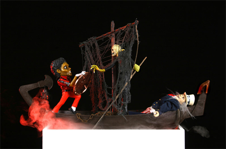
Two artists invoke the likeness of another African American icon, whose cultural significance similarly is both pivotal to and transcendent of race: the recently departed Michael Jackson. Lorraine O’Grady’s four diptychs pairing Jackson with Charles Baudelaire, The First and Last of the Modernists, depict both poets at defining moments in their lives, from their halcyon days through to their epic declines. The very first work encountered in the museum’s lobby is Daniel McDonald’s The Crossing: Passengers Must Pay Toll in Order to Disembark (Michael Jackson, Charon and Uncle Sam), in which the eponymous scene is staged with carefully arranged action figures, the Jackson figure struggling to hoist a colossal, shiny penny before Charon; Uncle Sam meanwhile is broke and passed out. A number of variations on the American economy and economic crisis can be read into this allegorical tableaux, which also alludes, obliquely, to an economy (and crisis?) of contemporary art materials and meanings, with these plastic figurines accentuated by kitschy smoke and resting upon a mirrored, white plinth.
Between the extremes of the President of the United States and the King of Pop, other figurations of America occur throughout the exhibition. Perhaps the most prevalent is not human but architectural—houses figure into many works, from Maureen Gallace’s spare, oneiric paintings of coastal New England residences; to Robert Williams’ watercolor subtitled “astrophysically modified real estate,” showing quaint homes being sucked into a vortex of spiraling sky; and James Casabere’s large scale, aerial photographs of miniature suburban sets, rendered in an Easter egg palette and gloomed by a haunting chiaroscuro.
The Casabere pictures are the face of the floor two lobby and they couple poignantly with the Ari Marcopoulos video in the screening room immediately to their right. Titled Detroit, it is a recording of less than ten minutes spent in the vibrant playroom of two little boys who mix feedback signals, sirens and other assorted electronic noise into a cacophony of decay and alarm emblematic of their gritty, crumbled city—and yet the video conveys an air of inner peace as a portrait of their rambunctious, imaginative inner worlds. While Casabere presents a pretty image bestowing a sense of dread, Marcopoulos’s dissonance produces calm. This reversal underlines the American maxim: never judge a book by its cover—and its subsequent: maybe do judge, then invert your determinations, as taught by the nerd who becomes a hunk in any teen movie.

The German, New York-based artist Josephine Meckseper contributes a video that is part stirring critique of consumerism, part dispassionate gaming of its loopy, anguished appearances. The artist edits documentary footage shot at The Mall of America—from sale signs, to native American moccasins, a flight simulator, and glances of Lake Wobegon U.S.A, the Garrison Keillor store—into a highly subjectivized and menacing account evocative of madness (Perfumania!), desperation (40% off entire store!) and commodified violence.
Perhaps the work that most overtly takes America as its subject is The Bruce High Quality Foundation’s melancholic memoir of her dilution, projected from within a vintage, white hearse-cum-ambulance onto its windshield. Titled We Like American and America Likes Us, a pluralized riff on Beuys, it is a popular exhibit with prime placement just to the left of the fourth floor lobby (where probably many are compelled to flee Piortr Uklanski’s room-sized opus of burlap and bloody lacquer). Like the collective, the project is undeniably clever, and a bit mercurial, luring high-minded audiences to plop down and watch TV, in the headlights of an oncoming car.
Viewers watch mash-ups of found sound and image pulled from West Side Story, Taps, Ghostbusters, Radiohead, WWF, the morph sequence of Michael Jackson’s Black or White, and more flippant, questionable combinations such as the Rodney King beating scored by the theme song to America’s Funniest Home Videos. The video casts America as the nostalgic archetypes of the aloof father, the picked-on kid, the one that got away… and is narrated by a pensive, wistful female voice in the spirit of a Wonder Years eulogy—that is, with a distinct recognition of the entertainment value of pathos, particularly of that which is rooted in pop cultural tropes. As usual, the group’s work is described here by the curators as a “critique” of the art world. It more clearly resembles the knowing, jaded complacency of a high concept ad campaign. It’s possible to connect the dots between the two, but only time will tell.

The inclusion of the work of two photojournalists, Nina Berman and Stephanie Sinclair, sets the bar awfully high for more abstract critiques of America. Berman’s portraits show a young Marine sergeant, critically disfigured while serving in Iraq, with his fiancé in the weeks leading up to their wedding. Sinclair’s photos document women in Afghanistan whose absolute despair led them to inflict fire upon their own bodies. Both series are disturbing, enthralling and painful to see. It is to the curators credit that they do not feel tokenized in the greater context of the exhibition; in fact, they are contextual touchstones that remind viewers of the roles identity, figuration and performance play in the real and everyday traumas of the world.
As Biennial artist Hannah Greely explains in the catalog, in reference to her installation’s modern day integration of a pay phone, “When an object is no longer useful in an obvious way, it becomes something closer to art.” A general success of this biennial is the refusal of a thesis that would demand the art works to assume an intellectual support function; to serve such an obvious use might, by extension of Greely’s comment, distance the works from their status as art. Still, so much of the art in 2010 can’t escape serving a purpose, even if it is one that is interchangeably tacit and manifest: they represent American art, and by extension America. Accordingly, one would hope for each work to be so uniquely exceptional as to be unable to stand for a broader constituency. That may be asking too much, but it’s the desire that fuels perennial interest in shows like this.
Kevin McGarry is a writer and curator based in Brooklyn, New York. He is a co-director of Migrating Forms, an annual festival of new experimental film and video, whose 2010 edition will run May 14-23 at Anthology Film Archives.

