Still from La Regle du Jeu (The Rules of the Game), directed by Jean Renoir, 1939.
This is part 2 in a series on Curating Online Exhibitions. Part 1 can be found here. The presentation based on this article, given on April 12, 2021 as part of “From Black Boxes to Open Systems,” is available on Vimeo.
Watching Jean Renoir’s 1939 film La Règle du Jeu (The Rules of the Game) during pandemic lockdown was a bittersweet pleasure. On the eve of World War II, the characters in the film celebrate gaily despite the heavy pallor of somewhat self-inflicted, impending doom that hangs over the proceedings—a familiar affect of the recent past, for today’s viewers. Truly awful people careen across the screen in a devastatingly chaotic party that ends in tragedy, a harbinger of societal collapse to come. On the one hand, what better reminder of the drawbacks of convivial life, the benefits of a solitary existence? On the other, I miss those nights.
In the first section of this text, I argued that online exhibition can be thought of as a form of performance, and promised that in part two, I would continue in this metaphorical vein by discussing the mise-en-scène of online exhibitions, which is what prompted my return to Renoir, a filmmaker who famously made virtuosic use of staging. The concept of mise-en-scène originated in 19th century French theater, where it referred to everything that went into the production of a play apart from the recitation of lines—the arrangement of scenery, props, lighting, the blocking of actors, setting, and other elements of staging. The term was later adopted in cinema, where it is sometimes expanded to include not strictly diegetic elements such as film stock and composition.
Rhizome’s preservation director Dragan Espenschied began to use the term several years ago as part of our discussions about online exhibition, and it has proven useful as part of our ongoing work. This was in keeping with a kind of mantra for Rhizome’s preservation and curatorial efforts, which was that digital culture is made up of practices, not objects—Dragan contends that it can be productive to say that “Everything inside the computer is a performance.” Thus, this theatrical metaphor, which had already been expansively reinvented for a new medium once before, offered particular possibility.
All of the elements that come together to create the performatic scene of an online exhibition can be thought of as aspects of its mise-en-scène. This sounds straightforward enough, but the list of these elements is potentially endless, because online exhibitions rely on complex ensembles of technological and human factors. Listing each concrete element that comes together to shape an online exhibition proves to be a laborious and unproductive undertaking; there are truly endless permutations. And yet each of the parts that make up an online exhibition, from interface design to users’ setups, may be important; Dragan contends that “all aspects of an online exhibition are subject to design and presentation choices, and have no ‘natural’ state.”
On a quite basic level, visitors access an online exhibition using their own setup. Their hardware, software, viewing environment, connectivity, and behavior are beyond the control of a curator. Even the most default assumptions underlying an online exhibition may reveal themselves as completely contingent on technological context. Twenty years ago, no one thought to specify that a particular web-based artwork would require a mouse, because no one anticipated that this mode of human-computer interaction would be replaced. When exhibiting a legacy artwork in 2020 that depends on actions like “hovering” over a hyperlink, though, it becomes necessary to think carefully about how to interpret user actions on a touchscreen device. This is a quite concrete example, but it also illustrates the way in which overlooked aspects of digital culture deeply shape an artwork’s performance.
In staging an online exhibition, it is important to embrace the openness of the situation. The goal is not to engineer the online exhibition down to the component level, but to understand the way in which given or easily overlooked factors can play a crucial role in shaping the performance and reception of a given online exhibition. Rather than listing each granular element that makes up the mise-en-scène of an online exhibition, it’s more helpful to focus on what Dragan calls “productive abstractions,” the concepts that can be generalized outside of a specific technological context. This way of thinking through the fundamentals of online exhibition helps to avoid the common pitfall of skeuomorphically reproducing white cube gallery in virtual space, and instead to engage with the particular affordances of online exhibition.
Infrastructure
Online exhibitions are deeply shaped by the technical infrastructure that performs them, and the infrastructure through which users access them. To no small extent, this is outside of the control of exhibition organizers. Nevertheless, infrastructure is fundamental to the experience of an online exhibition and its meaning.
In some cases, online exhibitions make highly intentional use of specific infrastructure—projects that are available only from a given wifi hub, for example, or websites that are accessed from solar-powered or DIY servers. One example of this type of approach is “!!!Sección A R T E [Art Section],” a selection of work by Cuban and international artists that is inserted into El Paquete each month, curated by Nestor Siré. El Paquete Semanal [the Weekly Package] is a collection of digital media that is distributed across Cuba and via in-person file-sharing. Users often pay fees to access a selection of material from El Paquete, which may include TV shows, magazines, music, and more. Many users access this material using a USB stick attached to a flatscreen TV. In this case, the conditions of accessing art via Siré’s offline-networked exhibition are highly particular to the viewing conditions afforded by this infrastructure.
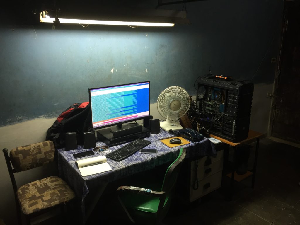
Behind the scenes of El Paquete Semanal. Julia Weist and Nestor Siré, Holguín (BABALAWO), 2016 (still). Courtesy the artists.
There are also more pedestrian examples of the way in which infrastructure figures into online curation. In Rhizome’s Net Art Anthology, we made extensive use of online emulation to offer users access to legacy artworks. Online emulation involves using a fast connection to view and interact with a computing environment that runs on the cloud; close proximity to server infrastructure and a fast internet connection are a must. Unlike online video, which can buffer and change quality dynamically in response to network conditions, online emulation suffers greatly from any problems with connectivity. For the presentation of Epithelia and netart latino database, advisor and participating artist Brian Mackern asked that we present a documentation video along with online emulation access, to better serve audiences in the Global South. Mackern’s position highlighted the way in which the geography of cloud infrastructure replicates colonial problems of distribution and access.
In fact, a similar position was articulated by the art collective tsunamii as part of their participation in documenta 11. For the major international exhibition, curator Okwui Enwezor planned a series of convenings or “platforms” in geographically disparate parts of the world. tsunamii pointed out that moving the documentation materials from these events to server infrastructure in Germany replicated colonial patterns of extraction, and their work—a walk from the site of documenta to the location of its web server—was staged as a way of calling attention to this digital colonialism.
The URL of a given work can also be thought of as a way of locating it within the infrastructure of the web. In an article for DU Magazine in 2000, artist Olia Lialina emphasized the importance of the address bar as a part of the experience of a website, and noted that many galleries and museums exhibiting online used various strategies to obscure the URL of externally hosted online artworks:
The URL, the original address of the project, together with the names of folders and files, disappears. This way, they create an illusion that the work belongs to them. It doesn’t really qualify as theft. You can even argue that it’s being done for aesthetic reasons—so that technical details won’t distract the viewer from the contents of the main window.
The problem is that what happens in the location bar is no less important than the text and the graphics. The address bar is the author’s signature. It’s where action takes place, and it’s the action itself. The real action on the web doesn’t happen on the page with its animated GIFs or funny scripts, it’s concentrated in the address bar.
To prove the importance of this, Lialina curated an online exhibition in 1999, “Location=Yes,” that featured artworks and other projects that emphasized the URL: “Unusual or significant domain names, animated address bars or those that feature dialogue prompts, formalistic or baroque URLs.” The URL of a given exhibition not only locates it on the network, but also confers meaning.
Making use of existing platform infrastructure can be a way for online exhibitions to offer commentary on existing attention economies and modes of interaction, to encounter new audiences, and to experiment with new formats. Paul Soulellis’s series “The Download” considered “posted files, the act of downloading, and the user’s desktop as a space for exhibition.” Many exhibitions have made use of existing social media platforms or online virtual worlds, from “Manetas Desert in Second Life” to Lars Eijssen’s “The New Easy” in Google’s 3D chat environment Lively. Krystal South’s “Exhibition Kickstarter” was a crowdfunding campaign that welcomed visitors with the words, “This is not a Kickstarter. This is an exhibition.” It offered works by 11 artists that were compatible with the Kickstarter format. Bubblebyte’s website takeovers, including a 2013 project on the Create London website by artist Hannah Perry, offered memorable interventions into the otherwise straightforward online presence of their host organizations, and raised the question of why primary experiences of art are so rarely found on such websites.
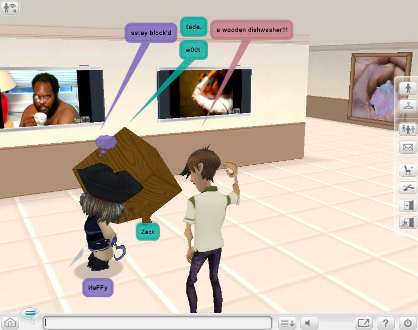
“The New Easy,” curated by Lars Eijssen. Screenshot from Oliver Laric, An Incomplete Timeline of Online Exhibitions and Biennials, 2013.
Foregrounding infrastructure is not always necessary and can even be an unwelcome distraction, but at times it can play an important role in shaping the experience of viewing art online, and can lend depth and meaning to users’ encounter with an online exhibition. In particular, this dimension is important to consider because infrastructure materializes many of the political and social conditions that surround the reception and circulation of online art.
Arrangement
In the “traditional” definition of exhibitions I shared in Part 1 of this article, order played an important role: “Exhibition involves imposition of order on objects, brought into a particular space and a specific set of relations with one another.” For online exhibitions, I prefer the term arrangement rather than order; it feels more appropriate to open-ended and dynamic situations, and it also evokes a performance metaphor (as in, a musical arrangement), which is often more suitable for born-digital contexts.
In traditional exhibition-making, order is mostly expressed through the “hang” of a show, the placement of works in space for a given period of time. The “space” of an online exhibition, though, is a much more contingent and flexible concept. Online exhibitions may involve arrangement in skeuomorphic virtual space, informatic space, and embodied space. They may also involve especially dynamic kinds of arrangement in time. In this section, I’ll discuss each of these kinds of arrangement, but I’ll leave any discussion of one key aspect of arrangement—the selection of artworks—for a future article.
3D Virtual space
One exemplary use of a re-creation of physical exhibition space in a virtual realm is CyberPowWow, a biennial exhibition held from 1996–2004 in the Palace chat environment. Organized by Skawennati with various collaobrators, CyberPowWow, as Mikhel Proulx argues, was formulated in response to the understanding that “cyberspace” was being positioned as a new territory:
The Internet as “information superhighway,” as “network,” and as the “electronic frontier,” and the use of architectural forms within the popular imaginary such as the “gateway,” the “table,” and the “cloud,” and in applications like Explorer and Navigator, all imply movement and spatiality. This implication carried forward a thoroughly imperial flavour to digital technologies’ colonizing expansion across the planet. Hence, the mythologizing of network technologies as an “open space” has often served to naturalize its highly-structured organization. This recalls Manifest Destiny frontier attitudes in which a materialist conception of the empty land (terra nullius) led to its dismemberment and occupation. As [Jason E.] Lewis and Skawennati made clear: “if Aboriginal peoples learned one thing from contact, it is the danger of seeing any place as terra nullius, even cyber space.”
CyberPowWow adopted the format of a (somewhat) three-dimensional gallery as an intervention into this construct of virtual space. It took the form of a series of rooms where users, represented by 2D avatars, could encounter and interact with exhibited works, and also chat with one another. Per Proulx, the exhibition was viewed as a self-determined occupation of this metaphorical space by Indigenous artists.
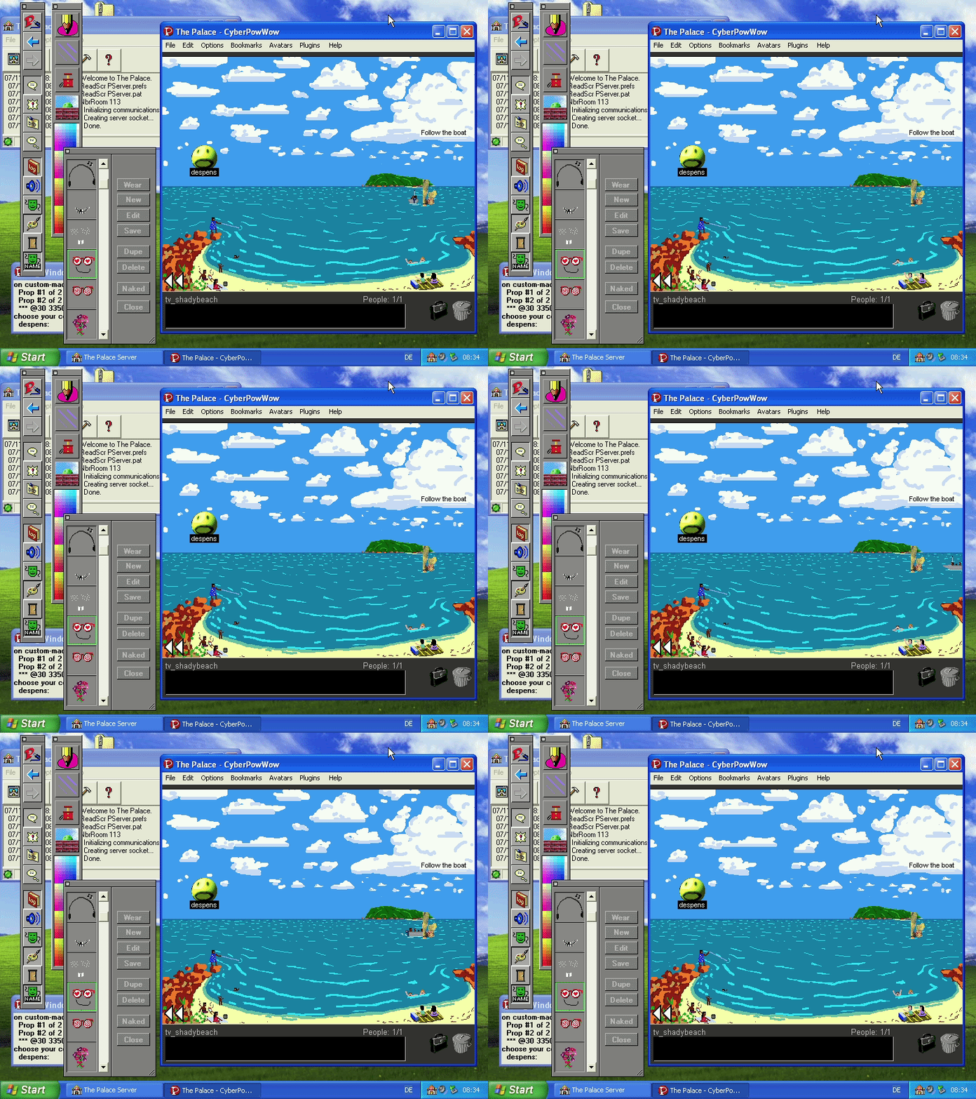
"CyberPowWow", organized by Skawennati with various collaborators, 1996-2004. Courtesy of the artist.
A recent exhibition that made thematically appropriate use of a metaphor from traditional exhibition was “The New Outside,” curated by Constant Dullaart for the platform upstream.gallery. The exhibition positioned all works on view within a large browser canvas. Upon landing on the page, visitors were greeted with a map of the layout of the works, allowing them to navigate among them quickly, and conveying the immediate sense of the scale of the exhibition, even if only a portion of it was viewable at a time. The map resembled a salon-style hang, a metaphor from traditional gallery display that resonated with the exhibition’s theme of the computer as a new kind of window to the outside. The mosaic-like display of works in the traditional salon style implied that “space was discontinuous and categorizable,” with each adjacent window offering its own complete perspectival space, not entirely unlike the experience of accessing the outside world via the computer.
While neither CyberPowWow nor “The New Outside” aspired to photorealism in their construction of navigable onscreen space, the use of photogrammetry and virtual reality allows online exhibitions today to achieve a quite high level of fidelity to real physical spaces. Virtual representations of art galleries can be helpful for conveying a particular impression of a physical work’s dimensions in relation to a given context, or for offering a commentary on specific or general institutions or places. Such virtual representations also run the risk of being skeuomorphs, reproducing vestiges of physical exhibition space that are not necessary or desirable online. In particular, works that are not made for a 3D graphics environment often suffer when placed into one: a digital image placed into a skeuomorphic setting is often subject to shading, perspective distortion, and other artefacts that are typically undesirable for the exhibition of a digital image or object. Many photorealistic 3D environments also impose rather extreme constraints of hardware, bandwidth, and user behavior that tend to overdetermine the audience experience of an online exhibition.
Informatic space
On the web, informatic arrangement often simply means creating a clear ordering of links, thumbnails, and descriptions or metadata, but this is far easier said than done. Numerous questions arise: How many works are included? What information is provided with each artwork? How do visitors locate themselves within the exhibition, move through it, and understand the scale of the exhibition as they encounter it? How is the curatorial concept presented? How are thematic or chronological relationships among works expressed? All of these questions arise in considering the informational arrangement of an online exhibition. Here, I will offer a couple of examples to suggest the diversity of approaches to informatic arrangement that online exhibitions can take, but for a more in-depth consideration of these questions, see Lozana Rossenova’s research on curatorial interfaces for digital archives.
The NFT platform Feral File does an exemplary job in its presentation of contextual information and navigational elements. Its inaugural exhibition “Social Codes” features previews of ten works in a grid layout. Clicking on a work brings the visitor to a page with a larger preview image and information about materials and pricing, and here a link gives them the opportunity to view the work in full screen. Navigation buttons allow the user to move directly from one work to the next, so that they can choose to experience the works first, in a given sequence, and return to didactic information only as needed.
Where traditional exhibitions conventionally position captions off to one side in a discreet location, online exhibitions sometimes bury artworks under walls of text. Finding the right balance between textual interpretation and primary experience is an important challenge. One project that did this in an interesting way was Parallelograms (2011–2015), curated by Leah Beeferman and Matthew Harvey. The exhibition explicitly tackled the relationship between images and interpretation, and it announced its methodology on an About page: “Invited artists are given a set of images taken from deliberate web searches and asked to create a web-specific piece in response to one of them.” The only information given for each artist was the artist’s name and the image that the artist was responding to, and this was enough: it focused attention on the relationship between the source image and the artwork, rather than on the origins of the image or the prior practice of the artist. This created a parallel structure–a parallelogram?—between the visitor’s interpretation of the artwork/image pairing, and the artist’s interpretation of the source material. (A list of bios and links for each artist could also be found on the site).
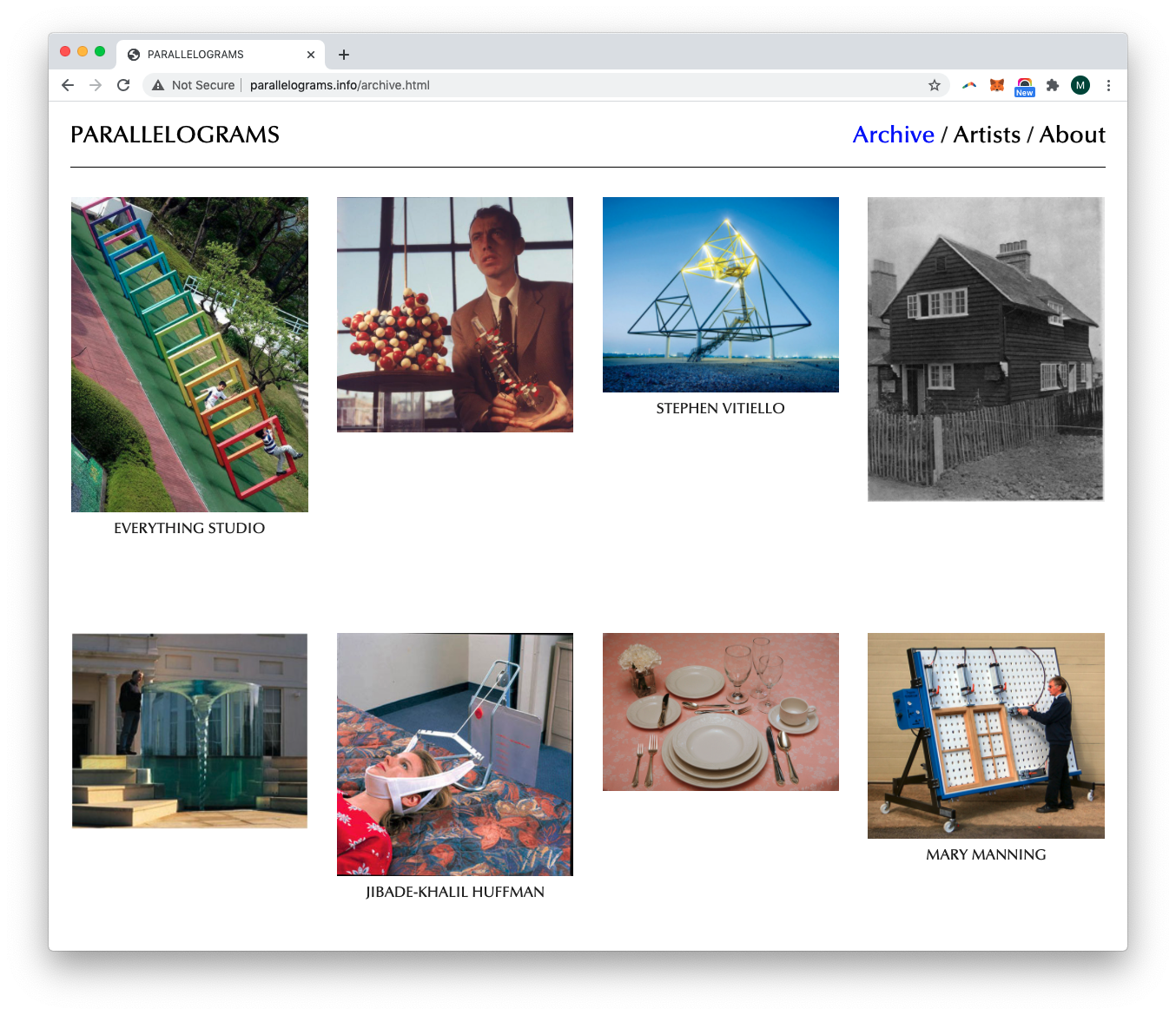
"Parallelograms", curated by Leah Beeferman and Matthew Harvey, 2011-2015.
Information can even be encoded directly in artwork, as in Rhea Myers and @coin_artist’s TORCHED H34R7S, which encrypted the key to a Bitcoin wallet within the image itself. It took three years for the puzzle to be solved by an unidentified computer programmer, at which point the currency in the wallet was worth $50,000. No less than the other elements of mise-en-scène, the informatic arrangement of an online exhibition can be an opportunity for experimentation and play.
Physical space
Online exhibitions often explicitly engage with users in their physical environment. “Do It,” an exhibition conceived by Hans Ulrich Obrist, Christian Boltanski, and Bertrand Lavier in 1993, was launched as an online exhibition by e-flux in 2001. The online platform featured instructions by artists that could be completed by members of the public, and included an interface for uploading completed results after following instructions such as these by Joan Jonas:
dance with a large piece of chalk
mark up the nearest surface and pay attention to the movement of your feet
music optional
The third edition of the online exhibition, “do it (home version),” looked in particular at “the at-home use of artists' do-it-yourself instructions.” The exhibition was realized on users’ screens, but also in their homes, through their actions in response to it. Shortly after the exhibition launch, Obrist noted that 200 submissions had been received, “from artists, philosophers, scientists, poets, and musicians.”
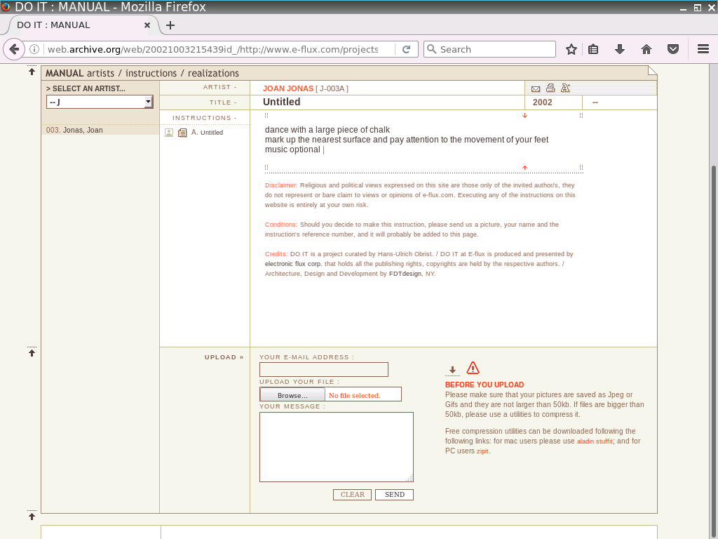
“Do It”, curated by Hans Ulrich Obrist, Christian Boltanski, and Bertrand Lavier, 2001.
A similar interest in addressing internet users in physical space can be found in Heath Bunting’s Project X, which involved writing a URL in public places with chalk. Rachel Baker described the project as follows:
You'd see the URL scrawled in chalk in various places around London, bridges or alleyways, places that would have some kind of personal significance…through walking around London and turning it into a kind of fiction, a personal narrative I suppose. So if you found this particular URL in the street and if you went to that URL online, you'd get to the website with a form. And the form would ask you, where did you see this chalk? Who did it? Why do you think it was done? And then that takes you to a kind of a list of responses. What that does quite nicely is get you to think about location—locate where Heath chalked that URL all over the world, locate yourself in relation to everyone else who noted it, not just in London, but worldwide.
Asking users to locate themselves and their messages within a networked experience can be understood as a precursor of certain kinds of augmented reality works of the present day. Prior to the pandemic, augmented reality exhibition often involved presenting artworks in relation to a specific physical environment, such as the [AR]T walk curated by the New Museum for Apple, which included a site-specific version for Central Park, or the group exhibition “Open to the Public” staged in 2019–2020 by MoMAR, part of a series that introduced projects in augmented reality into the galleries of New York’s MoMA. Since the start of the COVID-19 pandemic, as Samantha Culp has noted, AR experiences have tended to address users in domestic space, with projects such as Nina Chanel Abney’s Imaginary Friend, which introduced a digital character, a storyteller, into the user’s immediate environment.
From this brief selection of examples, it is hopefully clear that online exhibitions may be specific to particular locations, they may address the embodied experience of users, and they may be specifically designed for at-home access. These dimensions are likely to be explored in greater depth in coming years with the greater availability of technologies for augmented and virtual reality, but they have been abiding concerns throughout the history of online exhibition-making.
Temporal Arrangement
If time is often treated as a constant within white cube exhibitions, where art often “exists in a kind of eternity of display,” online exhibitions take on the time of the network, which is at once completely subjective and highly engineered. Brian Droitcour gave an apt consideration to the temporal experience of the internet user in his essay on the curatorial platform JstChillin:
Time doesn’t exist when you’re… just chilling!” [...] The slogan situates the presentation of artworks in the temporal and physical environment of a regular internet user, while suggesting how one might describe that environment. I’ll give it a shot. Chilling entails an awareness of parallel threads of messages, ordered by clock-time sequence (the sequence of clock-time) and subjective assignments of importance (as in Facebook’s toggled feed settings “Top News” and “Most Recent”), and the knowledge that each discrete parcel of information can wait for your next connection to your e-mail, your RSS aggregator, your Tumblr and whatnot. But they might lose relevance if you wait too long. The chilling body is motionless except for a few minor gestures: typing, clicking, shifting the direction of its gaze. Chilling is simultaneity of recent past and lagging present, with a furtive hope for updates in the near-future: the sum of attempts to follow a track or two into the past and push others toward forward. Awareness of physical surroundings gets fuzzy as old layers of digital sediment are sifted through, new ones deposited. Jstchillin says: “To chill is to live in a constant state of multiplicities, a flow of existence between web and physicality.”
JstChillin addressed this temporality in part through its structure—its inaugural exhibition, “Serial Chillers in Paradise,” unfolded over the course of a year and a half, with a new artist presented every two weeks.
This type of temporal arrangement, with new layers of sediment deposited with each update, is far more common with online exhibition than it is with gallery exhibition. I used the structure of a blog for my first exhibition with Rhizome, “Raiders of the Lost ArtBase,” which was designed by Dragan. An earlier example of this kind of aggregative approach can be seen with the online exhibition Kingdom of Piracy (KoP), curated by Shu Lea Cheang, Armin Medosch, and Yukiko Shikata. KoP began as a project sponsored by the Acer corporation to celebrate artists’ resistance to the copyright regime and embrace of alternative strategies. Against the backdrop of a major anti-piracy push in Taiwan, the sponsorship ended, but the curators continued the project, finding a home first at Ars Electronica in 2002 and expanded for a presentation at FACT in Liverpool, at my invitation. The exhibition design was exemplary: a horizontal scrolling sea featuring floating buoys that linked to a range of artworks. As new works were added, the sea would expand. Shu Lea, in her inimitable style, described the exhibition design as artworks “floating in the open source open sea.” This also allowed the project to grow and be updated over time, serial and as open-ended as the web itself.
Temporal arrangement can powerfully express the performative quality of web-based work. The ongoing series “Sunrise/Sunset” is a series of site-specific commissions for the website of the Whitney Museum of American Art, which appear each day to mark sunrise and sunset in New York City. The projects take the form of a temporary daily disruption to the normal functioning of the website, while evoking a relationship between the web and the physical home of the museum.
Works on the Brazil-based curatorial platform Aarea.co also use temporary presentation as a way of expressing the performativity of the web. For “Redirección,” a series of nine works presented on the platform’s website and on the website of Colombia’s Salón Nacional dealt poetically with the passage of time and its relationship to the internet. Brazilian conceptual artist Carlos Fajardo’s Sem Titulo was one particularly evocative example, offering live images from a stationary camera showing the play of light on two perpendicular walls, calling to mind the interplay between physical and online exhibition spaces, and the passage of time in each. The works on Aarea.co are performed only for a limited period of time, and then disappear from view.
Finally, it must be noted that the performance aspect of online exhibition can also be understood as a form of labor that implicates artists and audiences alike. This argument was advanced by Devin Kenny and Lucas Pinheiro as part of the curatorial text for their exhibition “Real Live Online,” copresented by Rhizome and the New Museum as part of the First Look series in 2015–2016. Kenny and Pinheiro argued that
Writing in the late 1970s, Michel Benamou identified performance as the dominant characteristic of postmodern society—a cultural landscape where everything performs. Technology performs, the news performs, art objects perform, poetry performs, politics performs, and, most critically, we all perform, be it gender, race, sexuality, class, or any other expression of politicized identity that we enact.
Today, the internet has transformed capital’s age-old demand for ubiquitous performance into a twenty-four-seven reality. Users are constantly asked to produce and consume content, update software, respond to notifications, earn ratings, click, share, like. And yet our capacity to imagine and perform possible alternatives—to pursue love, political projects, social connection, community, and self-determination—has not been exhausted.
Style
The staging of an online exhibition conveys meaning not only through the arrangement of works, but also though a wide range of technical and aesthetic choices that may be thought of as an exhibition’s style. The style of an online exhibition’s interface—whether it is the “open source open sea” of Kingdom of Piracy or the “just the facts” presentation of left.gallery—may convey a particular position, or they may simply set a tone. Online exhibitions can explode with color, such as the artist projects presented by Bubblebyte, or they may offer a straightforwardly institutional presentation of links, texts, and images. They may adopt handmade aesthetics, as with “oMoMA” or “Raiders of the Lost ArtBase,” or interfaces that borrow from contemporary gaming environments, such as Pete Jiadong Qiang’s website for X Museum.
Rather than trying to comprehensively map the elements that make up an online exhibition’s style, I’ll discuss just one: background color. White backgrounds in online exhibitions resonate with the history of the white cube architecture that is seen as the default for gallery exhibitions. Claude Closky’s iGalerie (2001–2005), commissioned for Mudam Luxembourg while its museum was under construction, referenced this archetype by placing the user into an endless white room. The user traverses a long corridor with artworks displayed on either side, converging toward an unreachable vanishing point at the horizon—an early version of the endless scroll. Hovering over images on display revealed information about the work, and clicking on them opened a pop-up offering an externally stored artist’s work, including contributions by Aleksandra Mir, Zhou Yi, David Shrigley, and Tale of Tales. As Nathaniel Hitchcock has pointed out, iGalerie “showcased the liminality of the museum as it was, still in its planning stages, giving a series of conceptual, architectural models to the screen space; structures that remain impossible for the physical museum.” Closky made a virtue of the incompleteness of his representation of the gallery, which mirrored the incompleteness of the museum itself.
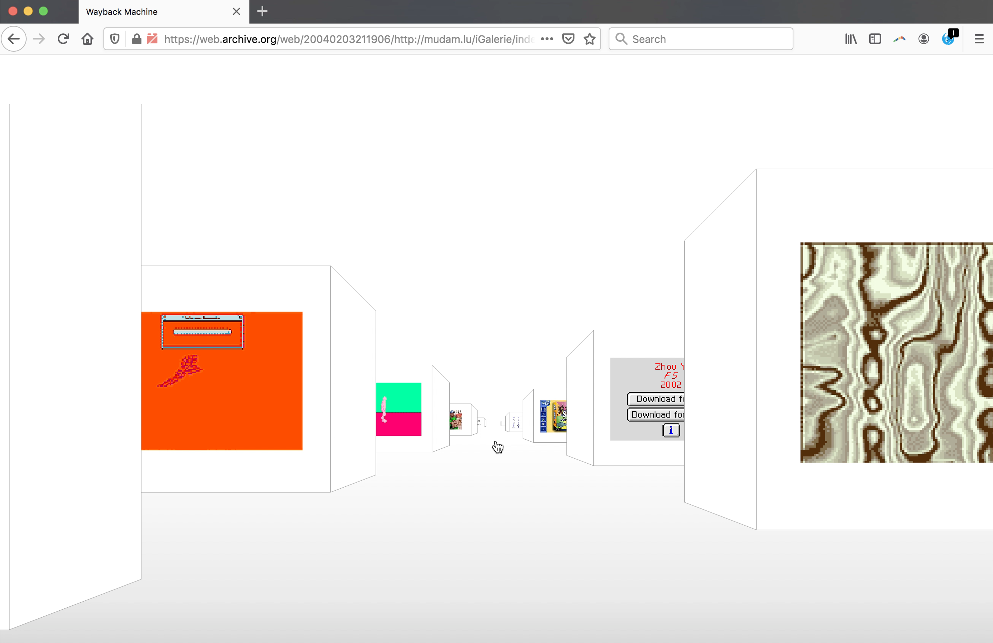
Claude Closky, iGalerie, 2001–2005. Courtesy of the artist.
Closky adopted the white cube of the modernist gallery for his online exhibition, but the color white reads very differently on a screen than in physical space. Graphic designer David Rudnick discussed this on a recent episode of the Interdependence podcast:
What became increasingly important to the first modernists was their realization of the plane on which information was placed as being as important a part of the work as the information itself. And that's where the whiteness of the page starts to take presence in modernism and modernist layouts when negative space is deliberately created and used as an active element of composition. I'm forced to reconcile with the digital for the first time in the way that modernists didn't, and I know that the work will exist on a screen. My page is a light emitting diode array. Therefore, how do I create the whiteness of the page? I must turn off the lights.
In other words, black represents more of a default option, allowing for a clearer interplay between the artwork and its ground. “Turning off the lights,” as Rudnick does, doesn’t minimize the context of the web. Rather, it draws it into conversation with the work, it invokes its presence.
Rudnick’s use of the black background calls to mind manuel arturo abreu’s reading of Kazimir Malevich’s Black Square. When art historians analyzed the painting under X-ray, they found that the black paint concealed a racist joke by Alphonse Allée that specifically revolves around the relationship between image and negative space. abreu argues that Malevich wasn’t intending to hide the joke, but to make explicit reference to the racist lineage of European abstraction. (See abreu’s An Alternative History of Abstraction for the argument in context).
For Rhizome’s Net Art Anthology, we avoided making one unifying decision about background color by assigning every work its own background color. Some of the colors we chose had a thematic relationship with a given work, and others were just vibes; as the user hovered over each work listed on the page, the background would change accordingly.
In contrast with traditional exhibitions, where the design shifts between one gallery and another might be incredibly subtle, online exhibitions vary wildly in their approach to style. At the same time, even seemingly simple decisions can have profound implications for the meaning an online exhibition might express, or its reception. To return to Dragan’s quote from above, “all aspects of an online exhibition are subject to design and presentation choices, and have no ‘natural’ state.”
Social Process
Where traditional mise-en-scène involved the movement of actors on a stage, online exhibition may include or be initiated by curators, artists, and also audience members, all of whom may play an active role in shaping the form and context of a given project.
For their second exhibition, LikeLike (2020–ongoing, Paolo Pedercini, Tenley Schmida, and Heather Kelley) launched an online multiplayer exhibition space rendered via blocky pixel art. “oMoMa,” the online Museum of Multiplayer Art, comprised nine environments that imposed certain rules or constraints on the behavior of users. One room was structured as a rhyming game, where users could only communicate by competing to rhyme as many words in a row as possible. One was structured as a role-playing environment, where users were assigned new avatars and names as they crossed the threshold into a sitcom-like living room, where they were asked to play the part of a family member in a scene that achieved truly madcap chaos as the exhibition opening wore on. Paolo Pedercini described the project as
both a tongue-in-cheek response to the forced virtualization of the art world under COVID-19, and an attempt to leverage the peculiarity of mediated spaces. There is not much to see at the oMoMA: to experience the rooms, you need to have conversations with other users. Some “pieces” go entirely unnoticed by lonely or shy visitors. Most of the rooms encourage subversive play and revolve around client-server power relations. Whereas traditional multiplayer games attempt to distribute an “objective” reality to all players, the oMoMA plays tricks on its visitors, manipulating what they say or how they look.
In some cases, online exhibition in relatively open-ended social environments can be reshaped by coordinated user behavior or trolling. The Mythical Institution, a fictional art school organized by Jan Berger, hosted a series of exhibitions in Minecraft beginning in 2019. During an exhibition organized by the Institution for Simon Denny’s exhibition at K21, a Minecraft user stole the artworks on view. Denny received a Facebook message from the user, who asked that he “meet him on the server and bring diamonds as an exchange for the artworks.” While trolling can be discomfiting and even harmful, it also can open up certain artistic possibilities. In 2011, the curatorial platform jstchillin.org was taken over by the artist Math Wrath with a purportedly “unauthorized hack.” Under a bitmapped animated graphic of Justin Bieber, scrolling text reminiscent of the 8-bit demoscene read “jstchillin was hacked by one of the greatest! and i was like baby baby baby math wrath coming back in 2k11??!”
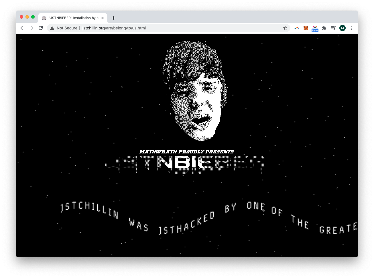
Screenshot of Matt Wrath's allegedly unauthorized hack of justchillin.org, 2011.
Artworks in an online exhibition may also simply unfold outside of the control of exhibition organizers. When exhibiting web-based works, exhibition organizers often make an effort to host all exhibited works on their on servers. However, simply linking to artwork that remains under the stewardship of the artist is often preferable, as web-based works often have a dynamic life and may undergo changes over the course of an exhibition. Lialina has argued that for online exhibition “All You Need is Link.” An external link offers a simple and clear structure that allows artists to remain as stewards of their own works, and makes this transparent, while accommodating the dynamic lives of online artworks. The externally linked work can unfold on its own site and at its own pace, an especially valuable strategy while online artworks live—while the eBay auction remains active, or the Instagram performance continues to be updated.
Linking to a live web-based work as part of an institutional exhibition is an act of trust in the artist as steward of their own work. However, it’s often best to acknowledge and honor that trust rather than trying to conceal or avoid it—not least because, over the long term, artists have often been the best caretakers of their own online work.
The dead or hijacked link can also be thought of as conveying a certain kind of meaning. Describing the many dead links in his netart latino database, Brian MacKern told the New York Times that “It has a romantic thing, no? These are like footprints of something that happened, like a kind of fossil.” Similarly, Cze Zara Blomfield’s “room” at The Composing Rooms embraced the entropy of the web. Blomfield described it as “a clean white HTML page with no design. Only links to online artworks were hosted—like hanging something temporarily, some of these works are now 'moved' or 'lost,' the links broken.”
The circulation of artwork on the network beyond the control of either artist or institution can even be understood as a resource, and privileged within the network structure of an exhibition. Vuk Cosic, Andreas Broeckmann, and Alexei Shulgin’s “Refresh,” a “Multi-Nodal Web-Surf-Create-Session for an Unspecified Number of Players,” used this kind of network geography by inviting members of the public to display their own work as part of a webring. They were asked to create a page with the URL <http://[your server]/fresh.htm>, with two links on it, inserting a header that would forward the visitor after ten seconds to another user or to a central hub maintained by Cosic. Thus visitors could sit back and be moved from node to node through a network of creators.
Online exhibitions may also include both onscreen and physical social interaction. Each edition of CyberPowWow would launch with a series of events called Gathering Sites, described by Mikhel Proulx as follows:
Each space supported simultaneous, two-day events—expanded ‘openings’—during which time visitors could eat and drink but, more importantly, were invited to become participants via engagement with cpw. Tech-savvy assistants would guide users through the projects on computer stations, as in the mid-1990s personal ownership of computers was not yet ubiquitous, especially among Indigenous populations. For many participants of the day, this engagement was a distinctly Aboriginal experience. As Tuscarora art historian Jolene Rickard wrote at the time: “somehow when you exit this site you definitely know you were in Indian territory.”
The social process of online exhibition involves some matters of planning and design, and some openness to processes that may be explicitly outside of curatorial control. Understanding and embracing that balance is a key aspect of online exhibition mise-en-scène.
Deep Focus
Decisions about mise-en-scène in online exhibition involve careful consideration of elements, such as the URL, that could easily be overlooked as incidental or merely logistical. At the same time, mise-en-scene should allow a certain openness to the event, an acknowledgment that success for an online exhibition might involve allowing the performance to play out in ways that exceed the curator’s intent.
This is in keeping with the history of the concept of mise-en-scène, which was taken up ardently by film critics in mid-century France, prior to the rise of semiotics and psychoanalytical approaches to cinematic analysis. The concept was championed in particular by André Bazin, who positioned it in contrast with the montage theory championed by Sergei Eisenstein. For Eisenstein, writing in the early years of the Soviet Union, montage—the creation of meaning by suturing one shot to the next—was the fundamental language of cinema. Cinema was a new and revolutionary technology, and montage was what was most new and revolutionary about it.
For Bazin, writing in post–WWII France, montage could only ever be an ellipsis, a kind of fake. In its stead, he favored long takes, with action taking place in a multi-layered layered space from foreground to background. For Bazin, Renoir was perhaps the greatest practitioner of this style. In Rules of the Game, action spills in and out of corridors, while the camera seems to wander like a confused party guest. Its partial view, though, creates an openness to interpretation. In deep-focus, long-take films, “the viewer can, so to speak, do the editing in his or her own head. In short, deep-focus cinematography invites an awareness of both personal freedom and ethical responsibility.”
Similarly, if we take mise-en-scène rather than montage as the basis for a language of online exhibitions, we de-center the curator’s synthesis of meaning, and emphasize the exhibition as a process in which the visitor may take an active role—an open-ended process, involving the dynamic interplay of many elements that are outside of the curator’s control. This open-endedness is often perceived as a threat, but it is a unique quality of the online exhibition. Creating the mise-en-scène for an online exhibition is a way of considering, embracing, and facilitating the open-ended processes that it will set in motion. For a successful online exhibition, like a Renoir film, speaks to a world that spills out beyond the edges of the frame.
Support
This article is published as part of “From Black Boxes to Open Systems,” a knowledge-sharing initiative made possible by the John S. and James L. Knight Foundation and by a grant from the National Endowment for the Humanities.
Any views, findings, conclusions, or recommendations expressed in this event do not necessarily represent those of the National Endowment for the Humanities.


