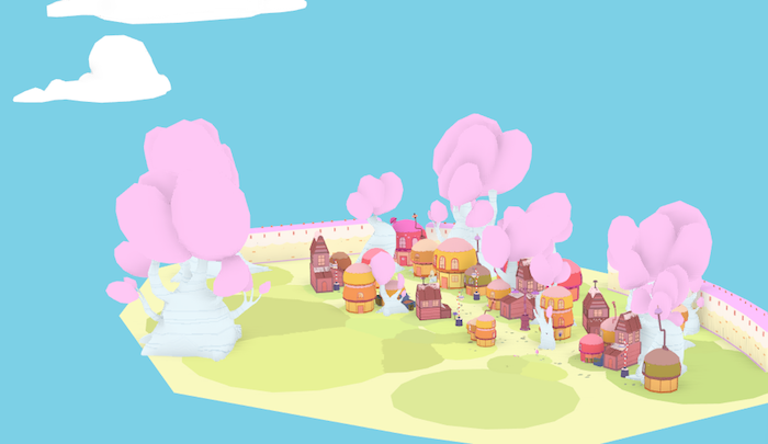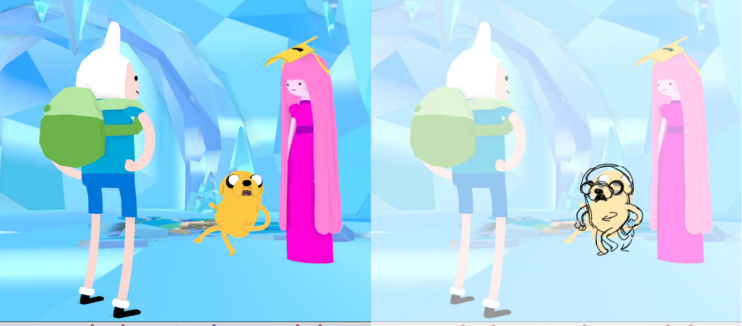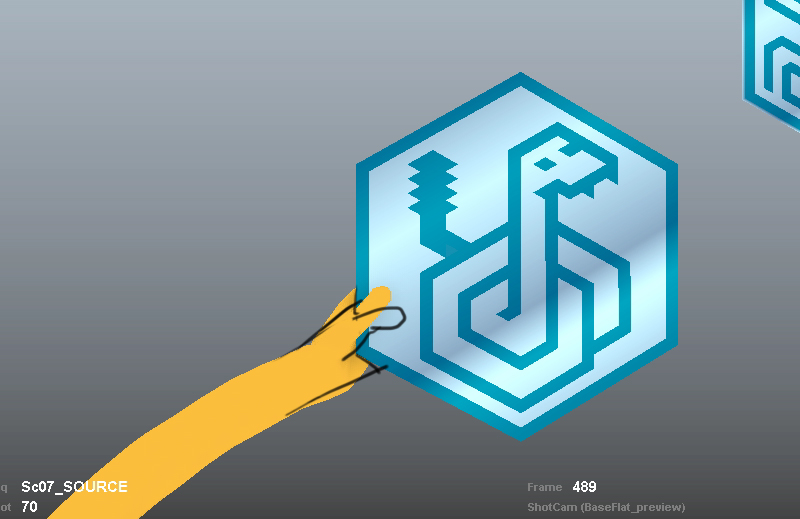
Screenshot of work in progress, David OReilly, "A Glitch is a Glitch" (2013). Episode of the television series Adventure Time.
David OReilly is a 3D animator’s 3D animator. Embracing a stripped-back aesthetic that foregrounds the very processes of animation, OReilly—whose past short films include award-winning titles "The External World" (2011) and "Please Say Something" (2009)—is recognized as much for his astute grasp of dark, abstract comedy as for his unique approach to visual design. Drawing on glitch aesthetics, underground Japanese Manga and the most parasitic of Internet memes, OReilly forges original compositions from the debris of contemporary culture.
On April 1, Cartoon Network aired an episode of primetime television series Adventure Time that was written and directed by OReilly. Entitled “A Glitch is a Glitch,”[1] the episode tells the story of a villain who creates a computer virus to delete all of the other characters in the show, with the exception of his love interest. The other characters must weed out and destroy this glitch in the system.
“A Glitch is a Glitch” arrived a couple of weeks before a new ‘viral’ trailer for Superman reboot Man of Steel, which also used glitchy datamoshing techniques to deliver its message. It seems significant that as glitch aesthetics take root in the Hollywood mainstream, a young animator, who has creatively embraced glitches for years, would make a television cartoon devoted to weeding them out.

Screenshot of work in progress, David OReilly, "A Glitch is a Glitch" (2013). Episode of the television series Adventure Time.
DR: How did you become involved with Adventure Time?
DO: Pen (the creator of the show) was a fan of my short films and got in touch in early 2010. At the time I was making The External World and wasn't able to jump ship, so it was put on hold. About a year later I had moved to LA and we ran into each other a few times and started talking about it again.
DR: At what stage did the music producer Flying Lotus (Steven Ellison) become involved with the project?
DO: Steve is a friend and knew I was doing this early on. We were originally planning on doing a completely different intro that he would score, so he sent over some tracks during production. In the end we didn’t have time or money to do that intro, so the end credits sequence was born.
DR: Were there any restrictions and/or stipulations on what you could do with the show?
DO: Creatively, Pen really wanted me to do my own thing. The writers on the show are really good, and I would have been happy to animate one of their storyboards—but he really wanted me to do all that stuff myself. I can't think of a precedent for that. It may be the only animated show in history to let a total outsider write and direct an episode. As far as restrictions, there were a few because ultimately it's for children's TV. A few jokes were cut or toned down, which was frustrating at the time, but I'm proud of what made it to air.
In-progress footage from David OReilly, "A Glitch is a Glitch" (2013). Episode of the television series Adventure Time.
DR: A Glitch is a Glitch features a clip from another work of yours where a grey, doll-like woman swallows her own hair. In Adventure Time, the clip arrives through the window on a floppy disc taped to a brick. Jake and Finn watch the clip, which then seems to bring the glitch into being. There’s a couple of references here to the Japanese film, Ring (1998), in which a VHS tape must be watched, copied and passed on in order that the "original" viewer not die. Your doll woman in particular echoes and subverts a memorable motif from the Ring franchise, having the long-haired spectral figure literally eat herself like an ouroboros.
DO: I think that was misinterpreted by the fans. That clip isn't an earlier work—I made it alongside the episode and released it a week before. For that scene I was kind of thinking about those shock sites you see when you're younger. Back in my day it was tubgirl or goatse; they were passed around and became these enigmatic things you had to see. Kids now are way more exposed to that stuff—and probably at a far younger age. A lot of people complained that scene was too extreme for kids' TV, but I think people don't give them credit for what they can tolerate. If they have the Internet they're pretty much exposed to the open mouth of hell at all times.

Process images, David OReilly, "A Glitch is a Glitch" (2013). Episode of the television series Adventure Time.
DR: The shock value of your work is often emphasised by your allegiance to cute—kawaii—figures. Adventure Time feels like a good fit for that contradiction to play out. Do you have any major influences when it comes to addressing this balance? Other than Goatse, of course.
DO: I should say the scene of the girl eating her hair wasn't about shocking the audience, it was about getting Finn & Jake to feel sick. Only a few seconds of it appears in the actual episode.
In general I never think about shock value in any project because it implies there’s no meaning behind the images. Surprise might be a better word; I'm interested in using animation for ideas that it isn't typically used for. Of course, some people were shocked, but that’s mainly because they expected a regular 2D episode—and the story existed outside of the show's canon.
DR: In your essay Basic Animation Aesthetics, you talk about bringing consistency and coherence to the 3D worlds you create. At a few points in the Adventure Time episode, as the glitch tears through the Land of Ooo, things get stripped back to their elements, which in this case appears to be the software interface itself . I wondered whether you could talk about restrictions in relation to 3D animation. How did you force yourself to “think outside the box” with this project?
DO: In general I try to find ideas which justify being in 3D animation. On this project, I wanted to focus on glitch as a narrative device. I had been doing that stuff a fairly long time ago, but my interests shifted to story, so I abandoned it for a while. This was a chance to really use both these interests in one project.
It’s a back and forth between what works for the story and what's interesting visually; you can't structure a narrative around a bunch of interesting visual ideas and vice versa. The world being deleted allowed for a lot of visual corruption of things so that seemed to fit.

Still image from "Treehouse of Horror VI" (1995), segment entitled "Homer3. Episode of The Simpsons.
DR: I was reminded of the 1995 episode of The Simpsons, "Treehouse of Horror VI," which featured a segment titled "Homer3." I couldn’t resist this reference I found on Wikipedia: "One of the key shots in Homer3 was where Homer steps into the 3D world and his design transitions into 3D. Bill Oakley considers the shot the 'money shot' and had a difficult time communicating his idea to the animators." I wondered whether you could think of an equivalent, troublesome "money shot" in your AT episode?
DO: There were a lot of technical hurdles. In general, doing stylistic glitch is easy compared to doing good character animation. Mixing the two gets very tricky though. One of the hardest things was corrupting the scene near the end of the entire broadcast so that the earlier clip is superimposed over Finn & Jake to give them an idea (i.e., using glitch as a kind of thought bubble). It was easy to storyboard that idea, but making it work properly took a lot of grind.
DR: How much of the "stylistic" glitching came directly from "real" glitches? In other words, what processes did you use to introduce random, glitchy elements into the design process? Did you have to cheat to get the "stylistic" results you wanted?
DO: It was all generated from "real" glitches—but since everything is run through compositing software and sort of controlled you could also say it was all fake. The glitches needed to begin locally—inside objects—then spread out until they became part of the scene itself. The local stuff was done by generating a ton of sprites that had random pixels move outwardly to create the colorful flourishes we associate with video compression. These had a decent amount of control—a blob of glitchy stuff could move around a scene, for example. Once the scenes were fully animated and rendered the global full-frame glitches were done. There was some jpeg corruption added on top of the battle scene at the end.

Screenshot from design process, "A Glitch is a Glitch" (2013). Episode of the television series Adventure Time.

Screenshot of work in progress, David OReilly, "A Glitch is a Glitch" (2013). Episode of the television series Adventure Time.
DR: Some of the behind-the-scenes images you sent me are overlaid with interface elements that appear as part of the glitches that engulf Jake and Finn. This made me think again about the hand-drawn corrections made at the design stage (the scribbles repositioning Jake’s thumb, for instance). Your work merges and disguises the layers that exist between design, interface, 3D environment, characters and story. All of them are blurred via post-produced digital effects that seem to mimic the story itself (with characters having to literally swallow themselves in order reboot the glitchy world of Ooo). I wondered if you could say something about all these story arcs, design self-references and post-produced "mistakes"?
DO: In every case with design, it has to be intentional. Even if there are chaotic elements, it still has to be intentional or controlled in some way—otherwise you're just showing off the tools and probably not communicating an idea. Some people might disagree but that's my feeling about it.
There's a kind of back and forth between software and idea that goes on when I work in 3D, because to me it’s weird NOT to acknowledge that everything is fake and animation is basically an optical illusion - but it’s still ultimately a medium to get ideas across. I don't want style or design to be center stage—it’s just something that happens in the translation process from brain to screen.
DR: To my eye some of these effects look painterly, like video codecs corrupted on purpose, or what is commonly referred to as "datamoshing." Could you let us into some of the processes you used to make that painterly aesthetic?
DO: There was a few layers of stuff going on. Some effects were applied as part of the 3D scene and others as a post-process. The painterly aspect of compression comes from the codec trying and use motion data over a static image, so that image is pushed and smudged around leaving these colorful trails and blotches.
I also generated a lot of moiré patterns for the "time tunnel" sequence. I’ve wanted to use moiré effects for a while, they’re another example of the computer generating seemingly organic results from limited input. They're also really damn pretty.
DR: You’ve talked in the past about viewers becoming used to 3D aesthetics over time, meaning that a technical approach "that once would stun an audience with its realism now barely has any effect." [2] I wonder whether you think glitch can become more than just another addition to the "rapidly expanding aesthetic library"? [3]
DO: Glitch in its current incarnation will date like everything else. It’s a motif associated with jpeg and DivX compression, and we won’t be using those formats forever. In the 80s & 90s, there were a lot of analog errors being explored, and the errors in the 2020s will probably look a lot different.

Screenshot of work in progress, David OReilly, "A Glitch is a Glitch" (2013). Episode of the television series Adventure Time.
DR: A lot of your distinctive visual style stems from the way you strip back the clutter of 3D design. Was there ever a chance you might have stuck with the 2D look of Adventure Time?
DO: I don't think so. As much as I loved getting to know those characters and trying to write for them, I also really love 3D. I still feel it's at its earliest stage and I get excited about doing ideas that only work in that medium.
DR: I'd like to move on to the question of how your work circulates on the Internet and feeds into a culture of artistic re-use. You recently released all 65 character rigs from your project The External World, allowing anyone to modify and re-use them in their own (non-commercial) projects. Have there been any surprising results from doing this?
DO: It's still early days with those, I haven't seen more than a few tests done with them. One animator has decided to use them for 51 animation exercises. I’d like to see them do interactive stuff, but that may take a while.
DR: A few months ago you collated some of your creative influences for a Russian design magazine. Who inspires you at the moment?
DO: The Adventure Time storyboard writers are awesome (literally all of them). In 3D I like the work of Andrew Benson and Robert Seidel. In comics I can’t get enough of Chris Ware and Jason. About 100 other people. I can't list them all off because I'd think of another 100.
David OReilly, "Mindsploitation Timelapse" (2013). Single-channel video with sound.
DR: You recently shared a video showing the design process behind your cover for Mindsploitation, a book by Vernon Chatman. What are you working on next?
DO: I had been working on that book for about a year. As with every project, I never talk about it. As much as possible I try to maintain the lowest expectations from people.
DR: And finally, do you have any advice for young, aspiring visual designers? The next generation of glitchers and creators!
DO: It's hard to not use clichés for questions about advice. Most people say the same thing over and over, which 99% of the time is a way to dodge it. Here is some random crap I would tell my 15 year old self: get off social networks, finish every project even if you think it's bad, be happy to have free time and use the hell out of it, do more drugs, keep a diary.
This conversation between Daniel Rourke and David OReilly took place between April 10 and 24, 2013, on Google Drive.
References:
[1] The Glitch is a Glitch is not available on YouTube or Vimeo – here instead is an unofficial, unendorsed link to the episode from the darkest recesses of the web

