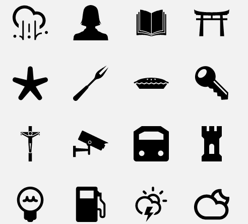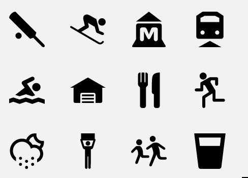
The Noun Project is a seemingly infinite collection of black-and-white symbols put into the public domain. As the founders put it, it is an attempt to organize the world’s visual language into one online database. Edward Boatman, one of the project’s founders, is also its sole gatekeeper. Each symbol on the database was either collected off the Internet or created by designers around the world. Boatman approves every submission to the project and assigns each icon a word — a noun, of course, either an object or a concept. The images are often surprisingly evocative, despite their simplicity, and unlock a potential for wordless communication for anyone with an Internet connection.
Boatman was working in architecture design when he noticed it was surprisingly difficult to find basic, high-quality symbols on the web, even for common transportation symbols used by the government. The Noun Project was launched shortly thereafter in December 2010. Now the scope of the Noun Project is limitless. As Boatman told me, the project could create a symbol for, potentially, every noun in the world. Boatman (and co-founders Sofya Polyakov and Scott Thomas) are looking ahead to making the project a sustainable business.
I talked to Boatman about the purpose behind the project, design for social good, and some of the challenges in creating a visual database that’s always growing.
SS: The Noun Project has thousands of icons. What are you looking for in a good image?
EB: Simplicity is key. One thing I always try to articulate for best design practices in a symbol is this idea of only analyzing the essential facts of the object or idea. It’s really fun. First you have to analyze it, and then once you analyze it, you have to identify the attributes or the elements of that object that you want to represent. Then you execute that into a design that’s elegant and has great proportions. One of the more important things in the design is that it can scale up or scale down and still read well. You don’t want to put too much detail in there, because a lot of these symbols are seen at pretty small scales.
SS: Okay, how would you design an icon for the noun “bacon”? What about for the word “envy”?
EB: Bacon has a distinct shape and pattern that would translate well into an icon. Conversely, an icon for envy would have to be more abstract because there is not a physical object associated with this concept.
SS: I’ve noticed that not only are they all black-and-white, but they also all share a particular aesthetic. Why?
EB: By stripping away all color, texture, and embellishment from the design, all that’s left is the bare essence of the object or idea, and this creates a more effective communication tool.
SS:Does each noun have only one symbol?
EB: No. If you search “bicycle,” you’ll probably get around 20 different bicycles. (It’s actually the noun with the most symbols in the entire database.) That is something that I find to be really interesting — the larger the database gets, it’s going to be really fascinating to see how these symbols change with culture and geography.

SS: What are some symbols that surprised you, or made you think about a noun differently?
EB:If you search “community” on the site, usually the community symbols you’re seeing most often are just like three people grouped together, that’s how you represent community. And you see these a lot online, or on mobile devices. But we got a symbol — someone submitted it from Ethiopia or had spent some time in Ethiopia — and their symbol for community was three huts together, which was really fascinating.
Someone submitted a symbol for “penis” — which we knew was going to come up. We had a internal pool for “When is the first penis going to be submitted?” And you know, it was well-designed, it was simple, it was iconic — you could tell the guy put a lot of effort into it. And I wrote him — “Hey man, it’s a great design, it definitely communicates ‘penis,’ but there are a lot of kids and teachers using our site, so I don’t think it’d be an appropriate addition to the collection, I’m sorry about that.” It was an interesting debate for us, the pros and cons of this decision.
SS: Where do you see your symbols in use?
EB: BMW just did a national ad campaign with symbols from our site. We were watching TV one night and we were like, “Wow, our symbols are on a national ad campaign! That’s pretty sweet.” Another really interesting application of it: We serendipitously released our “protest” symbol into the public domain a few weeks before Occupy Wall Street started to gain momentum. And now you can see the symbol on posters all over the world.
SS: That’s appropriate, as it seems the Noun Project is committed to designing for the social good.
EB: Absolutely. That’s something that is important to all three of us. Since symbols are a form of communication we all can understand — and a form of communication that can be really easily shared over multiple communication platforms — we shouldn’t only be designing symbols for common everyday concepts. We should also be designing symbols for ideas and concepts that we want to see more of in the world. We made a big push to design symbols for sustainable energy. Or designing symbols that graphically represent the negative effects of bullying — we did that for the Boston public school system.
SS: How did that happen?
EB: These were developed through our Iconathons. They’re a series of design workshops, and their goal is essentially to create civic-minded symbols for the public domain. What we do is run a group design workshop, where we invite designers, subject matter experts, and citizens who really care about their environment and their community. So we invite citizens into this process who have no design experience.
What’s great is that non-designers can really add value to this process. We keep the execution level just to pencil and paper. Keeping it to a pen and paper, it’s all about ideas. We design these symbols in a group, and we talk about which symbols best communicate certain concepts. Then after the event, I work with a series of graphic designers to take those sketches and turn them into vectors. With this process we’ve produced about 55 symbols to date.
Last year we held them Los Angeles, San Francisco, New York, Chicago, and Boston, and each Iconathon had a different theme. The Los Angeles one was food policy. The L.A. county food policy heads came to the Iconathon, and they really helped inform the process by telling us: This how the symbols could be used. This is why they’re powerful tools. This is how they help solve problems. They really helped inform the process.
SS: How do non-designers contribute to the process?
EB: Laymen add a ton of value. As designers, we’re trained to think about proportion, scale, line weight, the visual aspect of things. And sometimes we designers kind of get trapped by that, and are not necessarily thinking about user comprehension. Non-designers really emphasize comprehension, and what the symbols really mean.
We designed the site to be a resource for designers. But as soon as we launched, we were getting emails from educators who were using our site to help their children learn how to read in their classroom. We were hearing from researchers that work with kids that have autism, and are using these symbols as communication tools to connect with them, because those kids learn better through visual communication. And that’s when we really started thinking: We built this tool for designers, but the potential use for this goes way beyond just designers. That’s something we’re really focused on right now, making our site more user-friendly for users who are not designers.
SS: What’s next for The Noun Project?
EB: Our next step is developing this into more of a platform, where designers can have their own profile page, so they can share and promote the symbols they’ve designed. We really want a tool for designers to promote their talent. And then we’re going to make a large push into rapidly growing the collection. We want to make sure the collection is growing with symbols from China and from India just as much as symbols from the U.S.
We are not a nonprofit. We envision ourselves being a sustainable, profitable, growing business. But there is a component of our site that always will remain free. We are going to build in revenue models. There always will be a free component, but we’re working on building a premium version.
SS: Why do designers submit to the Noun Project?
EM: You know, that’s a good question. There isn’t really a good incentive right now for a designer to submit. And that is obviously something we’re trying to change. The profile pages will be an incentive. But right now there’s none. I think the project taps into a lot of people’s fascination with symbols. And it also taps into something broader — a bent towards design for altruism that I think a lot of people have.

