A desktop is a changing record of visual decisions. It speaks to the aesthetics of a particular work-flow and personal space. A desktop exhibits a diagram of your organizational habits and a screenshot of it captures a brief moment of its functional evolution. The image of your desktop becomes an intimate self-portrait and the impulse to decode an unfamiliar desktop is unavoidable.
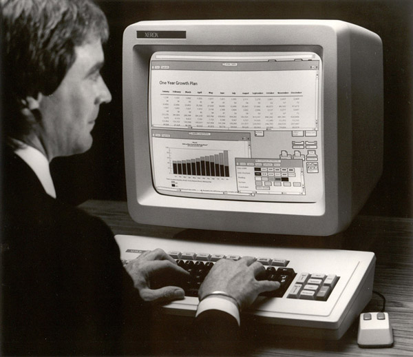
Xerox Star 8010 Workstation - Image via plyojump.com
In January, Adam Cruces wrapped up his Desktop Views project. Cruces collected 51 images of artists’ desktops including a number of artists he worked with in his earlier project STATE.
Cruces frames Desktop Views with a quote from Alexei Shulgin’s legendary Desktop Is project, created 15 years earlier in 1997, at the dawn of “net.art.” The quote, taken from the about page of Shulgin’s project, uses the title Desktop Is as an iterative I Ching-style manifesto about the desktop. Its final lines claim in paradox, “desktop is a question, desktop is the answer.” Cruces’s description of Desktop Views is more straightforward and less poetic. To him the desktop is “the (virtual) space that serves as the foundation of the working environment.” Cruces and Shulgin, however, channel the same curiosity. The two projects are echoes that present voyeuristic peeks into artists’ personal virtual working spaces on public websites.
The Desktop Is site is a deteriorated time capsule. Its nostalgic Apple OS desktop interface links to two folders; one, leads to site information, and the second, to a list of submitted desktop images. Link rot has broken nearly half of the links in Shulgin’s list of submissions and the ones that work are a mix of cryptic handles, like Murph the surf, in contrast to full names - some followed by an email address.
In converse, Cruces’s new iteration, Desktop Views is standardized. It presents a grid of images (a sort of meta desktop) that can be sorted alphabetically by first name or chronologically in the order they were collected and released on the site. Artists’ full names label each desktop thumbnail in the grid. Cruces hosts all the images he has collected, so perhaps this archive of desktop images will remain intact for more complete future reflections. Within the order, the desktop images range from stark defaults to extreme clutter.
Sara Ludy’s desktop, for example, is minimal with a blurred blue smudge of pixels centered on a black background. On the right side, vased.mov is immediately above vased.gif which might reveal a recently created animated gif. Daniel Keller’s desktop image presents a more complex space. His numerous file icons stand in an equally spaced array – small and unreadable. They vanish into an endless crowded background of solar panels stacked edge-to-edge.
Martin Murphy’s desktop, for example, has a strange background image: a hand wrapped in latex touches a warped smiling face in a pool of purple color. The face stares out of the screen. Icons, floating on the right, are grid-free and vaguely organized. Three external drive mounts show a potential need for more space while a folder announces a “project with Evan” in its name. Perhaps this counts as evidence of collaboration. Amidst bluetooth connections, a dropbox account, and a desirable suite of creative software applications in the dock below, Murphy is present. He listens to Spotify and captured his desktop image with OS X’s Grab application.
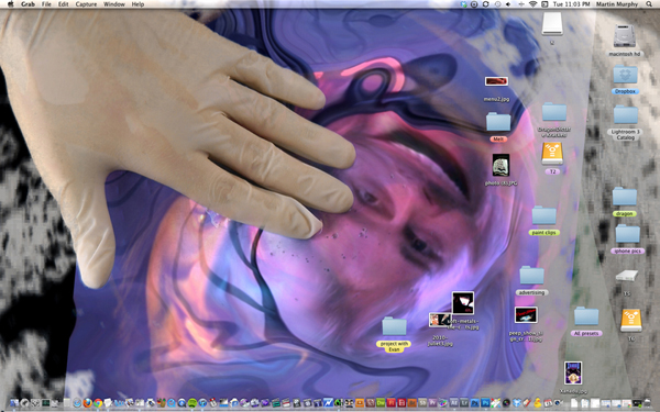
Martin Murphy's desktop from Adam Cruces's Desktop Views
Some visual clues reveal location or language, like Jon Rafman’s Canadian flag in his menu bar. His background image shows two men climbing a floating knot of infinite stairs up and down, down and up. A handgun icon labelled “TODO” floats point-blank at one man’s head. Other desktops are more mysterious. Rafael Rozendal’s blank grey background leaves everything to the imagination – his tiny system activity monitor, maxed out in red and green, is the only leading detail.
While Cruces’s project feels curatorial, Shulgin’s is more ethnographic. When Shulgin started Desktop Is in October of 1997 he sent an email out to a mailing list and proposed to accept submissions for six months. It is impossible to determine if everyone who submitted was an artist, but Shulgin had started the “net.art” mailing list approximately two-months before which might help classify the list of linked names.
Seen as a broader survey the desktop images of Desktop Is accomplish two things: They historicize the nostalgic aesthetics of 90s desktops and help frame newer artists working with technology in a longer view. With each iterative software and hardware update, however, we wash bits of that history away.
So what can we learn by reconsidering desktop aesthetics 15 years later? The default structure and icons of operating systems are more or less the same. They have not changed substantially since Xerox designed Star, a pioneer in graphic user interfaces in 1981, which was refined slightly by Apple in 1983. The biggest difference is in the color space. The pixelated palette moved from binary black and white, to the 16 colors of early versions of Windows, graduating finally to modern operating systems which are anti-aliased and millions of colors deep. Clunky and outdated window, button, and menu graphics have all been refined – smoothed, over a long period of time, like river stones.
Promotional video for the Xerox Star 8010 Workstation, 1981 - Video via digibarn.com
Icons offer the most concrete evidence of what has survived and what is new. The core icon set of operating systems still clings to skeumorphs that help us relate abstracted digital data forms to their ancestors. The physical file folder, for example, was introduced at the invention of the filing cabinet in 1898 and remains the inspiration for the default folder icon. Even on the earliest desktop, a document was represented by a single sheet of paper with the top right corner folded at a comical 45 degree angle. Thirty years later that folded corner has a subtle shadow, gradient, and tradition.
Photoshop’s icon has survived the decade or more of upgrades too. Its transformation spans from its original monochrome, pixel-edged eye-in-window to the new, dark, sans serif “PS” pressed softly with a shadow into an extruded blue gradient block.
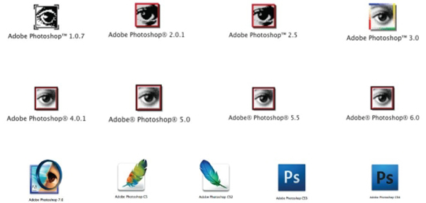
Image via www.officialphotoshop.com
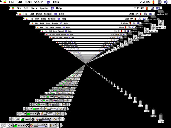
Older desktop images in Shulgin’s Desktop Is collection feel arcane and nostalgic – pixelated microfilm. At the time, it was the eve of the dot-com bubble, and Windows and Netscape Navigator were commonplace. Screenshots in Desktop Is have grit in both content and color depth. Some, like Rachel Baker’s, contain coded political phrases in the folder names while other desktops mock the virtual space’s infinite potential. Fast-forward 15 years — Windows is no longer a common OS for artists, and Netscape Navigator is extinct. Artists use OS X and Google Chrome. The new desktop images from artists are hi-res, smooth, or ironically pixelated.
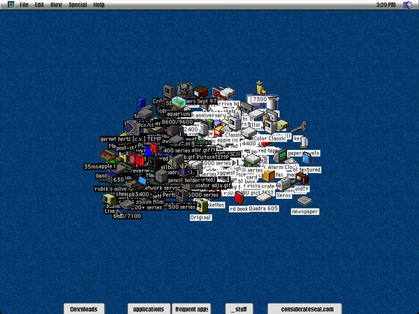
Desktop images via Desktop Is
But the curiosity of private desktop space shown publicly withstands software and hardware upgrades. Interpretations of layout, background image, icon size, and other details that describe a human presence - or lack of one - hold weight. The question is not about aesthetics, but about how artists create and use their desktop space.
To answer this, The Guardian started a series profiling writers and their desktops. It takes a dual approach: a desktop image with a parallel explanation. The series begins with Ben Johncock interviewing Tom McCarthy about his submitted desktop image, which captures a few open folders in addition to the typical background image and icon grid. The open folders reveal deeper personal information as McCarthy takes us through a few of the folder names that relate to projects he is working on. This is all mixed in with conversation about technology’s affect on his writing and on humanity at large. The desktop becomes a room for conversation about work and leisure, and a platform for reflection and speculation on technology.
When I asked Cruces over email to describe his own desktop image on the about page of Desktop Views he replied, “I think it's quite reflective of how I utilize my physical spaces (apartment and studio). I prefer to keep things tidy and organized - concealing personal items, tools, materials, works in progress, and final products.”
Desktops are the new studio. In the 1930s people were captivated by photographs of Francis Bacon’s London studio – a dark cluttered mess of half-used paint tubes, gnarled brushes, and stained walls. Now we can look at these desktop images with the same memorializing curiosity – all the while trying to decode who created them.


Even more artist desktops - a series form 1998, reposted on http://trendbeheer.com/2012/03/15/desktop-views-2012-1998/
Great news! Name-brand net artists still use Macs to get their work done. Cheers to Rafael Rozendaal for keeping a clean workspace. Jeers to Brad Troemel for his background – it looks like he is cutting up powder drugs on a "For Dummies" book.
Honestly! Krist Wood is the only desktop with any mystery to it – what OS is that anyway? Only Laura Brothers and Katja Novitskova use something like windows anymore.
Alas, Cruces rejected submissions from the public, preferring to canonize netart celebrities similar to Domenico Quaranta's facile "Collect the WWWorld" exhibition. This is just another password-protected circlejerk, and the password is "MFA".