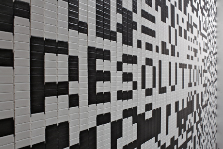
A large installation in the Grand Entrance of London’s Victoria and Albert Museum clatters away, registering its presence in this historic hallway. Jointly commissioned (by the V & A and SAP), bit.code (2009), by Julius Popp, consists of a large panel of black and white blocks which appear to represent a curious, indecipherable code as they rotate around their frame. Periodically its units align, clearly depicting popular terms streamed live from news site feeds. In this physical form and location, this is real-time made somehow more timely. Looming over visitors, a literal staging of data being decoded, the work asserts itself as an apt entry portal to "Decode", the V & A's inaugural exhibition of contemporary digital and interactive design.
This institution has long been dedicated to collecting and presenting the myriad manifestations of design, from architecture to textiles. It therefore seems right and fitting that some of the products of recent digital design be displayed here too. A lovely detail of this continuity between objects d’art past, present and future is demonstrated by the cover of the exhibition catalog. Its decorative ‘wallpaperyness’ seems to reference the Arts and Crafts movement while looking not dissimilar to 1960s Op art, and yet there’s no escaping the fact it features a highly stylized plug motif. This serves to reinforce the digital as the mode du jour, as well as making it clear this is somewhere it should feel rightfully at home. And such eager hospitality allows the show to occupy not just the Porter Gallery, but other parts of the V & A and South Kensington locale.
The exhibition has been arranged under three closely intertwined themes: Code, Interactivity and Network. Though they serve as reminders of the characteristics of the work, there is too much over-lap between these terms for works to actually be ordered according to such categories. In more literal terms, therefore, you first encounter small, mainly screen-based, code-driven works before arriving in a playground of large-scale interactive installations, with the pieces categorized as ‘networks’ sitting in between. However, given that a great number of works within the selection (made by the V & A and partner curators onedotzero) reference mirrors, a clearer - though unofficial - theme might be that of ‘reflection’.
For example, Venetian Mirror (2009), by Fabrica, is a large, modern-looking Venetian-style mirror which spookily delays the moment of reflection. Stand still in front of it and wait for your image to gradually emerge like a Polaroid picture; keep mobile and witness a ghostly amalgamation of your different movements, moments after they were made. It is indeed strange to encounter something that is, ostensibly, a malfunctioning mirror, but the fascination it holds is remarkably brief.
Another attempt at a lyrical looking glass is Weave Mirror (2007) by Daniel Rozin. Again, it approximates your image as you fall in line with its gaze, but this time by rotating the warp and weft-like facets of its surface into the different shades of your own form. This physical interpretation of your image is much more compelling than Venetian Mirror and the work has great potential, for example, as a collaborative partner in a dance performance - the tapping sound of its mechanics adding to the rhythm.

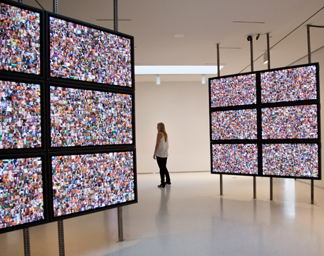
Still other mirror-related works are Jason Bruges’ Mirror Mirror (2009), Ross Phillips’ Videogrid (2009) and rAndom International and Chris O'Shea’s Audience (2008-2009). By far the most exciting piece interested in making your presence felt, however, is Rafael Lozano-Hemmer's Make-out (2009). On several large screens Lozano-Hemmer presents a grid of hundreds of videos of kissing couples: girl/girl, girl/guy and guy/guy. Without you near, the couples wait, preparing to kiss - with the odd flicker of movement discernible as one or two of them give in to temptation. Responding to your proximity however, the screen is set a-quiver with a ripple of desire as each pixel-like frame broadcasts a kiss. Walk the length of the work and it becomes a wave of human-to-human connection.
Though it pulls you to it in order that you might voyeuristically evaluate each individual embrace, the fact your closeness triggers this passionate mass motion gives it a degree of physical immersion too. Drawing parallels with the manner in which social networking sites seduce you by appearing to offer a more intense connectivity than real-world interaction, this work plays with the limits of being kissed - or otherwise contacted - from beyond a screen. Unlike the fore-mentioned reflective works which do little more than bounce back at you a version of yourself, Make-out reflects and comments upon contemporary perceptions of networked connectivity.

Among the array of other ways to be visually present in this exhibition are the internet-based parts of the show. Digital agency Saint and artist Karsten Schmidt have created an open-source animated logo for the exhibition. The original has been used in much of the online advertising for the exhibition, but by offering the code, the V & A are inviting people to rework it into new versions which can be uploaded to an online gallery and selected for use in further advertising by the museum’s marketing department. And likewise a Twitter hash tag (#decode09) lets you track people’s reactions to the show, and is streamed live on the "Decode" microsite.
In all its appropriateness as an ornate door to a realm of digital design bit.code unfortunately sets the tone for the exhibition in a number of negative ways too. For one thing, it is deliberately clunky, alongside some works which are so clunky they aren’t even active: lamentably, several works including Golan Levin's Opto-Isolator II (2007) were inoperable when I visited. For another, it serves as a reminder of the ways in which this show fails to decode this field of artistry. Much digital practice conceals the work that has gone into it and here, as stated, the works are most memorably about you. While interactive installations serve well to engage the audience in a level of role-play that (certainly in the case of Make-out) reflects digital culture more widely, here they are somehow also quite evasive - giving perhaps more the effect of smoke and mirrors. Little of the craft of coding is actually on show in terms of the tools and techniques employed and so code-based works remain here shrouded in mystery for all but a niche, informed audience. The exhibition is supported by a rich range of events (including the recent two-day conference "Decoding the Digital" and a weekend-long Digital Design Festival on 26th/27th February) which expand upon issues pertinent to the recognition of digital art practice - its cultural decoding - yet the show itself is far less rigorous in its reveal.
Charlotte Frost is an arts writer and academic with a New Media/Digital arts focus. In February 2010 her book chapter ‘Internet Art History 2.0’ was published in Revisualising Visual Culture, edited by Chris Bailey and Hazel Gardiner (Ashgate Press); she’ll be giving a paper at the Association of Art Historian’s Annual Conference (Glasgow) in April, in the ‘Digital Continuities’ session; and she recently contributed to a video for the Guardian on artist Jill Magid’s Tate Modern show ‘Authority to remove’.


An interesting point about reflection being a dominant connecting theme of much of the work in this exhibition. This is very true but the point should be made that much of new media art (certain anything which is interactive) is reflective of the user, not necessarily in a literal way as it is in Decode but it 'reflects' a users desire, intent and action.
I think it's a fair assumption that the curators of this show would have felt comfortable with the literal interpretation of reflection i.e. its use of (probably) video to achieve that or a close to figurative representation of the user as in the case of Daniel Rozins work. Why the curators have failed to identify this sub current in their choice of works for the exhibition within a curatorial statement and elaborated that into a discussion of possibly how new media art itself 'reflects' our cultures expectation of instant response / gratification from media seems quite an oversight.
As a curatorial whole there seems to have been much oversight in this exhibition. It's safe to say that both you and I would fall into the perhaps not so "niche" but certainly "informed audience" of this type of exhibition but all of the structure around the exhibition, the workshops (a particular segment of which is tailored to teenagers) the promoted accommodation of school and college trips (free entrance offered as an incentive), makes it clear that this is targeted at the uninitiated and particularly a young audience. Your completely correct in that the curators have not decoded for that audience what new media art is. The information next to the exhibits and in the catalog simply reads as a technology listing exercise with some background on the artist / designer / company. Insight into the process of the work, it's overall aims, what the artist is dealing with as a particular subject matter is almost completely missing.
Reading the catalog after the show, I got more satisfaction from reading Golan Levins interview where he retro-justifies the premise of the exhibition as accessible to all and puts that into context with some notable English exhibitions such as Cybernetic Serendipity than I did from any of the curator statements under the titled segments of the exhibition. We could be overly pessimistic and say, as the English are forever fond of saying about much of their culture / education / politics etc. that the exhibition is dumbing down but accessibility of content doesn't necessitate dumbing down.
I agree with Garrett and Charlotte that the show omits a great deal of perspective , particularly in understandings of history, cultural context and process, but is aimed a new audience for the work, and is actually tagged as design-led , rather than art-led. It is however significant that such a major art museum took on the job of popularizing a rather esoteric niche in the art universe. The crucial question now is whether this opening out of the established cultural hierarchies can be built on by the digital arts community or whether it is simply a one-off novelty show. To be fair, the curators readdressed some of the lost contextual opportunities through the excellent DECODE conference which spoke more directly to an informed audience. This is definitely a more crucial cultural sea change than the elevation of the visibility of net art a few years ago by museums like the Whitney.
I held of on reading this until I (finally…) finished my own review of Decode.
Some of the works were out of order when I visited as well. ;-)
I think the lack of context might be because the show presents the work as "design" rather than art (for whatever reason). It's about the aesthetics and the technique, not the content or the subject. I was glad to see such a major presentation of digital art. But I was disappointed that it wasn't really framed as art.