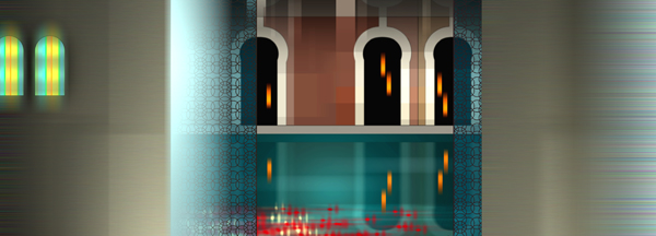
Jeremy Blake, Liquid Villa, 1999 Digital C-print 29 x 84 inches Edition of 3 + 1AP
Rhizome Editor and Curator Michael Connor, in his prior capacity as an independent curator, co-organized Liquid Crystal Palace, opening on March 1. Because of its relevance to the Rhizome community, we felt it was worth publishing Michael's writing about the show. Rhizome.org will also present Blake's Liquid Villa as a front page exhibition on March 6 from 3pm to 5pm EST, courtesy Kinz Fine Art and Honor Fraser Gallery.
Jeremy Blake's work seemed to be everywhere in the early 2000s. At the time, I was aware that he was successful in a commercial context, and that he didn't really see himself as a new media artist. (Blake always described himself as a painter.) Both of these things annoyed me about him, because I liked new media art, and I took some perverse pride in its lack of market recognition. It was therefore somewhat annoying that I liked the work. It seemed unsettling and druggy and dangerous, and it felt funny and good in my brain.
Since Blake's tragic death, I've rarely seen the work anywhere, and it sometimes pops into my head. So last year, I decided to look at it again, or as much as I could get my hands on. I was living near LA, and I brought my 2-month old daughter to the highly accommodating Honor Fraser Gallery to go through a stack of DVDs. This time around, Blake suddenly seemed closely connected with a number of other artists working today. The connections that emerged in this new viewing began a thought process that culminated in the exhibition Liquid Crystal Villa, opening tomorrow at Honor Fraser and co-curated with Nate Hitchcock.
The exhibition incorporates Blake's Liquid Villa (2000). Although Winchester remains my favorite of Blake's works, it was almost too successful in its own time. Now, I find it kind of hard to see it with fresh eyes. Somehow it seems more productive to return to the earlier work, which had a more serial, unassuming quality, and which nevertheless embodied many of Blake's concerns.
Shortly after it was completed, Blake wrote this description of that work:
Liquid Villa depicts dreamlike states using a combination of architectural and abstract imagery. I refer to this work as "time-based painting," and employ a painterly sensibility and process to create images that transform over time.
Liquid Villa begins with a series of patterns in deep, aquatic tones overlaid with an intermittent glowing vertical stripe or ray. This imagery eventually disintegrates to a view across a pool of water in an imaginary villa. This structure is in turn subsumed by a pale fog. When the fog dissipates, the scene has been reconfigured back into an abstraction. The fog, the abstract imagery, and the architecture are protean, slowly mutating into one another or recombining to create a sense of instability and unease.
As Blake describes, Liquid Villa shifts between lucid, crisp dream architecture and colorful, blurring abstraction, unsettling the viewer between pictorial depth and flatness. These shifts take place from moment to moment, but also within particular scenes. For example, the dark alcoves in his dreamlike villa feature glowing orange torches with jagged edges, suggesting (on a pictorial level) the amorphousness of flame, but (on a material level) the low-resolution artefacts of a too-large digital image. Such passages function in a way that is analogous to facture in painting: as traces that point back to the process by which the work was created. Thus, Blake's "painterly sensibility" incongruously leads him to call attention to his use of digital tools.
Travess Smalley, Primordial Trance Puddle, 2011, HD looped video from GLORIAMARIA gallery on Vimeo.
Abstraction and architecture, pixellated and painterly; Blake's work sets in motion a series of seemingly irreconcileable incongruities. Liquid Villa is amorphous and organic, it is also geometrically precise. It is composed of computer code generated with a suite of prosumer digital tools—off-the-shelf high-price software like Photoshop that media artists of the time were supposed to either hack or use self-referentially, not just use—but it is also psychically charged, haunted.

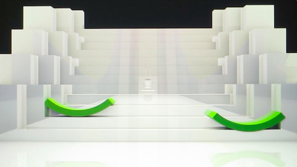
Sara Ludy, Dream House (2014). Still frame from digital video.
The other artists in this exhibition, all younger than Blake, inhabit similarly incongruous positions, although they often are not presented as incongruities at all. For her new work Dream House, Sara Ludy translates the architecture seen in a recurring dream into a rendered 3D model. With sterile surfaces and mathematically perfect lines and shading, the model somehow conjures a sense of a genius loci, an oneiric intensity akin to Blake's own work. Ludy has a strong personal interest in the paranormal, and has said that working with digital tools is the most intuitive way to explore these subjective experiences and qualities of space.
..jpg)
Jon Rafman and Chris Coy, Unexpressed Resentment: A Possible Beginning (2014).
Chris Coy, who conducted an email exchange with Jeremy Blake as an undergraduate in 2006, makes work that draws on cultural sources including uninhabited architectural spaces from the children's cartoon The Real Ghostbusters and the color-coded emotional tone scale used in Scientology. For his videos and prints, Coy crops and re-works his raw materials to the point of near-abstraction, creating compositions that evoke a sense of dread despite their use of bright colors and high image fidelity. Jeff Baij also makes work that is rooted in appropriation, drawing on and manipulating images from a wide range of sources to make new still or moving image works almost daily. However, in contrast with the high-fidelity, slick imagery found in Coy's work, Baij's serial production revolves around simple digital effects and an aesthetic rooted in degradation. In his work The Mind's Eye and the Sequel to the Mind's Eye (2013), he applies these tools to highly produced sci-fi video clips featuring bodies and technology in motion.

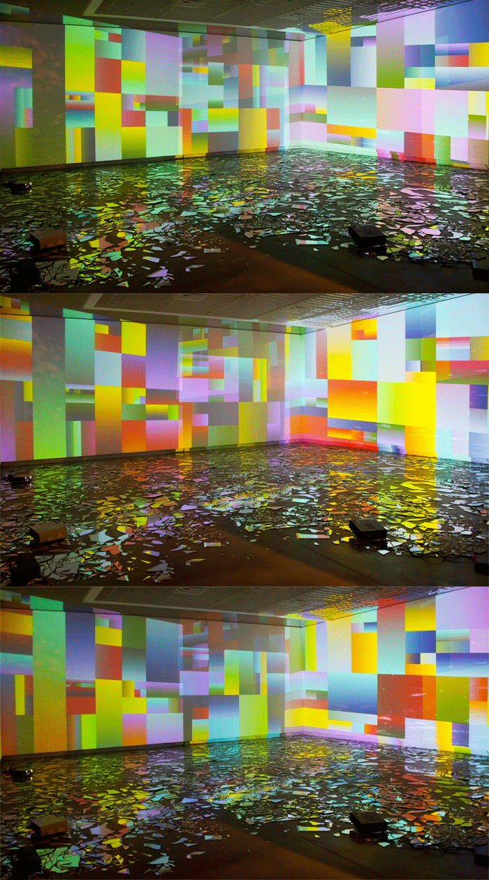
Into Time, installation by Rafaël Rozendaal. Mirrors, computers, projectors. Museu Imagem e Sol, Sao Paulo, 2012
In Rafaël Rozendaal's work, abstraction takes on a different valence than it does in Blake's:
I have an affinity for "abstraction in service of reproduction." What I mean is that in order to make images that are easily copied/transmitted, artists have invented different ways of simplifying. Think of Egyptian reliefs, Japanese woodblock prints, early Mickey Mouse, early video games. In all these cases the medium forced artists to simplify.
Thus, the abstractions in Rozendaal's work could be said to refer to a distinct tradition from that of painting, one rooted in the very technologies of image reproduction that have provoked repeated existential crises in the painting field over the years. While citing a disparate history, Rozendaal's work has certain traits in common with Blake's: in particular a use of both geometric abstraction and more organic fields of color and a push and pull between illusionistic depth and digital flatness.
In Petra Cortright's works, the seemingly conflicting traditions of painting and digital art are confidently and simultaneously put in play. Cortright exhibits two prints in the exhibition: fuzzy love clams is a gestural abstraction created digitally and output to an aluminum substrate, a material that references the hard, reflective flatness of the screen, while mp3 +skins +download +winap +patra is a print on silk made from still frames from a consumer-grade webcam, layered and blended in Photoshop. In these works, the seemingly opposed categories of digital art and painting come across as opposite sides of the same coin.
In 2004, Jeremy Blake told John Baldessari about an early source of inspiration for his move to screen-based media.
In Truffaut's Fahrenheit 451, you see Julie Christie in her apartment at the mercy of a, well, basically a flat screen, with kaleidoscopic, hypnotic projections being piped in from an all-powerful regime that has burned books and provided instead a kind of insidious abstract entertainment. When I was a student I saw that and thought, What a great comment on abstraction. What a weird, uncanny, dystopic potential for abstraction. I wanted to make paintings like that.
In Truffaut’s film, geometric abstraction and other modernist styles are held up as failures: reduced to mere ornamentation, and offered to the masses as a sense-tingling but mind-numbing panacea via the technology of the flatscreen. But the decorative, sensory, psychedelic weave of images that physically affect the sensorium of the body were never really outside of the project of modernism; they were merely its flip side. Haunted by the perceived failure of geometric abstraction, and fascinated by technologies that are often written off as mundane, flat, and lacking in affect, Blake found in digital abstraction and prosumer tools not dystopia, but a “dystopic potential.” It is perhaps this sense of dystopic potential that resonates so strongly in a contemporary context.


The Fahrenheit 451 connection is intriguing – a '60s vision of abstraction-as-dystopian-mass-entertainment is certainly an interesting jumping-off point for a '90s body of work. As one who watched Jeremy Blake's career from the start I'd say he hit it around '98 with Bungalow 8, depicting transparent walls of a modernist apartment sliding in and out of each other - and then it was all downhill, as his work became "pure" abstraction (such as what appeared in Paul Thomas Anderson's film Punch Drunk Love), and then the later narrative, collage-y stuff, which was the least successful work he did (except in the commercial/exposure sense). Liquid Villa was essentially a repeat of Bungalow 8, with what seemed to be gratuitous Mediterranean stylings.
One quibble with this essay is the use of "prosumer" at the end. One reason Blake was able to distance himself from new media (or what was then still often being called "computer art") was that no one in the art world knew anything about the programs or effects he was using and he didn't talk about it. The "prosumer" dialog that you've identified with artists such as Michael Bell-Smith is all about "look what we did with this or that program that mid-level professionals use." Blake's work would have benefited from that kind of demystification at any stage. Instead it was treated as some kind of mysterious painted video that emerged from the mind of a genius.
Not that anyone asked, but here's what I wrote about Liquid Villa in 2001, discussing a Tim Griffin-curated group show:
"Only two of the artists make direct, hands-on use of the computer. Conjuring post-human exercise videos, Asymptote Architecture's looping, slowly morphing pod-shapes on small display screens combine machine curves, body contours, and textures scanned from athletic apparel. In Jeremy Blake's DVD light-show-in-a-box, pulsating color field patterns alternate with views of a synthetic Mediterranean villa, as if to say that inside the computer, it's all just planes and colors. Both artists favor the sleek airbrushed look typical of commercial digital work and display their pieces on pricy appliances such as wall-mounted plasma screens and Apple G-4 hard-drives; this is fine, but the danger of embracing the dominant economy's techno-fetish is that (as Joseph Kosuth once said of painting) one also embraces 'the tradition that comes with it': consumption, fascination, waste."
http://www.tommoody.us/archives/2009/01/27/from-the-print-archive-compression-exhibit/