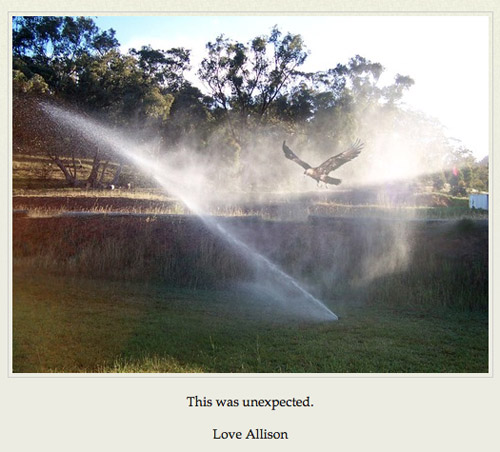
Tanner America is critical satire in the form of a Tumblr blog. The site is updated several times a week with "snapshot" style images and brief accompanying captions. Each image depicts a moment from the daily lives of the Tanner family of Colorado Springs, CO: the kids' science projects, camping trips, remodeling the house, purchases from Home Depot, and their neighbor Linda. The images are purposefully mundane and would be of little interest to anyone outside the Tanner's immediate family and friends.

What makes the images satire is the fact that they are clearly, intentionally fabricated. Each image has been noticeably photoshopped in such a way that it becomes an implicit critique. In many ways they resemble JOGGING-style sculptures or performance, as the strange juxtaposition of objects announces itself as fabricated and implies some form of intentionality, some form of critique.

The clearest commentary would seem to be a general critique of white, middle class, heterosexual Middle America. The Tanner's lives are dull, they have too many kids, they are uncritical and indulge in consumerist behavior, they watch Fox News, their Facebook page lists their political views as "Tea Party", etc. In a way Tanner America is poking fun at the suburbs, at the concept of "normal, everyday Americans," and in doing so reinforcing the kind of snide elitism that the Tanners would no doubt accuse "us" of, if they were real.

At the same time there is another critique, not of the values and lives of people like the Tanners, but the way they use the Internet and what it means to them. Taking a look at the default Tumblr theme the Tanners "chose" to use it seems grossly mismatched with the style and tone of the images and captions they post. It looks like a McSweeny's book cover, all minimalist design and Helvetica font. The cultural implications of the design seem completely absent from the Tanner's actual blog, as though it was chosen because it simply "looked nice," or it was a default that they simply never changed. It brings to mind Olia Lialina's series of essays on the vernacular web, but while she is trying to identify the kind of early everyday uses of the web that have been lost or forgotten, Tanner America seems to point to a contemporary vernacular that is not especially informed or interested. It doesn't necessarily understand how to use the technology it has, nor does it make conscious decisions about the aesthetic or brand it is trying to produce. The demographic depicted on Tanner America seems to point to a kind of Parent Web, for lack of a better term - the Web for people who have come to use and even rely on it, but for whom the technology is an afterthought. Like many parents of a certain generation out there, one could imagine the Tanners being deeply concerned about computer viruses, getting overpriced tech support at Best Buy or emailing photo attachments that have not been resized. Perhaps it is best to read Tanner America not as a critique of that vernacular use, but of the assumption that we all use these technologies in the same way.


The family unit is the primary "publishing" mode of the species yet art which in our age is so much a complex publishing has in the recent past tried to reconcile an image of art as exile with art as community by explaining adventures, a process very much "souvenir", "salon", as it were….and the caretaking of curating. The first photo is memorable because the human hand has an "articulation" in the picture, a body language a head of pictorial narrative. The second photo is the opposite, the weightlifters hand is not articulate, the possibility of redemption has dissapeared in an image about self improvement. in the third photo declension The ear as found is a phononym that has nothing to do with imagery, it is a complicated idea in the realm of word and sound…
The captions kinda remind me of Bill Owens Suburbia photographs. http://www.life.com/image/85876334/in-gallery/24991
Ok but who IS Tanner America?
got 2 understand th3 ethos 2 understand the pathos