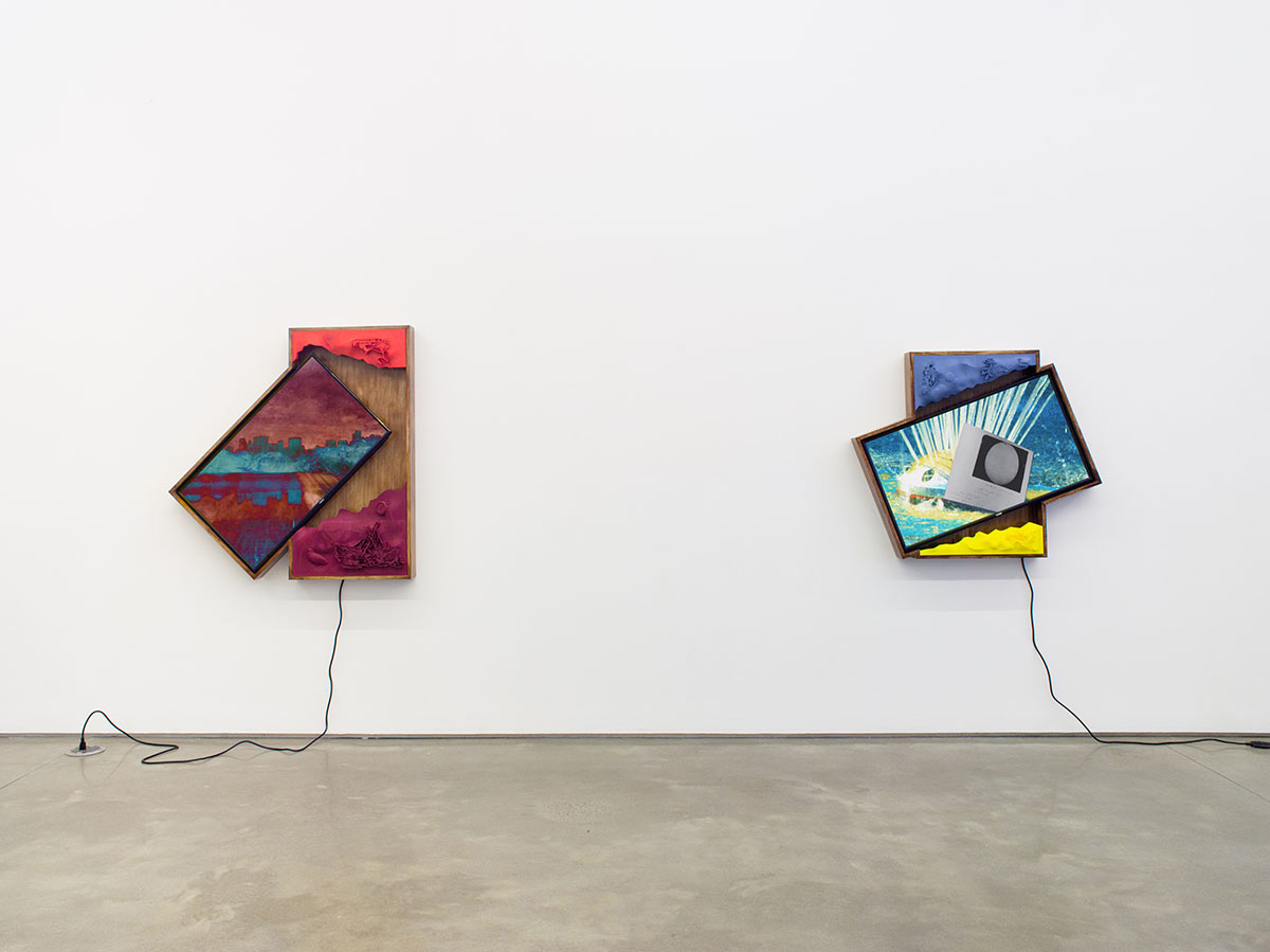
Installation view, “Camera Rider” at Team Gallery, New York, 2019. Courtesy of Team Gallery.
The latest in a series of interviews with artists who have a significant body of work that makes use of or responds to network culture and digital technologies.
Elizaveta Shneyderman: I’ve been a fan of your work for quite some time. From your entertainment centers to your current work—what you refer to as “Relief Drawings”—a continuous thread I see is a fidelity to technical operations in order to eke out what potential sculpture has for digital intervention. How has this evolved over time for you?
Collin Leitch: I started working on the entertainment centers in 2018 when 4K TVs more or less became standard. I would mount these TVs at odd angles in boxy wooden housings so that I could take advantage of their diagonal dimensions. The diagonal of a 4K TV has a resolution somewhere in the neighborhood of 4500 pixels, and configuring the TVs in this way allowed me to extract the maximum resolution possible, even if only for a small sliver at the center of the composition.
The way I work with video usually involves compositing several different sources and registers of cinema into a single frame, often combining scanned film formats and generative animations, so filling this tall dimension became a unique proposition. In the animations for the 2019 entertainment centers, I turned to media like film negatives that don’t have fixed digital resolution and are meant for projecting or enlarging. With the 2021 entertainment centers, I began to rely less on film and started to scan in more drawing and painting to serve a similar purpose. In particular, there were some hand-painted backgrounds of cel animations that I used as the backgrounds of my own animations. In the way they were originally used, you were never meant to see the edge of the background painting—often they would just roughly end, leaving blank cardstock at the edge, so it was naturally suited to the frame of the entertainment centers which typically omitted edges. The compositions displayed on the tilted monitors maintain a level relationship to the eyes of the viewer and the walls/ceiling/floor of the gallery, and perpendicular elements in the wooden frames, which would also contribute to “fixing” the horizon in the compositions. In displaying a photograph in this way, for example, you can only see a relatively small area of the image, and the monitors almost felt like windows onto some larger corpus of cinema that’s always sitting just outside the frame.
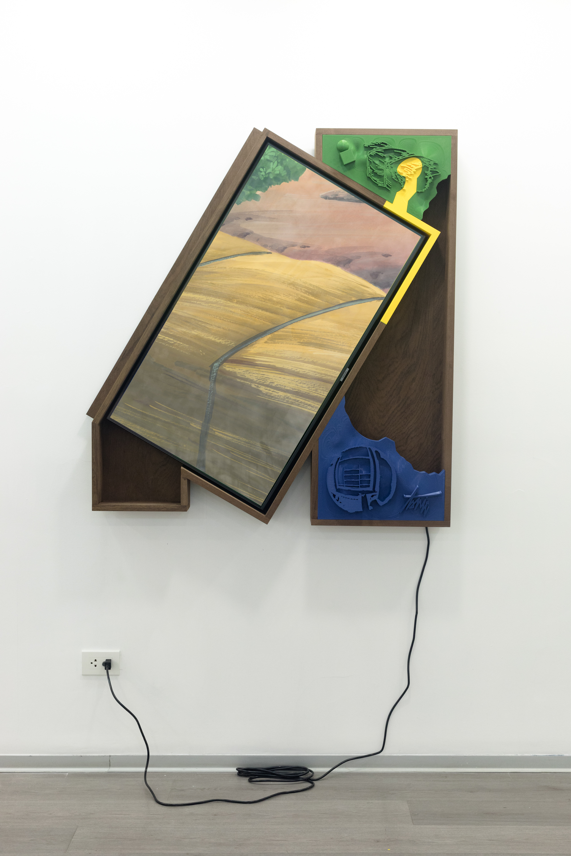
Collin Leitch, Tonick, 2021. 4K video, polylactic acid, walnut. Courtesy of the Artist.
I felt like these works sat within this furniture-sculpture tension that was a condition of showing early video art in galleries. Once I had one of these pieces returned to me from a gallery and I stored it in my living room. I didn’t have a TV in my apartment at the time, so I ended up watching all these seasons of streaming shows on my sculpture for a year while laying on the couch in this one position that wouldn’t hurt my neck. That’s where the entertainment center name came in—the piece of furniture that contains the TV in a home. TVs used to be designed as furniture but now they’re not. When artists first started working with video, they often had to enlist this piece of furniture into a gallery setting to display their work. To me, this seems like a highly charged gesture tied to the American home and American politics.
ES: Did you play with, subvert, or otherwise tropify the limitations of the hardware or playback resolution (pixel limits, resolution, aspect ratio, playback speed, etc.) in the “entertainment center” works?
CL: I think these pieces present the resolution of digital video as a surface for a materials-based or apparatus-based inquiry into the nature of cinema. By pushing resolution to it’s limit—not in a glitch way, but by achieving the maximum possible resolution of these screens—I hope a viewer could experience some kind of mental activation toward what resolution is meant to do in the first place, or negotiate their own feelings about the consumer television resolution arms race. If this drive to increase resolution becomes a trope, then I picked it up in a tongue-in-cheek way, by increasing resolution by rotating vision and interrupting the TV’s original function. But there is a meaningful increase in resolution in viewing along the diagonal! Up close with these pieces you can get a sense of looking at a lot of visual information.
Especially with film assets scanned into these pieces, where there is dust and scratches and grain, you can really look at photochemical film—not as a stylistic choice, like in an ad that has scanned film with sprocket holes, but as a material subsumed into a larger continuum of moving image technologies. Hollis Frampton wrote about this idea that photography, film, video, and CGI all sit inside each other without a hierarchy, and that has remained for me a very useful framework to think through.
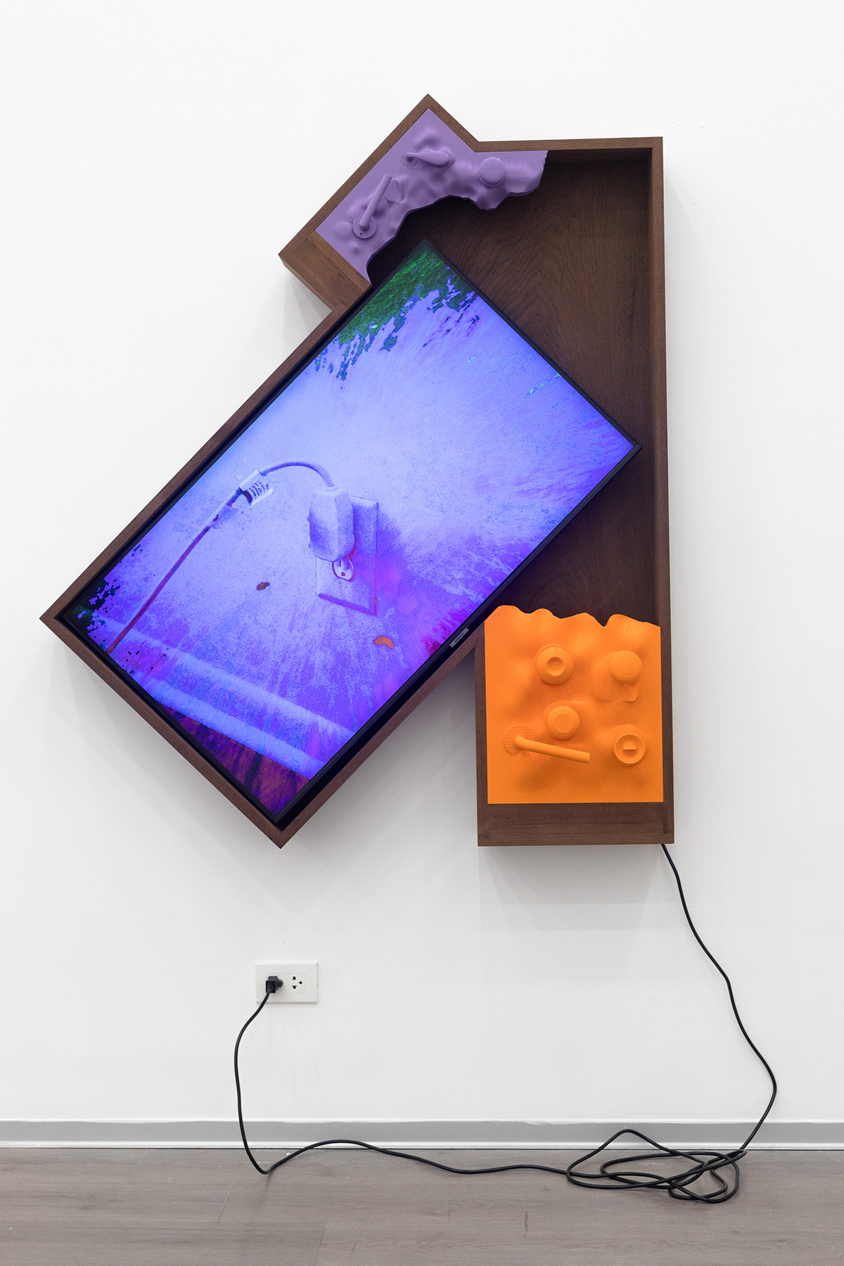
Collin Leitch, Memories of Uplift, 2021. 4K video, polylactic acid, walnut. Courtesy of the Artist.
As for hardware, I’ve tried to reinscribe the TV’s status as hardware or as furniture, as if to say, “This is a TV from BestBuy. This decidedly is not a sleek, anonymous surface for displaying a piece of immaterial media art that could live anywhere.” I started making these pieces when there was a lull in interest between the first and second generations of dedicated digital art displays, like Electric Objects and others. In pieces like Arck (Cusanus) or Memories of Uplift, I realized I was including images of drywall and electrical outlets in the animations. The way these pieces are wired, everything terminates in a single cable that is visibly plugged in, and everything runs automatically when it’s plugged in. It was important to me that this cable have a graphic quality and be part of the piece, to treat the piece as a kind of appliance. The onscreen outlet and onscreen wall become a mise-en-abyme framed by the real outlet and the real wall the piece is hanging on.
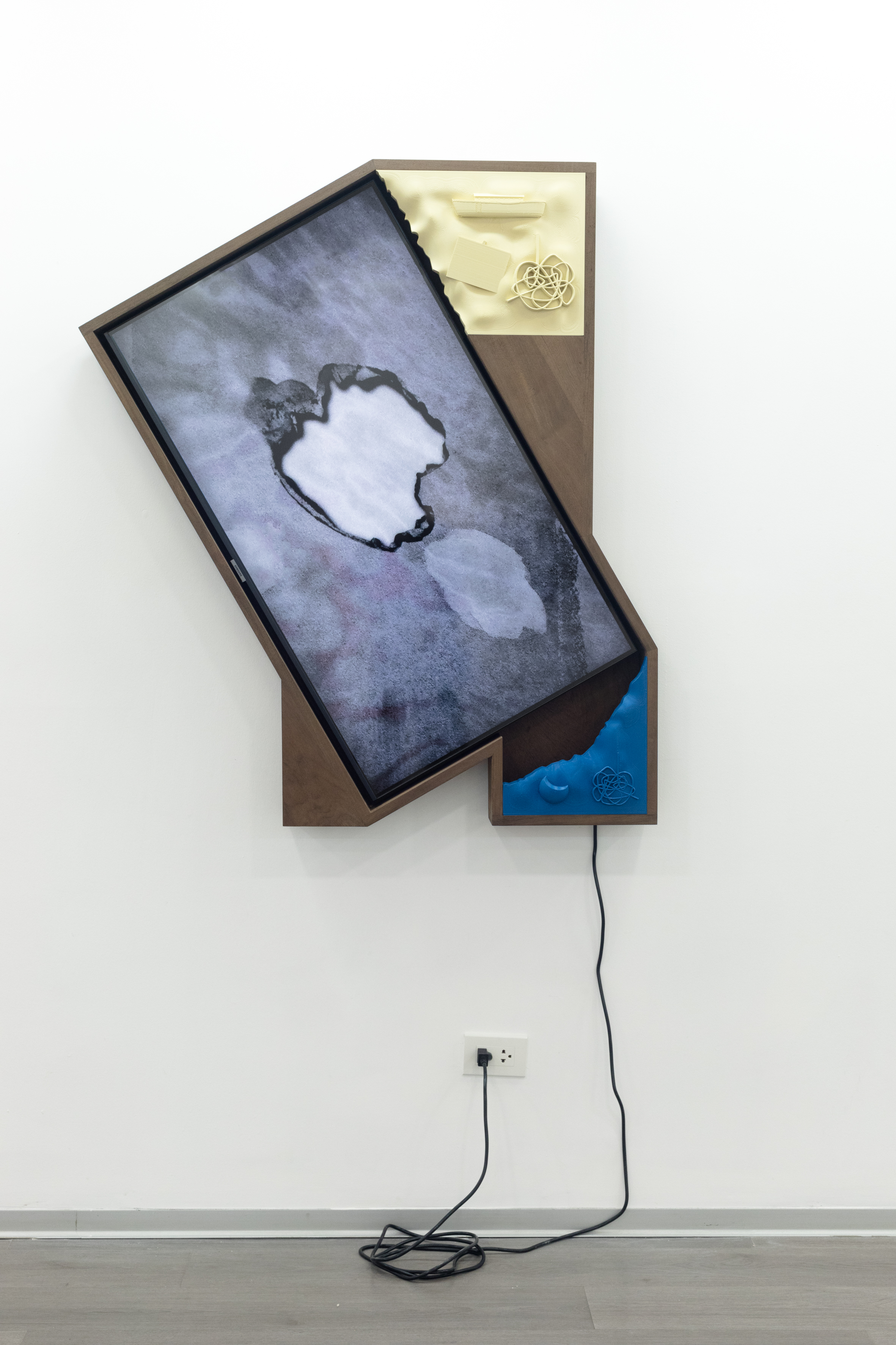
Collin Leitch, Arck (Cusanus), 2021. 4K video, polylactic acid, walnut. Courtesy of the Artist.
ES: My own interest in software and 3D-manipulation derives from a trope I’ve noticed in contemporary visual culture. The anagrammatic, recombinant features of software toolkits and libraries, which you use in your own work, create a novel form of realism—what I call a “parameterized real” in my own research—characterized, for spectators, by a familiarization with the uncanny and by a sense of “already-seenness.”
These sub-perceptual processes are evident in your most recent show World Edit, which utilizes what you call “plausible volumes”—extruded vector shapes which are 3D printed—that are then reassembled into a uniform surface. I’m thinking of Genesis Invitational in particular. Can you speak to the tension here between the 3D imaging software towards the final drawing, which actually produces a sculpture with more fidelity to 2D rather than 3D space?
CL: I first started using the 3D printer when I was working on the entertainment centers as a way to generate broad swaths of plastic to serve as relief adornments on the wooden consoles. All these prints had a 2D footprint that slotted right into a cavity in the console, and I tried to keep in mind that I was primarily using the printer to precisely deposit plastic to correspond to a fixed outline. I was emphasizing flatness and a drawn outline even as I included discrete 3D assets in these reliefs. As the entertainment centers began to privilege drawing more and more in the animations, the reliefs also started to mostly feature extruded drawings. 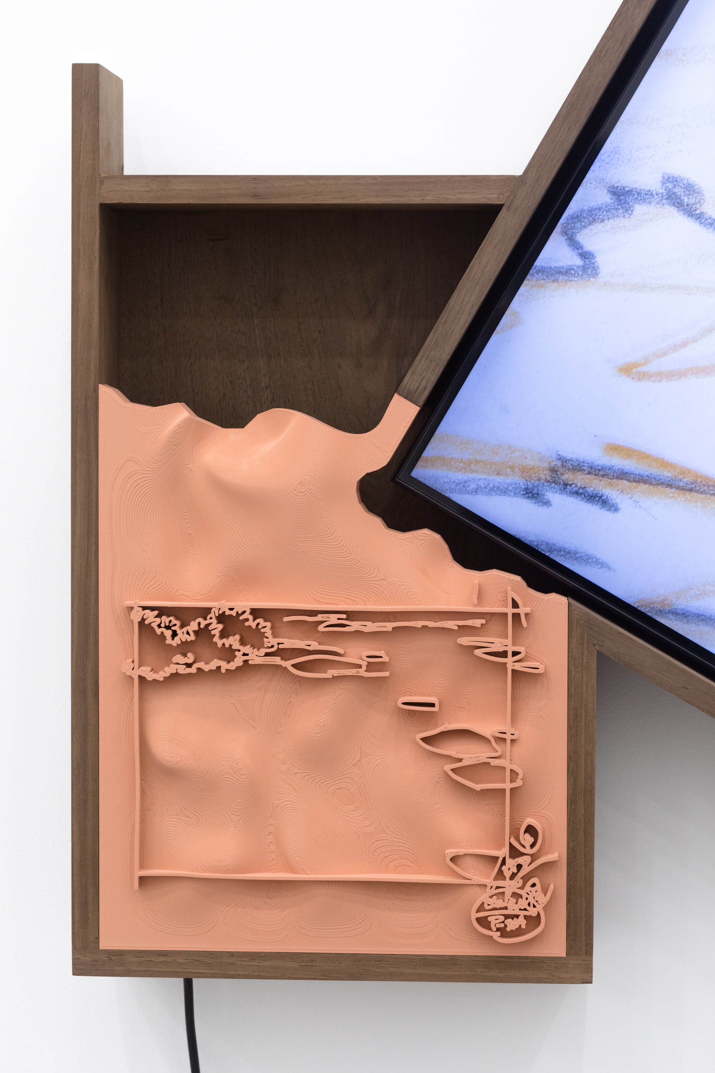
Collin Leitch, Vieiwing, 2021 (detail). 4K video, polylactic acid, walnut. Courtesy of the Artist.
I was using the 3D printer like a plotter, making drawings in plastic that took advantage of the relatively low resolution of extrusion printing. To deposit plastic layer by layer to produce a volume that was composed with an eye toward the limits and properties of this tool—I came to feel that this was the operation the 3D printer was best at, and needed to be kept in mind while attempting to use it to produce artworks.The drawings felt like they were within the same order of magnitude of the incremental layer heights and lines that are a material hallmark of this type of printing. The drawings also had a relationship to these units of resolution that is similar to scan lines in analog video.
I am not really interested in using the 3D printer to produce specific volumes that are on their own representational, either as a replica/clone of a thing in the world, or as an attempt to “just it print out” or transpose to sculptural space a scene or figure that was modeled on the computer. Also, to reiterate, a lot of this argument is really specific to extrusion printing. There are resin printers that can whole-cloth beam extremely elaborate forms out of a vat of material and do so with tremendous detail, but taking that process at face value doesn’t feel like the most exciting starting point for making sculptures, to me, right now.
From this understanding [about 3D printing], a lot of my lingering sympathies to structural film came back to me. The software I use to make these pieces is more or less the same suite of apps that I used to make videos. The relief drawings are very cinematic pieces, not in the sense that they are epic or are of tremendous scale but in that they are born of a process of thinking materially through a tool and what its essential function might be. I also have an inclination to think through the media and some of the tools of cinema by looking at them at their limits or through a mode of negation, at the point in which a tool or format is no longer broadly relevant.
With Genesis Invitational, I wanted to push the automotive motif of the other works in the show to a limit that would reveal something about the printing process. When that piece was in the drawing stage, I was looking at a lot of reference images of car wrecks. I was trying to think through the “insideness” of 3D printing and how to depict some of the interior components of cars that are brought to the outside in this catastrophic event.
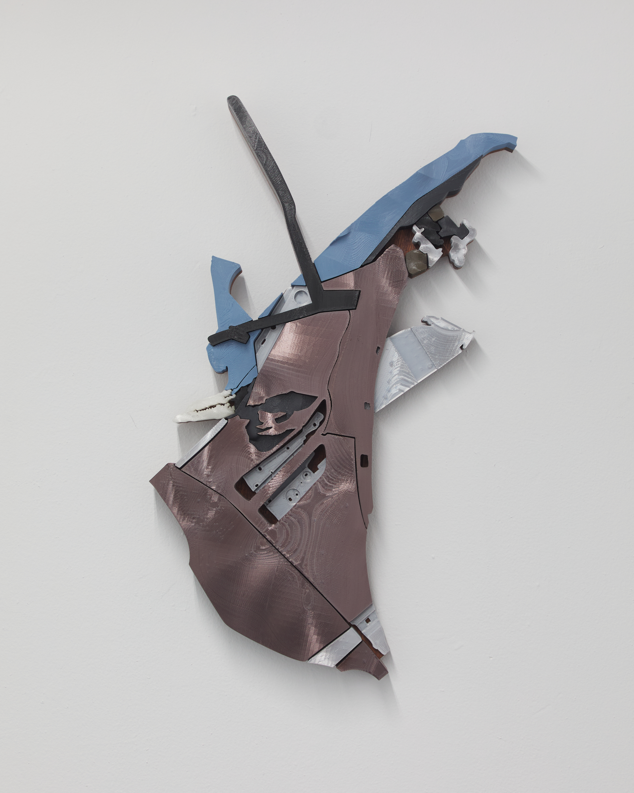
Collin Leitch, Genesis Invitational, 2022. Polylactic acid, mahogany and danish oil. Courtesy of Shoot The Lobster.
ES: I’m curious about your wielding of 3D printing technology against itself as a vector for the high-fidelity translation of verisimilitude. How is the process of working with 3D assets different for you, given that your end result is nonetheless a (representational) image?
CL: The end result is a representational image in the way a drawing could be a representational image; it’s less like the tendency to use 3D printing in a similar way to the common historical understanding of a photograph as a representational image of reality. There is an emphasis in these pieces on a graphic experience, and on withholding detail in an inverse relationship to the scale of the individual print (the prints are very large and have limited detail). Conventionally, a 3D print is representational by having a well-rendered, high-detail, 360-degree-relationship to the thing it references, whether that is a toy, a figure, or a car part. That’s why I called these plausible volumes, because in 3D space they maintain a more general relationship to their subject matter.
I also tried to imbue these pieces with something drawing can’t have, which is significant depth and thickness. The process of working with these assets begins with a complete vector drawing of all the constituent pieces and then is extruded up from there. Any particularities of those strokes or the non-uniform spaces between shapes get preserved through the process of printing, aligning, and gluing each piece to the wood backing. In the final relief drawing, a viewer can look perpendicularly at it and sort of step to the side of vision for a moment.
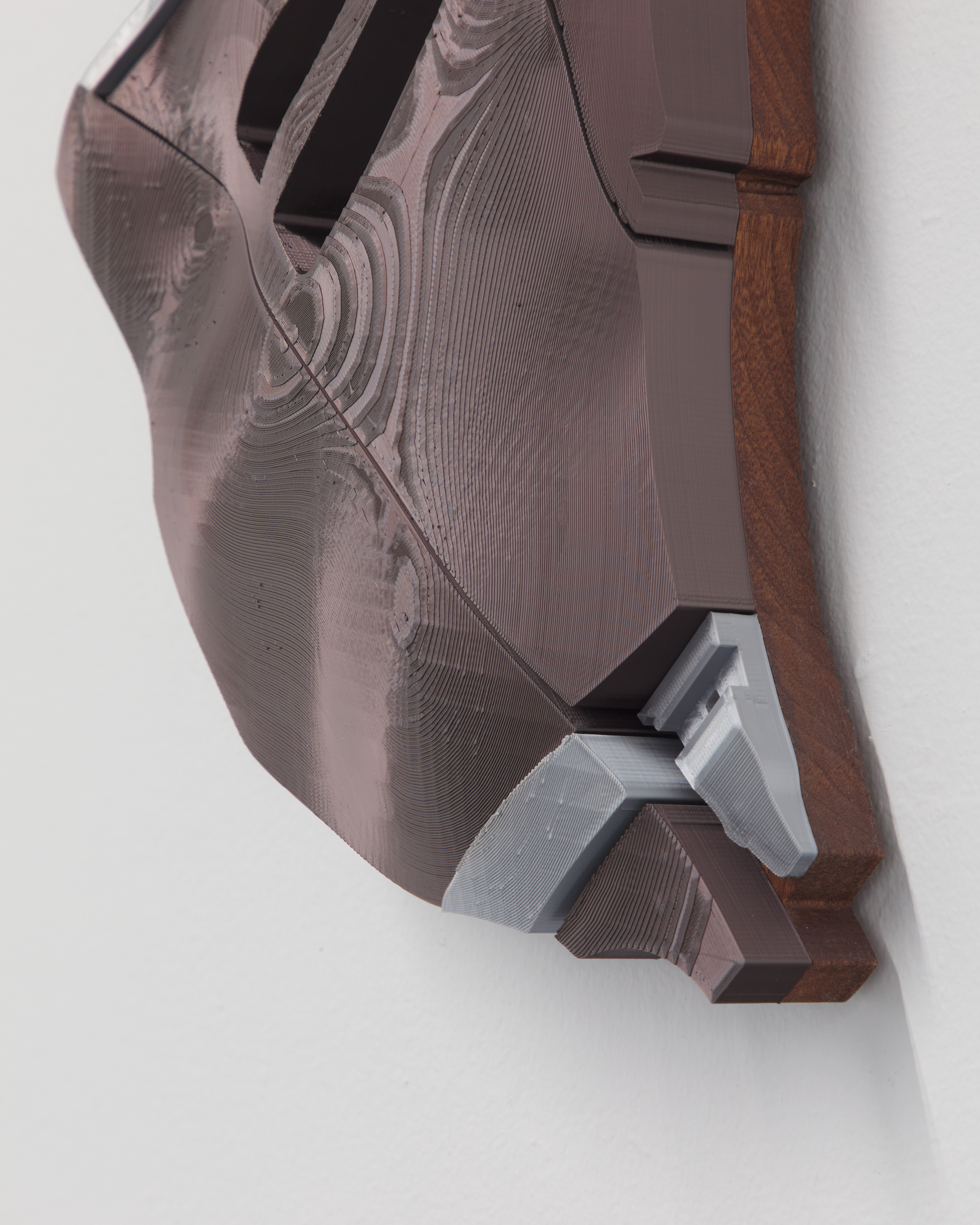
Collin Leitch, Genesis Invitational, 2022 (detail). Polylactic acid, mahogany and danish oil. Courtesy of Shoot The Lobster.
ES: When we did a studio visit last September, we spoke at length about car designs as vectors for stored design imperatives and cultural wishes. I’ve always been fascinated by their design history: cars started as trompe l'oeil horse wagons or stagecoaches and have evolved to hyper-realized curvatures, increasingly molded to look like 1:1 extrusions from 3D software, with curves, indents, and concave spaces only possible via that software. Do you see these cultural, paradigmatic, and visual shifts, especially where manufacturing is concerned, as relevant to what you’re doing sculpturally?
CL: Yes! I think we were riffing on how so much car design looks like CAD [computer-aided design] now, or that you can see back through it to a 3D design workspace. One of those pieces, Life, Car Thief, combines the tail of two different cars — one is a luxury SUV and the other is a common sedan that would be one of the cheapest used cars you could buy. They both inhabit the same visual language with very little distinction in how they hold these CAD curves in their exterior bodywork. When cars have been designed to inhabit a more maverick or referential design milieu like the Pontiac Aztec or the PT Cruiser, they are met with near-universal scorn and viewed by the public as a grotesque aberration.
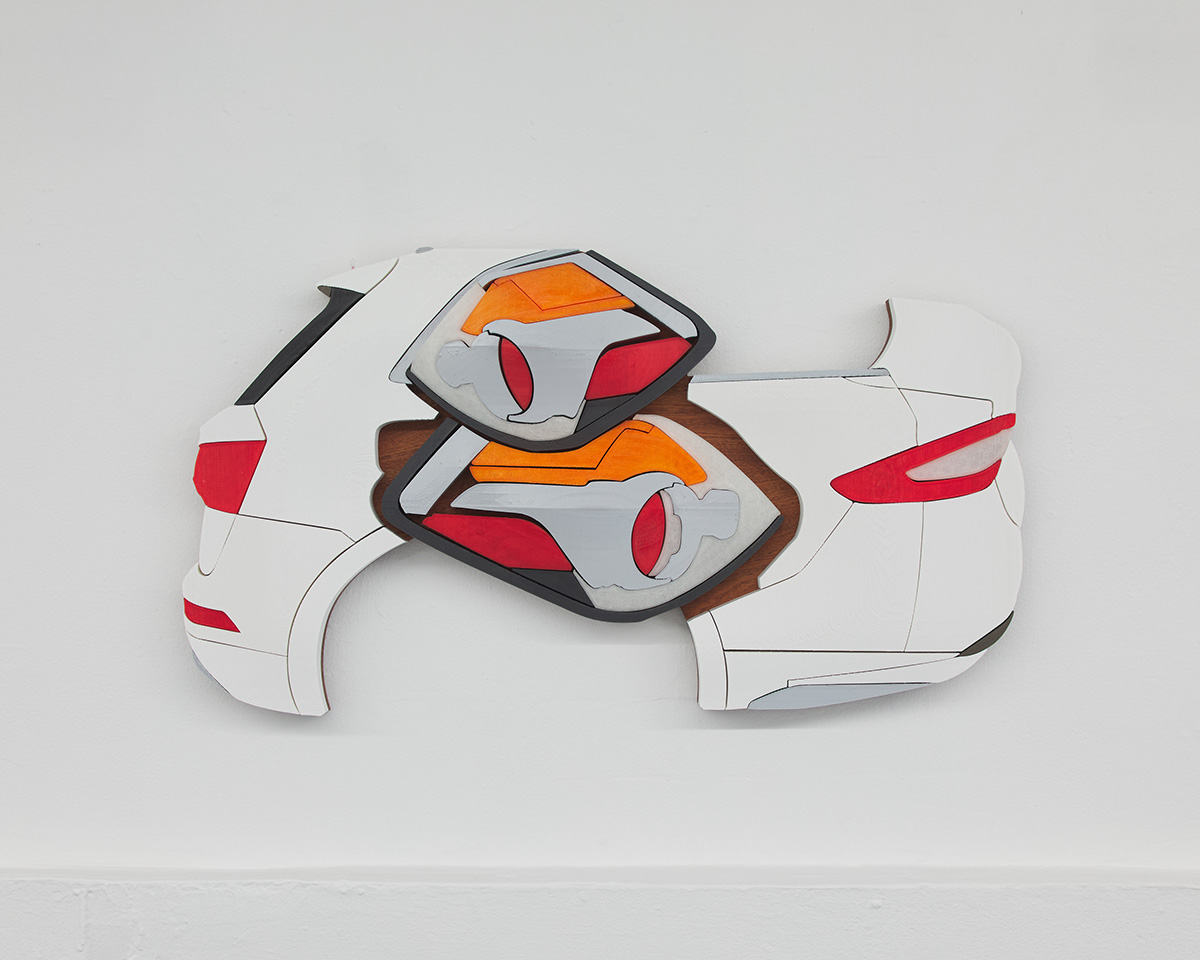 Collin Leitch, Life, Car Thief, 2021. Polylactic acid, mahogany and danish oil. Courtesy of Shoot The Lobster.
The subject of cars became a useful idiom for manufacturing, or a way to to think through a technology evolving alongside people’s expectations of it. To go back to these pieces being cinematic, I found it really useful to look back to the period of proto-cinema, to stereographs, zoetropes, and panoramas, all these efforts to try to realize cinema through a resemblance to photography, drawing, or the experience of train travel, and find in there some impulse that feels latent in cars looking like stagecoaches, or CAD.
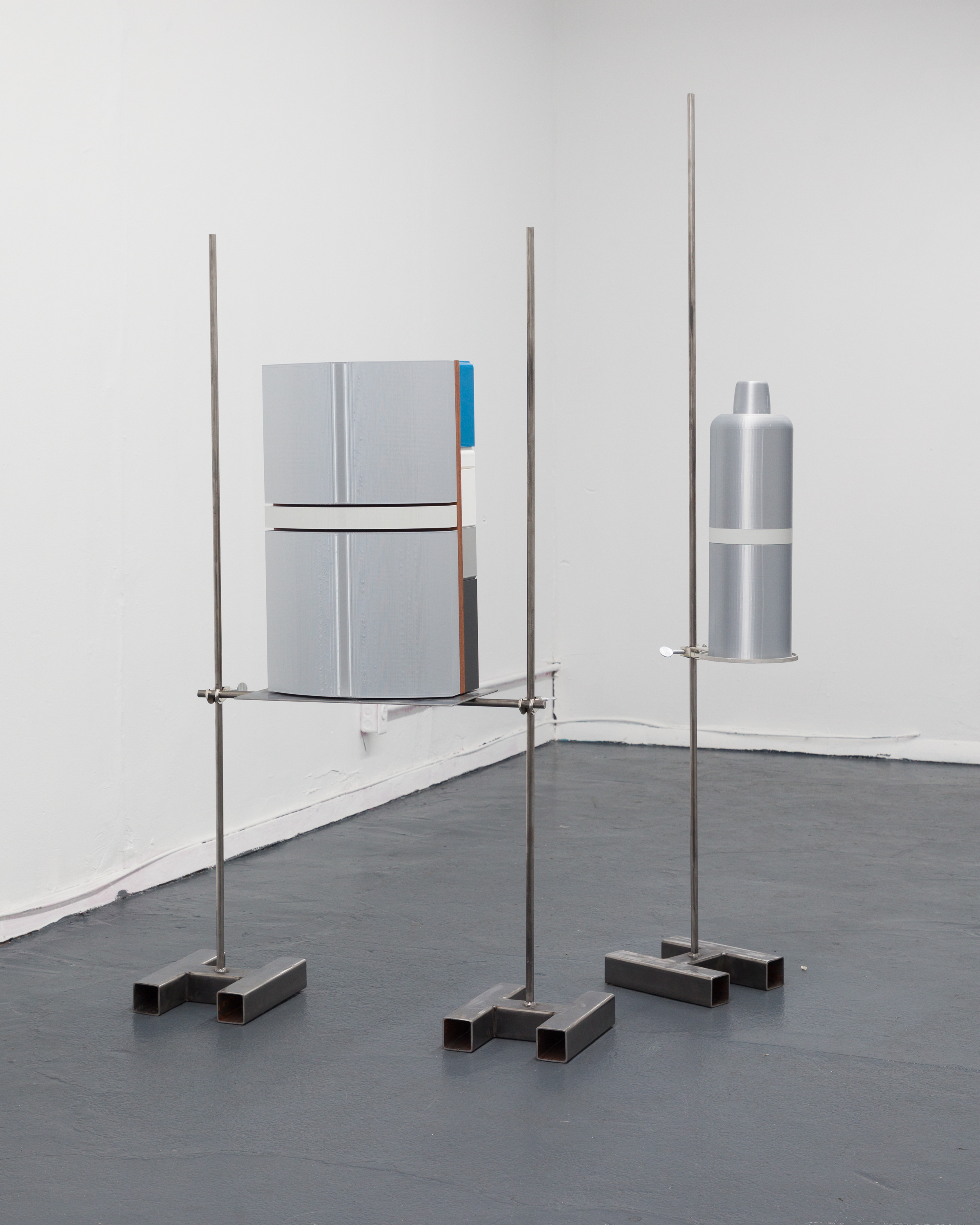
Collin Leitch, The Small Back Room (Berkey Bomb), 2022. Polylactic acid, mahogany, danish oil, steel, aluminum. Courtesy of Shoot The Lobster.
ES: Is there a metaphor here for this hyper-design epoch we find ourselves in—or at least emerging media within it? After all, the design principles, or structural qualities underneath every image, are a self-serving fiction invented by designers themselves.
CL: I’m a bit averse to hot takes here as I admittedly struggle with design. I have to text all my friends for advice if I am trying to buy furniture on Craigslist. And dressing myself, man, my ability to do that has been volatile, to say the least. Design is like…making all the things that enclose humans, and doing so from some kind of implicit worldview, right?
In my most recent show World Edit at Shoot The Lobster, there was a sculpture that was meant to, at least in part, evoke an armament or some kind of explosive. It’s actually just a regular 3D print, not in relief. I was thinking about the Cosima Von Bonin rocket pieces, sometimes rendered as plush toys, and this tendency of 3D prints in PLA [plastic] with bright filaments to look toy-like. In fact, it seems like the two killer applications for this type of extrusion printer have been either making toys or making guns. I was thinking about these rockets, and was looking at my sculpture, and a friend pointed out that these ordnance have never fallen into any of the design imperatives we’ve talked about. They have always just looked like themselves.
Age: 28
Location: Ridgewood, Queens, NY
How/when did you begin working creatively with technology?
I remember using my parents’ VHS-C camera to make stop-motion films when I was very young. I played with MS paint a ton as well as Adobe CS stuff on the school computers. However, I didn’t have real chops for anything until I started making rude photoshops of my friends.
What did you study at school or elsewhere?
I studied in the Film & Electronic Arts Department of Bard College.
What do you do for a living or what occupations have you held previously?
After school, I started working as an assistant for a few different video artists. I also did AV installation at galleries and museums.
What does your desktop or workspace look like? (Pics or screenshots please!)
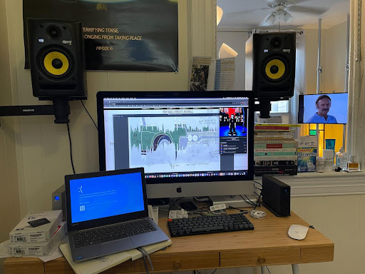
Photograph of Collin’s workspace, 2022, Courtesy of the artist.
