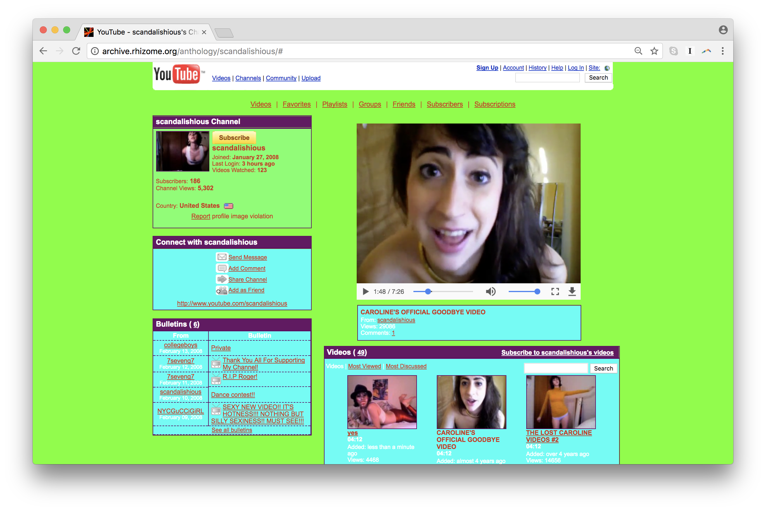
Yesterday, we shared the newest addition to our ongoing online exhibition Net Art Anthology: Ann Hirsch’s Scandalishious (2008-2009), a seminal work developed for the video-sharing platform YouTube.com. Contemporaneous aesthetics and interaction were key to the work, and thus restoring YouTube's older look and feel would be key to our restoration. The task of recreating late-aughts YT was put to Rhizome’s software curator, Lyndsey Jane Moulds.
As someone who lived through the 00s, and enjoyed YouTube when it acted like it did for Scandalishious, I adored the end result, and was curious how Lyndsey got there. So, I asked her on Slack.
ZK: Pardon me, Lyndsey. I’m slacking you to ask a few qs about your restoration of Scandalishious, for which you’ve done an excellent job. First, how did you approach this recreation of an older YT?
LJM: Keeping the visual styling and presentation of the page intact felt really important. The videos are obviously at the center of the work, but there’s a lot of personality in that channel page, too. It's really easy to forget what YouTube looked like ten years ago, since social networks have slowly removed the ability to personalize pages in the last decade — Facebook widgets, Twitter backgrounds, all of that has disappeared. And this work really does operate within YouTube as a social network rather than just a place to publish videos, so we wanted to preserve as much of that for Ann as possible.
ZK: I mourn the loss of page personality. (Or rather, personality overall, everywhere on the web...) What was the most difficult aspect of the restoration on a technical level?
LJM: Part of the plan was to present the work so that it could run natively in modern browsers, so the most difficult thing was probably just getting the new code to talk to the old code. There are a few different easy-to-use JavaScript libraries that take care of cross-browser compatibility, pre-loading, managing auto-play, that kind of stuff. But all of them made assumptions about the way the page was put together that would have meant rewriting more code or making more destructive changes to the page, so I ended up doing a lot of that work at a lower level, using just browser APIs. The actual work wasn't as difficult as figuring out where it was appropriate to use more modern approaches, and where it wasn't.
ZK: I have to say that I was truly thrilled to be able to show someone Ann’s work on my iPhone yesterday. At times, Rhizome can be... how shall I say this... mobile agnostic. So, kudos. Anyhow, what's your favorite aspect of the old YT look and feel?
LJM: I really appreciate the way users employed color on their channel pages. Scandalishious has that bright teal and green scheme. But even, for example, Barack Obama’s YouTube page from around that time used these rich blues and reds. I have a pretty large monitor in the office, and it feels so strange to maximize these archived sites on a really big screen. I didn’t own a screen anywhere near this large in 2008, so it's a really different experience to revisit these archives. Seeing a page that actually utilizes the kind of decorative CSS that was popular in the late 2000s at such a big scale really drives home how different social media looked.
ZK: It’s ironic how the web has been drained of color, as “retina” devices proliferate. I miss the old logo, which had a text tagline that exhorted folks like Ann’s Caroline to get into the mix. To close, is there an early (pre-2009?) YouTube video you really like? If not I’ll just share a Tech Deck video I like...
LJM: I need a second to see if there’s even one still online… [A few minutes elapse.] I’m looking through my old favorites and I feel like almost everything pre-2009 has been taken down, which I guess just emphasizes the importance of archiving. Chloe saying “bye” at the Copley Place Mall definitely holds up, though.
ZK: Lol. Well, for what it’s worth, here’s a Tech Deck video I like. Thanks, Lyndsey!


