This interview accompanies the presentation of Jennifer and Kevin McCoy’s Airworld as a part of the online exhibition Net Art Anthology.
Alec Recinos: How did you start working on Airworld, and how did it develop out of your earlier projects?
Jennifer McCoy: Was the radio the first thing? It’s all mixed up in my mind because we did it as part of the World Views World Trade Center residency.
Kevin McCoy: With the Lower Manhattan Cultural Council.
JM: Yeah, with the one in the World Trade Center. I know that we focused on Airworld there, which was crazy because of the plane logo that we developed and then 9/11, which was only the next residency cycle after us. We were doing pirate radio broadcasts from the top of the tower, which was pretty awesome,with the signal strength and all of that. We proposed Airworld as a sort of website to the Gallery 9 at the Walker Art Center, and then that’s where the DoubleClick ads came from. So I think that the banner ads were actually first. Then photo shoots and stuff was next.
KM: So it started off as this multifaceted project that had a kind of film set-logic to it.
JM: Yeah, and we did a bunch of video shoots, but we never really made any single channel videos out of that. When we proposed the banner ads from all the photography and then got the DoubleClick network partnership going, Steve Dietz from the Walker said, “What will they click on? When they click on the ad, where do they go?” And we thought, “Oh, yeah.” Because we just were so excited that instead of heading to some arcane URL, people would be seeing these ads streaming amongst the other stuff that was pushed onto the network. Steve encouraged us to think about where viewers would land after they clicked the ads, and then we started working on the Jargon Machine aspect of it and the Economic Theories part of it.

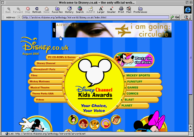
Jennifer and Kevin McCoy's Airworld Banner Ad on Disney.co.uk. Screenshot created in EaaS using IE4.5 for Mac.
KM: That kind of hybrid approach had come from the different things that we were interested in at the time, which was film, and film art to some extent, but also film language in a formal sense, as well as an idea of media collage, mashups and mixing. We were doing a lot of VJ work at the time and had developed VJ software we called Whirlygig that we were using for live shows. We were really interested in the idea of combining and collaging. To make material to feed into this process we first developed Airworld costumes and thought about the World Trade Center as a kind of film set. It was video clips and film stills that got the initial series of images going. Then through personal connections we had an opportunity with DoubleClick to send out a series of banner ads. Those photos became the banner ads. Then, as Jenn said, that became, “Okay, what happens if they click on it?” and the website itself was born.
So the initial website had these two components. One was the Economic Theories, which was jan overlay of texts, kind of cut-up style text overlay. It was almost like a graffiti approach. The other thing was called the Jargon Machine which was wildly adventurous and actually worked pretty well in a crude way to make this real-time collage-y broadcast technology. That part of the site was an extension of what we were doing with the FM radio transmitter, using early text-to-speech technology and doing software-based cut-ups of text, collages and cramming it together. So it was all part of this kind of amorphous interrelated set of projects.
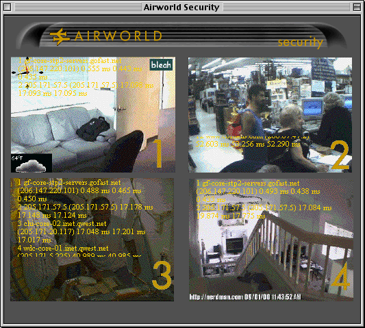
JM: Yeah, and then the third element of the site was the Security Desk. It was this huge PHP script that was hijacking all of these security cameras from around the globe and then putting them into a regular sort of security matrix grid, one feed would be a traffic cam from Seattle and another feed would be literally a water cooler from Tokyo. And then we had a traceroute code superimposed over the top of all of that. The idea there was that it was actual places of work that were collaged into one security cam view, and then the traceroute provided, for anybody who could follow it, [a path] back to the network channel from wherever the piece was plugged into, wherever the camera’s server was originating the image.
KM: This was in ‘99 so it was pretty primitive.
JM: All the interest in language was because all of these companies had started to put their marketing materials online. It’s that way now and you kind of just think it’s standard, but before the internet there was this moment where the business world didn’t have a publicly accessible face. You could be thinking about IBM or Pitney Bowes, but you couldn’t read anything that they had written, and they didn’t really have a need—except in maybe annual reports that went to shareholders—to share their vision of the world. And we got really interested in how that language was written as all of these companies started to have websites that were public-facing.
KM: Absolutely. The collaging and overlaying was precisely that—responding to this newly available public presentation that corporations were now able to do.
JM: Yeah, and the language was just hyperbolic at best and weirdly utopian at worst. The legacy of that is completely all over the internet now with every little app that talks about your ability to order pizza quickly being a utopian strategy that changed everything for the better. And we're still just not buying that. They’re selling it.
KM: Of course, Silicon Valley, the TV show, is the apotheosis of the critique of that whole kind of start-up culture, but we were in that vein as well then.
JM: Yeah. We had worked at some dotcom enterprises early on and worked at Microsoft spinoffs in Seattle, and were just truly embedded in it, so when we moved to New York we thought of this as source material. A lot of our art deals with workplace realities and I don’t know that that is always so awesome in terms of like entertainment factor, but we thought it was funny.
KM: The other thing, just in terms of background, that I think is important to try to explain around the Airworld project is that we came to New York in ‘96 and were involved in experimental video, media projects, and online projects exclusively at that time, from 1996 to about 2000. All of that predated any kind of gallery work that we did, or any kind of art object making that we did. Before that time it was just a big mash-up. It was just a big mess of interrelated projects and people and experiments and there wasn't a lot of clear boundaries between works necessarily. So Airworld was designed to be an umbrella between a bunch of different kinds of things, and we used a branding strategy where we had a logo, we had a name and we had some kind of basic design concepts.
JM: And a series of concerns. It was also made at a time where a lot of artists were creating sort of faux or real companies, like etoy, or FakeShop, or even JODI. Airworld was a little tighter focused than those. It was about the sort of language of commerce, but it was in that era.
KM: Sure, and from a net art and archivist perspective, Airworld.net housed three different projects. If you set the banner ads in the DoubleClick project aside, because that was hosted on their network and was distributed in a more performative way, then Airworld.net hosted three projects. One is that Economic Theories one, and that’s the text overlay that sits on top of these third-party financial websites. There’s the Airworld Securities Desk, which was the live camera streams that have the Unix traceroute command as a text overlay on top of those streams. And then there was the Jargon Machine, which was really pretty crazy, a text collage of different press releases done as a text-to-speech dynamically generated slide show video of weird corporate images and image search results based on terms.

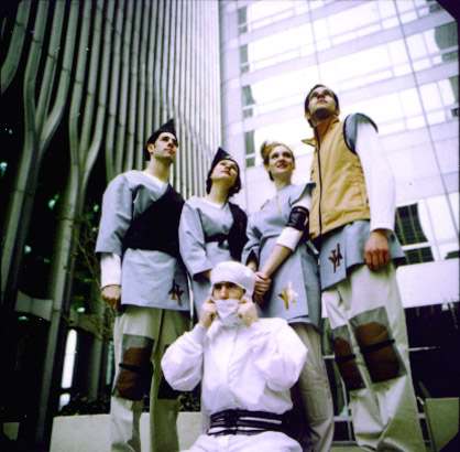
Jennifer and Kevin McCoy and friends at the World Trade Center, 1999
AR: It was really fascinating for me to see the different projects coming together, and I was particularly interested in the Economic Theories section. Most of Airworld seemed to be working with a sort of ambiguity from using the vague corporate language, but the Economic Theories seemed much more overt, literally foregrounding Marxist texts.
JM: Yeah.
AR: How does that fit into the other projects and how do they all work together?
KM: I think that time has shown that in internet-based projects, the better strategy is the strategy that we use in Economic Theories, where there is no room for ambiguity. So I think the thing that’s the most pointed critique and trollish kind of approach is where it works best. The other ones are more ambiguous and it's hard to figure out what’s going on with them. Airworld’s Security Desk with the virtual quad monitors and the text overlay, was migrated on a couple of occasions to gallery shows, group shows, and I think it worked better there.
JM: Yeah, because it’s more image-based and the images being live is more compelling when you have an installation, or a sort of time-based way to interact with it, instead of just checking it out on a screen. With the other parts, the line you walk is that when you whip out the Marxist text, all of a sudden that’s the text that you're reading and you’re seeing everything else in a truer way in its vapidity. With the Jargon Machine part of the project, there’s a chance that poetry is there somewhere and we wanted to leave that possibility open. But we wanted to have the viewer think about why the text from a commercial airline might be the same kind of rhetoric as an accounting firm. You know what I mean? And once you put those two together and it flows in an odd way, you start to maybe question all of the text that you read.
KM: Yeah, I think that that's really true. The position that we took, whether successful or not, was precisely that, to draw people’s attention to the underlying similarity, the underlying logic across these different industries, and how in the end they’re all basically the same. Take capitalism, for example, and say that there’s this common logic behind all of it. That’s what ties it together. It is the fact that here we can take these different fields, and all the language just kind of blends together and we want to draw people’s attention to that. Did it make that connection? I’m not so sure, I don’t know, but that was what we were thinking about at the time. So for us, the idea of combining and collaging was a critical strategy to make that point. To make that point of underlying similarity, we thought, could be explored through a collage approach. I think that it’s dated and has been proven not to work particularly well, since we’re almost twenty years out.
AR: Well, I think that’s interesting too because I think that choice to go with a more ambiguous approach versus overt activism, has really lasted much longer, with many contemporary art groups, still working in that vein. I noticed when reading the essay about Airworld that Felix Stalder wrote for the Walker in 1999, that he predicts that in a few years, banner ads will all disappear.
JM: That didn’t really work out for him.
Alec: I thought that the Airworld banner ads were interesting because instead of just presenting Airworld and its language and photos, they were also crawlers that pulled the texts for other projects, like the Jargon Machine. Was that difficult to do with DoubleClick?
KM: There was no kind of automated way to do it. When they were sponsoring the piece, we provided them with the sites that we wanted to work with, and then separately and surreptitiously on our end, used them as the source material for the Jargon Machine stuff, which was a semi-manual, semi-automated process.
JM: Yeah, otherwise I just felt like it was so disconnected. It was all very abstract, I think. It just made more sense conceptually that there was some feedback between our hosts and mirroring it back onto our site.
KM: This was in ‘99, but I think that was even before Google bought DoubleClick. They were the kings of online advertising at the time, but it still was so early-days in advertising, so there was no ad-tracking, or very little ad-tracking. The whole matrix of the online ad world was in it’s infancy. But making that connection between the ad and the underlying site and trying to bring those things together was certainly part of the way we were thinking. We thought that’s the way the advertising industry also was beginning to start thinking, and so everyone was on the same page, in a way, for better or worse.

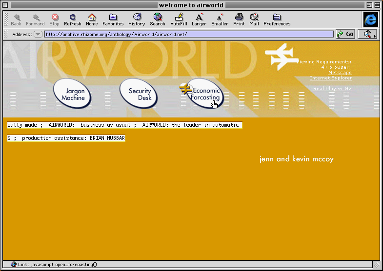
Jennifer and Kevin McCoy, Airworld. Screenshot created in EaaS using IE4.5 for Mac.
AR: How much control did you have over like where the banner ads were placed?
JM: A lot, I guess.
KM: I mean, we gave them a list of sites.
JM: Yeah, they sent us pages organized by industry and they let us pick. And that was it. We kind of just said, “We want to focus on these,” and they said okay.
KM: Yeah. It was a pretty manual process at that time. They had their network listed out, and we would just like check-box the ones that we were interested in. And they said okay and ran with that. The million impressions went pretty fast, even back then.
JM: It sounded great, though. A million. Mighty million.
AR: Do you know how long it lasted?
KM: Yeah, it was like a two-week thing. All the tracking was so rudimentary then, too. We had some simple tracking on the website and whatever, and we’re like, “Look, people from Australia are looking at it,” but we really had no capability at that time to track what was coming in from those banner ads.
JM: Yeah.
KM: Because, we were not online marketers.
JM: Right. Yes.
KM: But, we know that they were served. We know that people saw them. We know that traffic came in after we started the project, but whether that was art world stuff or banner ad-driven stuff was unclear.
AR: Another part of Airworld that I had a question about was the Airworld Flood Timer, which ended up being part of Toywars. How did that come about, and how involved were you in the net-art sphere at the time? Also, was it important to you that the Airworld project was flexible and open to kind of these changes?
KM: For sure, it was flexible and kind of an umbrella for a bunch of different things. Etoy was based in Switzerland, but all their hosting and their whole kind of online presence was done through the Thing, and the Thing.net, was our full online and physical home here in New York as well, too. It was really the nexus point at the time. No diss to Rhizome, but it was all about the Thing. So the Thing was the nexus point for a lot of online activism, and we were good friends with Ricardo Dominguez as he was developing the ideas of online activism, as well as the flood concept, and the idea of online sit-ins that he was developing with Electronic Disturbance Theater. It was in this context that we made it , and so we said, “Oh, we'll try this. We'll make this tool as well, too.” The idea of toolmaking and these kinds of online protests were both very much in the community we were in at the time.
JM: It was fun, yeah.
KM: It worked, and it was fun to make that. We used the same UI and the same kind of technical production that we used in our Whirlygig VJ software, and it was the same kind of UI and technical production that later became 201, A Space Algorithm, the film cut-up tool for 2001 A Space Odyssey, that we released the next year. So it was all kind of part of the same flow.
AR: I saw in your website that you had made these three different physical workstations to show Airworld kind in real life.
JM: That was one of those things where it’s like, “There’s an open studio,” and since all your work is online, you’re like, “Okay. Let’s inhabit this.” It was great because we had a lot of crappy desks lying around the studio space and we made some gels to stick on the windows. There were several video, too, that are kind of after-effects-y.
KM: We had just gotten a Firewire DV interface for our computer, and so we could kick out stuff from After Effects back to tape for the first time and do digital output to tape. We were really excited about that, and so for the open studios thing at the World Trade Center, we made these video bumpers and were projecting them into the space. But we made those desks, too, as a kind of ready-made installation from a bunch of broken-down crap from these abandoned offices that the residency was hosting us in. It was pretty busy. I like those pieces. They never went anywhere. Those were very much just kind of one-offs.
JM: We’ve got images.
KM: We’ve got images, but I bet we also have some of the posters themselves. We cut them out of film gels. We took film gels and cut out the plane logo and stuck them over these other kind of corporate posters that we found, so they were kind of a physical overlay. We were thinking it was like, “physical Photoshop.”
AR: What were you thinking about when translating the work from the web into the physical setting? Especially since Airworld was so multifaceted and I think it’s hard to translate that interconnection from the net to the physical installation.
KM: The other group that we were riffing off of and responding to was probably Fakeshop. Fakeshop would do these combination online streaming performances staged in physical environments they built. They were doing that at a warehouse space in Williamsburg, which is now where Vice has their corporate headquarters. So we were responding to there work, and it was about trying to make this linkage. Also, at that time, in ‘99, there were no smart phones, no iPhones, nothing like that. There was lot more distinction between offline and online. It doesn’t bleed in as much like it does now.
And so putting Airworld on a desk and in a work environment was a way to try to shorten the distance. Because you couldn’t look at the site on your phone and internet is not ubiquitous. You sit down at a desk and deal with the internet on your little CRT screen, right? It’s how it works. So, putting those projects physically in that environment helped narrow that gap down.
But then like aesthetically, or formally, we were thinking about the physicalization of Photoshop, of the corporate internet. We were thinking about this kind of détourned office space that was around us at the time, because we were in these spaces, spaces that were ready-mades.
JM: Yeah, I think it has to be seen in a specific way. The whole World Views residency was started literally because they thought painters would be interested in that view. And there were always a couple that were, but we were interested in using the space more as a site-specific attempt to maybe bite the hand that feeds you a little bit, but also to just underline the fact that corporate spaces have a psychological impact. Airworld was trying to be a truer expression of that psychology.


