This word, “biennale” (or biennial) has become a little painful. Sometimes it means “serious exhibition,” at others it stands for “survey.” But The Wrong Biennale, the digital art biennial organized by David Quiles Guilló, is neither of these things. Its closest cousin, perhaps, is the open submission exhibition, with all the wild variations in quality that suggests. The Biennale, accessible from a centralized website, includes 100 curated pavilions (read: around 100 different websites and some bricks-and-mortar spaces where events and exhibitions are held) and over 1000 artists, and its aims are chiefly scale (enormous) and plurality (global, diverse, not limited to sanctioned artworld spaces). That sounds fine when I write it, but I didn’t enjoy interacting with this exhibition—and not because I’m not interested or well versed in looking at art online. In browser space, with 22 tabs open, even the most conscientiously directed attention can stutter and drift after a matter of seconds. Not only was each pavilion on a separate website, but many of the individual artist projects within each pavilion were on other websites, or on Vimeo, or required that a viewer download large files from Dropbox, or any variety of new, sometimes suspect applications. I downloaded some .exe files, which I couldn’t open on my Mac. Sorry this is nearly as dull to read as it was to do. I recognize that a reliance on such platforms is chiefly financial, a greatly increased scale (this second iteration of The Wrong is roughly three times bigger than the first) with no budget to speak of, limits what can possibly be seen and how, and the experience that creates is one of wading through slow, sticky digital space which is frustrating. As an outsourced exhibition there is no coherence in design, theme, quality, or really anything at all. And while this does in effect reproduce the conditions of the internet itself, the whole project gives me that familiar feeling of ¯(°_o)/¯

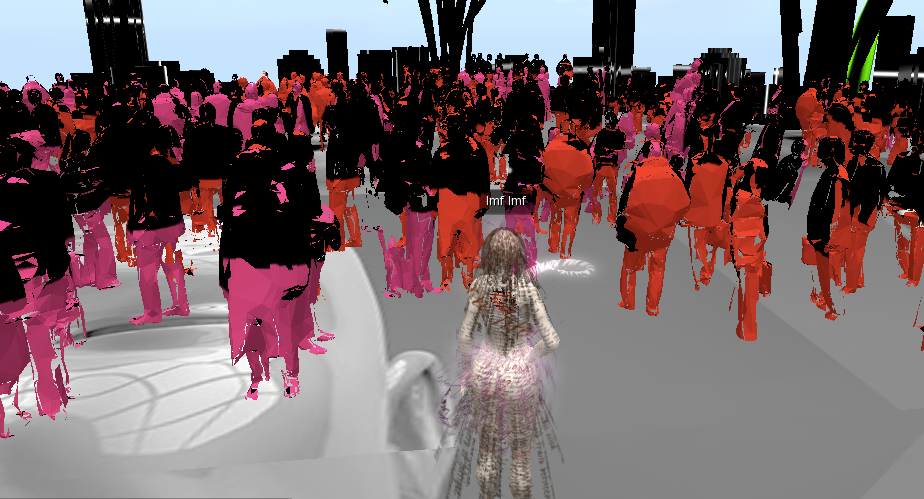
After a few hours of browsing many unremarkable videos and digital collages, I decided to go in hard and look at a virtual reality pavilion entitled “Wronggrid: L'art en Simulation,” curated by Frère Reinert and Ellectra Radikal. I had to download various applications and join something called Francogrid (not so different from Second Life). This simulated artworld is chiefly populated by virtual sculpture—giant heads, impossible forms or architecture, or world-building installations that cohere most readily in a simulated environment. An artist using the name TTY made a roomful of red and pink sculptural figures that alternatively flashed with black light while words THE HUMAN COMEDY dangled above them from the sky presumably to create the effect of a hellish party. I fell off that platform through the sky into other worlds featuring sculptures that I couldn’t identify, such as some giant upside down carrots, but as the teleporting device kept losing connection to the grid I left with little more than the impression that looking at art in a world-building environment suggests three dimensional shapes rather than images, videos, sound, or performance (though these may be interesting, where they exist).
To look to a specific pavilion that produces something of a net art trope, CALL.IO.PE, curated by Morehshin Allahyari, is focused broadly on internet poetry, and gladly includes a couple of medium-specific contributions that address browser space. Ying Miao made a series of pleasant, melancholic gif animations in which a browser error page appear on a wallpapered desktop. These have all the hallmarks of a particular form of cute netty aesthetics—overdone affect rendered in sparkles and tears, low-res stock wallpaper, generic graphic imagery from various outdated O/S, animated Word Art—and yet even such trite sentiments as “Flowers all fallen / Birds far gone” have the ability to raise some form of checked-out emotion when such sentimental designs are seen against the miniature horror vacui of a browser that says “This page cannot be displayed.” In Sam Kronik’s video Consensual Vibes, a group of people dressed in blue jumpsuits play word-association games in a giant geometric hole in the desert while they sit around a wooden machine. At the end of the game, the machine appears to perform a kind of poetic Tinder operation, picking up on “consensual vibes” in the participants’ language, and eventually producing a printout that reads “it’s a match!” on certain spoken words—“BODY + PATENTED MEAT”—which are then paired like a hot couple on a dating app. It’s heavy-handed, sure, but perhaps flags up the ways in which “poetic” uses of language might have partly developed out of the various forms of needy advertorial for the self on social media. One’s virtuosity with language is a tiny currency that can be used to accrue forms of attention: sexual, commercial, professional.

Poetry and the experimental virtuosity with words that have also been ushered in by the widespread use of emoji, ASCII, acronyms, instant messengers, and so on, is perhaps also flagged in this pavilion by Heather Murphy’s contribution to the project, The Honesty Initiative, which purports to be a Government-funded chatbot who attempts to learn the difference between honesty and dishonesty. When you chat to the bot, whose name is Abraham, he actually says things like “Time does not exist,” or “The Government made me this way.” The Government! LOL. It’s almost quaint to imagine that we have this monolithic organization when in fact what we are facing is rendition, outsourcing, contractors, agencies, and so on. Talking to Abraham is fun for a second, but the banality of his statements lacked anything textually experimental, or for that matter, lyrical. As a form of poetry it brings to mind the Q&A form of Anne Carson’s “Ghost Poem” (2011) which suggests fuller potentials, fears, and joys of talking to a being outside easily graspable ontologies:
Q what about moods
A the edges are freezing
Q is that good
A yes
Q is it crowded
A are you joking
On the subject of ghosts, a last Pavilion of note: “Not Found, A Broken Net Art Exhibition,” curated by Cesar Escudero Andaluz and Mario Santamaría. The pair identified various net art projects that had died online, suffering a common fate due to lack of resources or archival care, and simply made a list of broken links and project descriptions. These included Gerardo Suter’s 1999 project TranSistus which (according to the surviving description) was apparently a simulation of a fictional virtual United States–Mexico border crossing via containership, used as a site for exploring a character’s memory retrieval, and Thompson & Craighead’s 2002 conceptual online shop project DOT STORE hawking a variety of lighthearted product ideas and readymade net generated produce (other people’s e-cards, gif tattoos). Stumbling across their own project listed in “Not Found,” the pair resurrected the site as a ruin open for browsing. Products on sale included “TEACH BIRDS 2 SING,” an audio CD designed to help mimicking bird species adopt mobile phone rings, which is a phenomenon I remember people talking about around the turn of the century. Imagine finding one of those birds now, calling out Nokia ringtones from 2002. Our vocal chords have learned the language of other machines now, little bird.


