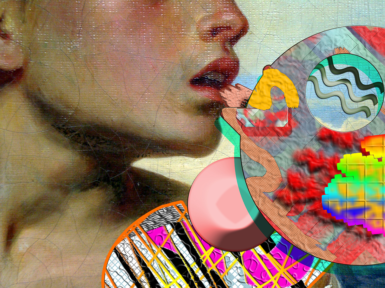
The latest in a series of interviews with artists who have a significant body of work that makes use of or responds to network culture and digital technologies.
GC: As a trained painter with strong roots in the Argentinian geometric abstraction tradition, how did you begin to dabble in digital media? Are the ideas/processes initiated in painting and then translated into digital production, or the other way around—how does it work for you?
AM: I started studying painting at 15 with Diana Aisenberg, and even then I assumed painting not as a mere material practice, but as a set of ideas and visual languages that are useful to approach all kinds of media. In my last year of college I made miniature recreations of metaphysical Italian painting using trash and toys, and I also worked at a design studio where I made my first animated .gif, based on one of my oil paintings.
My relationship with geometry and abstraction grew from the metaphysical paintings of the Argentinian groups Madí and Arte Concreto Invención, but even before I ever read about feminism or queer theory, I found the whole western canon highly misogynistic; not only because it is a history of male artists but also because it rejects themes and issues normatively read as "feminine": the sensible, the sweet, the pretty—everything existing outside of the European rational male; the body as an intelligent organ, sexualities, humor, vulgarity, crafts, and decorativeness. In the same way that the Bauhaus considered textile art as somehow below other artistic expressions, that sort of gesture is prevalent in art history. I could never find anything about female metaphysical painters.
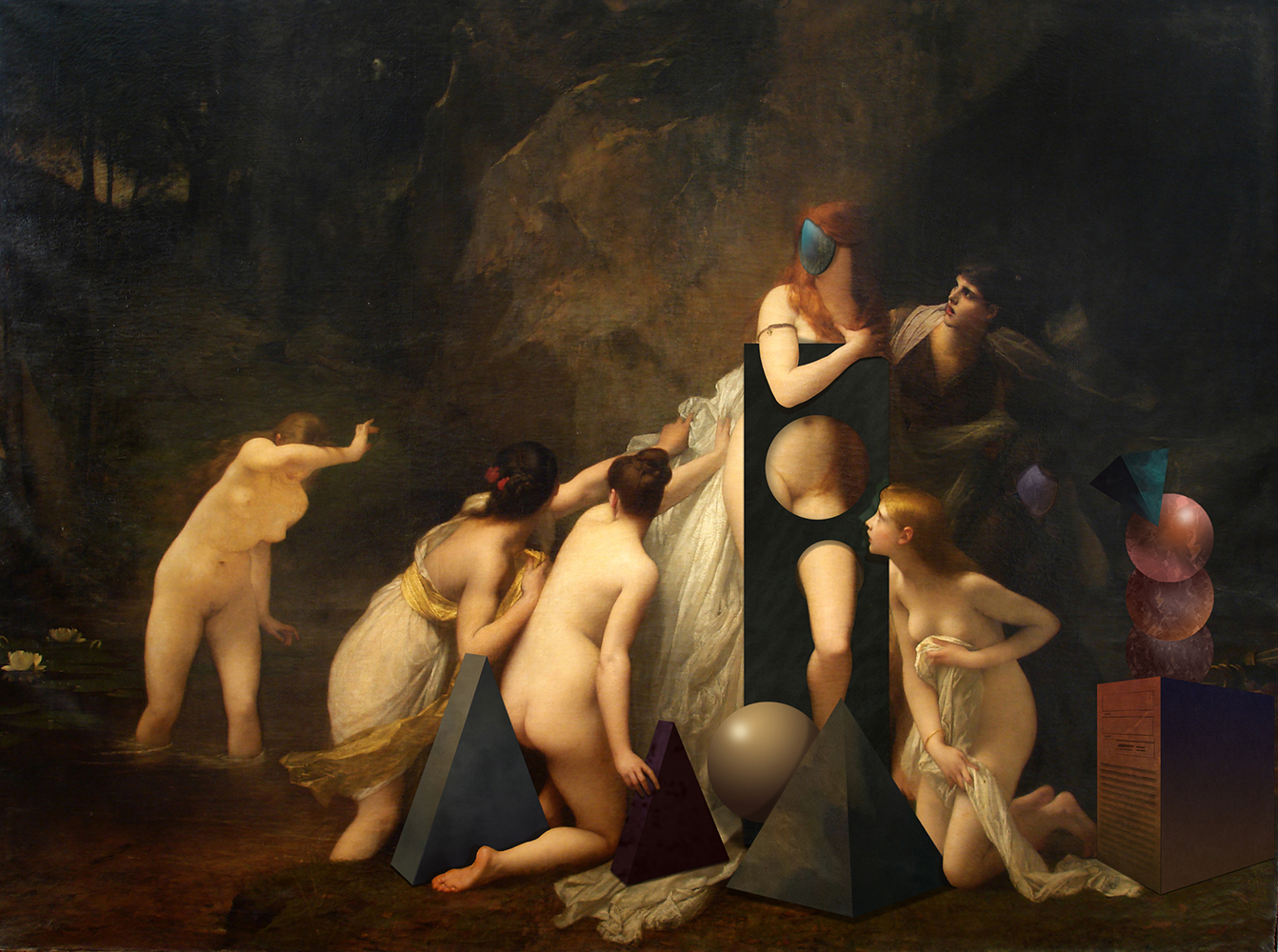
Ad Minoliti, NINFAS (2015)
When I was a teenager, I would make photonovels with metaphysical and geometrical characters; it was a sort of critique of the repressive and conservative themes most commonly used by metaphysical painters to discuss essentialist truths. I would have legs and modern chairs involved in heterosexual tragedies, or scenes involving buildings and plants to represent, respectively, masculinity/rationality and femininity/the organic, until I finally understood that to really expand those relationships I had to try to extract the human from the equation: modernist thought handed down to us a binary logic of the world. Masculine/feminine, culture/nature, order/chaos, evil/good, are mere discursive constructions to disguise, perpetuate and legitimize domination. And so, if this discourse was behind the metaphysical paintings I was studying, what was left out of their reductive avant garde? Infinite possibilities.
I found in digital media the best tool to go forward, and I started to make collages that could mix together everything that had previously been separated into categories and opposite relationships. I think that’s the reason our time is one of remixing and covers.
There is no dichotomy; my paintings and digital production are not separated, they are bodies and bridges growing between different themes and concepts—they feed off of each other. There’s not really an evolution from one to the other; instead, the mixing of different media in an installation creates a new hypothesis where "style" as capitalistic branding has no place, and geometry, bodies, and femininity mix together to create new meanings.
I’m super grateful for queer and feminist theory because they are essential to the exploration of new perspectives in every field, including painting. I have always been interested in art as criticism: abstraction and geometry are tools to represent a utopian reality outside human categories. What’s the purpose and function of a painting? How would an aphrodisiac painting look? Could a triangle be arousing? How to create desire without the predispositions of the human body or the sexual ideals of the pornographic industry? How could kinetic geometry work as post-porn?
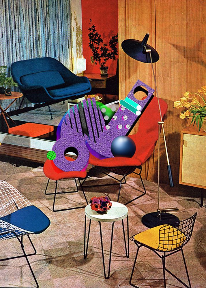
Ad Minoliti, QDECO1 (2011-)
GC: In your series of digital collages, PLAY_G and Queer Decó you intervene in, and essentially create geometrical inhabitants for, the images in '60s/'70s Playboy and interior decoration magazines. Can you talk further about the relationship between interior decoration and your works’ core themes of sexuality and queerness? What kind of connections unfold in these works?
AM: Queer Decó was the first series of interventions where I combined various aesthetics from different decades. The whole point was unleashing geometry in a domestic setting, and seeing how these geometrical creatures worked to reconfigure that space—one usually regarded through heteronormativity as feminine.
In my paintings I put these same figures in nature as re-imaginings of Manet’s The Luncheon on the Grass or other famous scenes of nymphs in the outdoors. I found that domestic interiors and nature are both thought of as feminine or soft entities as opposed to depictions of modern architecture.
When it came to intervening in porn, or Playboy magazines—an industry run by men—it was necessary for me to transform the subjects in the images into post-humans, potential cyborgs, for them to become bridges to new and exciting (arousing) geometrical forms. The transition from decoration to porn magazines was informed by Pornotopia, the book by Paul B. Preciado in which he wonderfully explains the golden age of Playboy in relation to its context: architecture, design, mass media, drugs and technology. Further reading of Preciado helped me understand the forms in PLAY_G as pictorial prosthesis: possible futuristic devices decolonizing the contemporary sex/reproductive-organs default system. I like the definition of them made by the group Micropolíticas de la Desobediencia Sexual en el Arte [Micropolitics of Sexual Disobedience in Art]: "Desire driven porno-geometric machines."
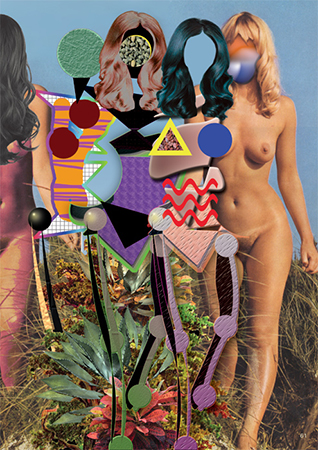
Ad Minoliti, PLAY_G-3gracias (2014)
GC: Your next collage series Museo Queer and CSH #14_Utopia uses your own pictures of the Louvre Museum and the "Case Study Houses" project commissioned by the Arts & Architecture magazine to architects of the '40s-'60s. Can you explain what these cultural references—modernist architecture, European museums—have in common with the previous ones—porn, interior decoration—and how you select them?
AM: Museo Queer was a specific project for Museo La Ene in Buenos Aires, worked around the fact that it’s an institutional critique-kind of museum. My project involved intervening in images that I took of the rooms at the Louvre Museum, and the way in which certain spaces would be modified if their users were no longer human bodies. Would it change the regular format of an exhibition? What would happen if the walls were pink instead of white? The show at La Ene featured white walls covered with spray painted green wiggly lines—a sort of humorous yet critical gesture.
CSH #14_Utopia is a continuation of Queer Deco, centered on this specific architectural project. The magazine chose only to invite male architects, and for some unknown reason, skipped the production of the 14th home. I was interested in claiming this empty space, one that looks like a domestic fantasy (to a foreigner it looked like a home for the Jetsons).
Both series try to tackle the question of "usership:" how classic museum design and modernist architecture that we take for granted is just another leftover prejudice originating in the idea of the white male as the universal ideal. So-called "universal" museums were created by men for men, just like porn. We can think of these spaces as spaces of the patriarchy.
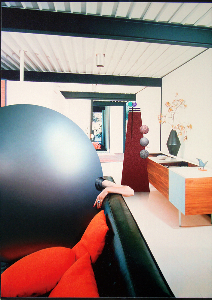
Ad Minoliti, CSH_21 (2015)
GC: In most of your painting shows you subvert white cube simplicity, going instead for pastel wall colors, paintings hung in corners, abstract furniture-like objects, and TV screens that add both content and context. Intervention into space, architecture and exhibition technologies are at the core of your physical practice. Does your digital work complement this?
AM: I’m always trying to reconfigure art spaces, changing the ambience in rooms and galleries. I believe the white cube is charged with a history that might be prejudicial to paintings. It’s presented as a vacuum, as actual emptiness that’s supposed to elevate the artworks; but in reality it just re-enacts the logic behind museums, denying the importance of context in the construction of images. Artworks are not autonomous or absolute truths; they’re devices or platforms for different ideas and concepts.
All my shows are pre-planned on Photoshop so that I can have a spatial idea and design a specific story for the gallery. In that way, my digital work complements my painting and powers my installations—it’s an integral part of it.
My show "PlayPen" was at a cultural center in Buenos Aires that used to be a convent and a nursing home, so I wasn’t allowed to alter the walls. I used cat stickers in the same humorous/critical feminist gesture I’ve made before through pink paint, and I created a sort of metaphorical installation by turning my show into a 3-person room: colorful platforms worked as beds lined up next to the 3 windows in the room, along with 3 different digital collages working as bed covers and 3 screens in front of each bed displaying different videos and animated .gifs. I like that idea of a functional image—images that keep you warm. I was also thinking about the collective living described by Silvia Federicci as offering alternatives to the typical cellular heteronormative concept of family.
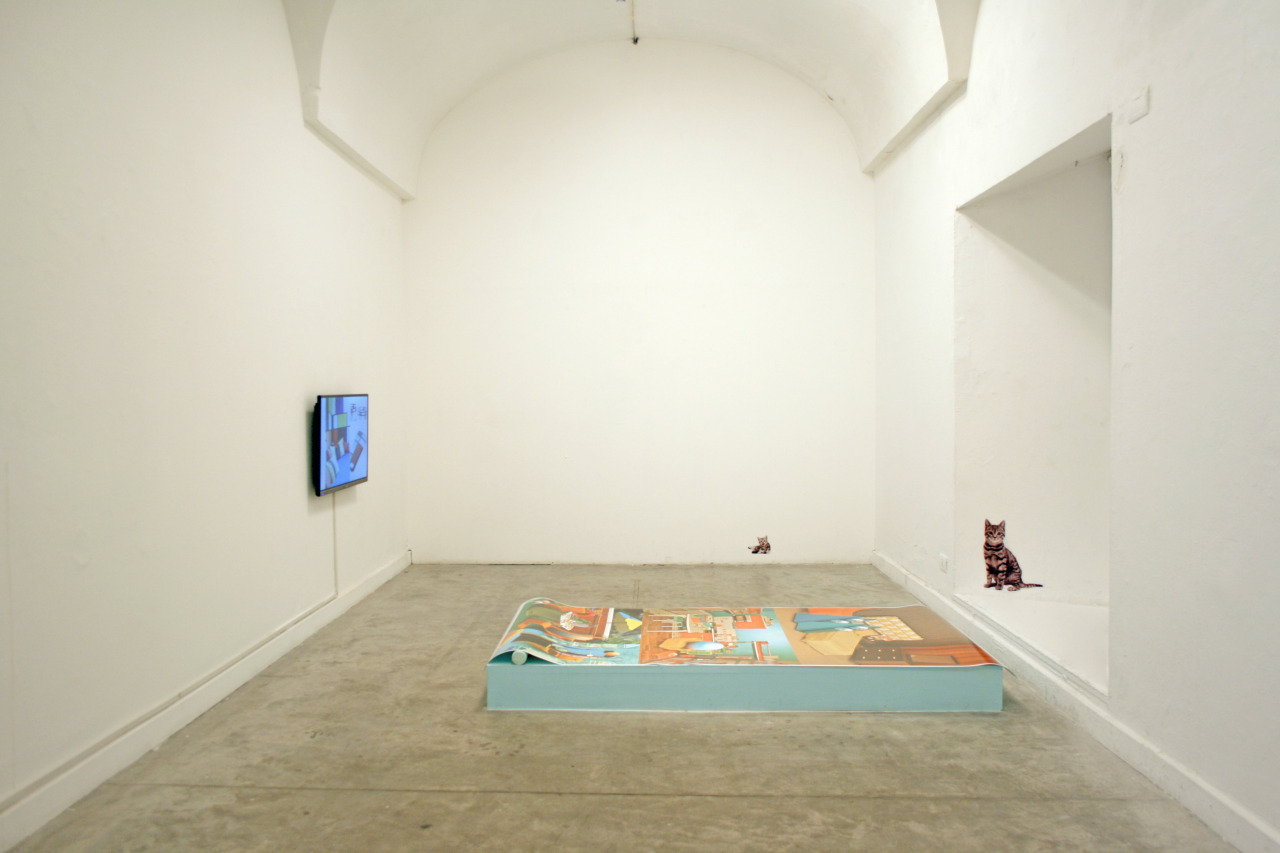
Ad Minoliti, "PlayPen," exhibition view at Centro Cultural Recoleta (2015)
GC: You have been working with Argentinian artist and programmer Mariana Lombard on the browser-based project -PLAY SIGNIFICANT OTHERNESS-, described as "[...] a genetic algorithm related to feminist theory and technoscience from Donna Haraway and the biologist Lynn Margulis [...] a geometric representation of a non-Darwinian artificial life". Can you expand on the motivations behind this project? Is it a game, a landscape? How does it look and work?
AM: Mariana and I were thinking about possible life-forms that were not harmful to each other or to their environment. We were talking about Donna Haraway’s work and Lynn Margulis’ symbiogenetic evolution. Her theory is not accepted by many in the scientific community who are not willing to remove or rethink competition’s role in evolution.
We don’t believe in competitive evolution. Capitalism took Darwin’s theory as a slogan: Survival of the Fittest, and used it to naturalize domination and violence. In most common digital life emulators subjects end up dying, eating each other up, or starving to death. I wanted to create a system where life worked on exchange and cooperation: subjects aren’t born, they don’t reproduce or die. Like Donna Haraway’s cyborgs, there’s no genesis, just like the "time out of time" of metaphysical paintings.
Our beings find each other, exchange information (shapes and colors), and go their separate ways to run into other subjects and continue their mutation. Their bodies/shapes start to change, lose their boundaries and become temporary bodies. That’s essentially my fantasy universe where geometrical beings also coexist within the digital and the paintings.
-2015.jpg)
Ad Minoliti, -PLAY SIGNIFICANT OTHERNESS- (2015)
Questionnaire:
Age: 35
Location: Buenos Aires
How/when did you begin working creatively with technology?
2003, digital photonovels: I would make mock-ups, photograph them and project the sequence.
Where did you go to school? What did you study?
Escuela Nacional de Bellas Artes Prilidiano Pueyrredón for painting.
What do you do for a living or what occupations have you held previously?
I work as an artist, and previously as I was a designer and professor.
What does your desktop or workspace look like? (Pics or screenshots please!)
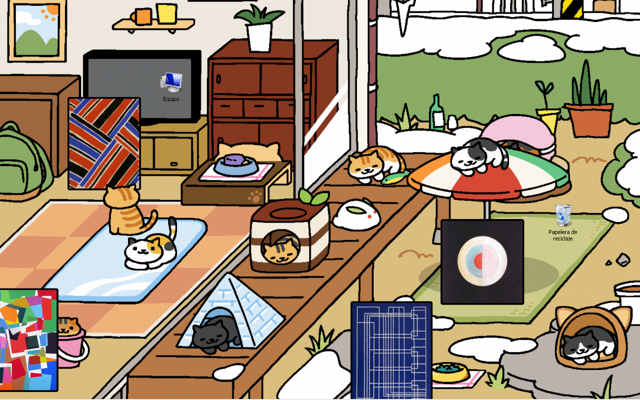
Top image: Ad Minoliti, MUSEOQ2 (2013-14)
