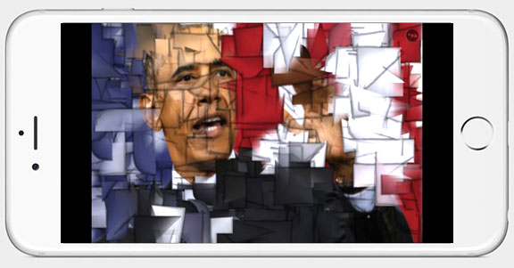
"The Facets of Obama" created by Jonah Brucker-Cohen using the Fracture application by James Alliban, 2011
The devices we carry with us can do much more than simply act as communication tools and entertainment appendages. They can also bring us into a growing world of artistic projects that could have never been imagined without their existence.
The recent boom in creative software for the iPhone and iPad now enables artists to remake existing web projects as iOS apps or use the physical world as a canvas for augmented reality, reimagining our physical surroundings through painting and rendering. In this article, the fourth one in a series that I've written over the past six years of reviews surveying art for the iPhone and iPad, I cover projects that both revive net art pieces that were once only possible on traditional computer systems or in browsers, as well as those that use the iPhone and iPad's sound and camera capabilities to their fullest.
.jpg)
Thicket:Classic (Hairy Circles mode), 2011, Interval Studios (aka Joshue Ott and Morgan Packard)
Beginning with abstraction and sound, two works examine methods of sound production through algorithmic composition. Thicket (2011) by Interval Studios (programmer and artist Joshue Ott and composer Morgan Packard) is an amalgam of abstract shapes and patterns that engage with touch-based interaction, visual stimulation, generative pattern creation, and mesmerizing sound transference. The original version of Thicket, or Thicket:Classic, feels like a musical masterpiece on the edge of a high precipice. As a user changes the orientation of their phone in four directions (up, down, right, left) the onscreen graphics shift to new modes.
Thicket 3.11 Video, Joshue Ott and Morgan Packard, Interval Studios.
My favorite mode in Thicket:Classic is "Hairy Circles," which features menacing yellow-orangish circles of tangled lines that correspond to each finger's touch and shift when dragged around, creating a machine-like beat that evokes an industrial assembly line. Ott explains, "Thicket uses a bunch of different algorithms—for both audio and visuals. The aesthetic came from repeated experimentation and rapid prototyping of modes. Sometimes we would start with the visuals, sometimes with the audio, but there was often a back and forth process of each of us adjusting our part until we both liked the results."
"It's all very intuitive, rather than thought-out, " adds Packard. "At the time we started Thicket, I was coming out of a period of being very involved with a lively group of indie electronic musicians and record labels—Ezekiel Honig's Anticipate label in particular. The idea of a group of artists forming a scene, forming a tiny tribe, and developing an aesthetic of their own has always been very close to my heart. So with the sound at least, I was looking toward the sounds my friends and I had been making, and trying to make stuff that fit into that aesthetic world."
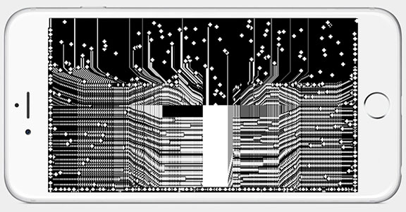
TURUX, Lia, 2015
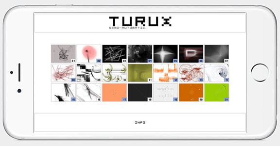
TURUX Interface , Lia, 2015
Also playing with sonic possibilities through the screens of the iPhone and iPad is Austrian artist Lia, who has remade her RE:MOVE (www.re-move.org) and TURUX (www.turux.at) interactive websites from the late 1990s. Lia, who herself also maintains a personal and very useful online archive of iPhone art at iphoneart.org, continues to be prolific as a solo artist using this medium. What used to exist as Shockwave-enhanced web experiences has since migrated to the handheld and the results are a much more seamless experience overall. The current version of RE:MOVE features algorithmic compositions that endlessly auto-generate into abstract patterns of lines, circles, and waves. The app features an abstract menu and control system that allows users to customize their sonic and visual output with surprising results every time the app is launched. Since no two users can have a similar experience, the app maintains our interest through its ability to stay fresh and offer new experiences the more one manipulates its underlying system.
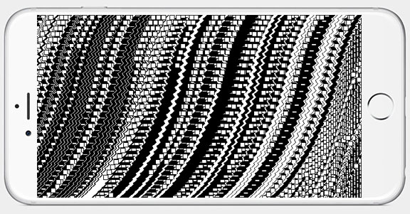
RE:MOVE, Lia, 2015
TURUX also plays with this dynamic of shifting abstract patterns but does so with a more colorful interface of twenty-one different composition modes that mix minimalist shapes, dynamic sound effects, and interactive vector graphics. Lia explains the reasoning behind the piece and her focus on code as a method for understanding and playing with generative possibilities. "My lack of understanding the code structures in the beginning probably helped getting unexpected results," explains Lia. "The aim was never to think everything through from the beginning on, then sit down and program it, but to play with code itself...simply put: exchange a plus with a minus in a formula that you don't understand and a) something interesting might happen and b) you might learn how the formula actually works. The idea behind the experiments on TURUX as well as on RE-MOVE later on was in principle not to explain everything to the user, but let him/her play..and experiment as much him/herself....With RE-MOVE I added a lot of tiny buttons, that basically allowed the user to change parts of the executed code without knowing what will happen, buttons without labels."
Fracture (2011), James Alliban, video of iPhone app.
Further engaging with the camera to create both abstraction and augmentation is British designer and programmer, James Alliban's trio of apps, Konstruct, Fracture, and Composite. After playing with these three interactive marvels for a few minutes, it becomes obvious that an entire article could have been dedicated to his work. Each piece feels novel in its ability to manifest new ways of interacting with the everyday, physical world, and the sense of limitless composition that it offers. Fracture is not only a painting tool, it is a real-time video and still image mixing application that allows users to create portraits like those painted by Pablo Picasso and Georges Braque in the early 1900s through the iPhone and iPad's cameras. Although some might write these graphical renderings off as the equivalent of Photoshop filters, the ability to paint a picture from live imagery as seen through the camera using Cubist-style brushes is something that only an app could accomplish. "The intention was definitely to allow users to recreate this aesthetic using their own subjects," explains Alliban, "Although for the more creative users I made sure there was enough room to step outside of this style and create their own imagery. It was interesting to see some of the work people made with it."
New York Nearest Subway, AR App for iPhone from Acrossair, 2009.
Konstruct, James Alliban and Juliet Lall, 2011
Working in the realm of 3D space, Alliban and collaborator Juliet Lall's Augmented Reality (AR) app Konstruct allows users to create an AR environment by speaking into the microphone on their device, which then dynamically generates a 3D object floating on the screen over the camera's vantage point. This abstraction retains its simulated depth as one moves the iPhone forward and backward through the 3D creation. Alliban describes touch interaction as something that is becoming so ordinary, that it is losing its appeal in the context of digital art. "Touch is such a personal, private, and, lets face it, boring interaction. Forcing people to speak, sing, whistle or clap makes the experience a type of (potentially collaborative) performance. Much of my work invites the user to play and perform in space to create abstractions of some aspect of themselves. Space is one thing that smartphones tend to lack. With Konstruct, however, just as the AR aspect broadens the interaction area beyond the tablet screen, incorporating sound broadens it further." As the phone and tablet's processors get faster, this type of experience will be more common and built into more apps that we now use daily, engendering new ways of experiencing information retrieval and public space. These types of locative applications for AR are already evident in apps like Across Air's Nearest Subway, which made its debut back in 2009. The app displays a floating arrow that points the direction to the nearest NYC subway station, as well as its name and distance from the phone.
Finally, Alliban is interested in ways we can better our seen reality through the lens of a device by virtually painting on the world around us as if it was a giant canvas. His app, Composite, was "inspired by the neo-dadaist collages of Robert Rauschenberg. Composite runs on both Windows Phone and iOS [iPad only], and allows you to remix your surroundings to create artistic compositions." By "remix," Alliban means paint and color the world around us through the lens of your device, altering an image of your surroundings in real time. The device allows you to work on captured images, then layer new views from the live camera on top, allowing multiple perspectives in a single composition. Alliban explains that his work riffs on Rauschenberg but stands on its own. "Although Composite was inspired by the work of Rauschenburg I didn't make it intending myself or others to use it to replicate his visual style (although some did to some extent). It was more a case of adopting the spirit of his work—the idea of telling stories using the things that surround you. I did, however, keep it open enough for users that want to experiment. Like Fracture, it was important not to constrain users to a single aesthetic."
Composite, James Alliban, 2011.
Also playing with movement and engagement in physical spaces with people and their mobile devices are the Dutch and Belgium based collective of Joan Heemskerk and Dirk Paesmans, a.k.a. JODI.org. Their app, ZYX.app, uses a minimal stick figure and audio feedback to guide users through a series of gestures while holding their phones, such as turning in a circle or raising their arm up and down. When the gesture is performed correctly, the phone lets out an audible "click" sound and a celebratory alarm goes off notifying the user of their success. ZYX.app transforms the user into a performer, amplifying the the ways in which people already engage with their phones by moving around while talking, pacing, breaking away from a crowd, or siphoning frustration through the device. JODI explains the connection between software apps and how they relate to our bodies movements in physical space. "ZYX.app is a tool for physical performance, it calls for the user's postures overdoing mobile body language. We focused on the sensor kinetics inside the phone, programming the gyroscope and the accelerometer to involve the user movements and using the screen only for interaction directions. While swinging and jumping around with the mobile, the user gets returning signals, as sound and vibration. The screen serves as a counter for initiating the next content."
Video of ZYX.app, JODI, 2012
As prolific as artists can be, none seem to be producing as many abstract apps as Jason Edward Lewis. Lewis, an Assistant Professor of Digital Image/Sound and Fine Arts in the Department of Design Art at Concordia University in Montreal, makes work that re-examines the world of text from a novel perspective. Lewis creates generative apps that allow users to compose new and recycled poetry into endless iterations. The P.o.E.M.M. Cycle or Poetry for Excitable [Mobile] Media is Lewis' main series of iOS apps that challenge our interaction with the screen. Lewis explains why the iPhone's interface has changed how he thinks about screen-based composition and interaction. "I had been frustrated for some time with the development of electronic literature, and one point of frustration was the conventional keyboard-mouse-screen configuration," says Lewis. "It felt physically distant, with the awkward triangle between the three, as well as impersonal and utilitarian, given the general purpose nature of the standard workstation. It wasn't comfortable, it wasn't focused—and it wasn't intimate, in the way I felt writing and reading poetry required."
Video of The Great Migration (Installation Version of iPhone app Migration), Jason Edward Lewis, 2011
This type of direct connection to the user is a quality that that many artists have been trying to gain from mobile devices where the traditional computer interface of the keyboard and mouse runs short. Lewis explains this point of contention. "At first, we were of course focused on the phone. Then the iPad came out in mid-2010, and I realized that was really the right form factor. We had been putting a ton of detail into the exhibition versions that was just getting lost in the small screen size of the phone—the pad allowed us to keep most if not all of the detail found in the exhibition versions. Yet it was still an intimate, personal device, and its single-tasking nature allowed you to create a powerfully focused experience for people. People have a personal connection to their mobile devices that is much rarer for their desktops or even laptops; if you design your apps well, you can leverage that connection."
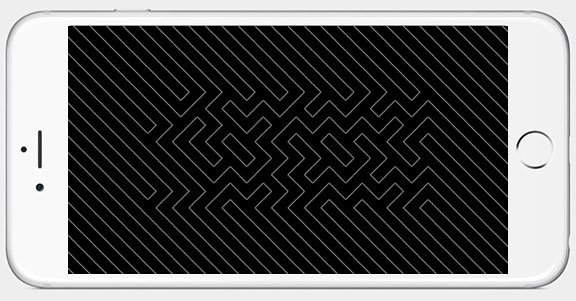
BIFURCAN, Devine Lu Linvega, 2015.
Leaving the realm of animation and narrative composition, there is also a trend towards minimalism that is bringing artists to these platforms. Turning the iPhone and iPad into a cryptic and beautiful timepiece is BIFURCAN by artist and designer Devine Lu Linvega. The interface is both purposely unusable and elegantly poetic in its representation of the passage of seconds, minutes, hours, and days. The project is named after a Borges short film of the same name, and manifests time as a constantly rearranging labyrinth that changes as each second ticks away. Creating it in only 30 minutes during a coding jam session, Linvega has released its source online in an attempt to lead more developers to create versions of it for more platforms. One such version of BIFURCAN written by artist Chase Colburn is a watch face for the Pebble Watch. With all of the possibilities that these devices allow for in both interaction and location-based information, there is a calming feeling when artists only use it for minimalist output such as a watchface or timepiece. By limiting its capabilities, the device seems to become much more than its original creators had imagined.
As platforms for digital art continuously expand with the plethora of devices and methods of delivery, there seems to be no limit to what artists can accomplish with these form factors. In fact, my next article on the subject might cover artists apps for the Samsung and Apple watches, which would be the most personal method of art delivery yet on a digital medium. Integrating artistic endeavors with built-in heart monitors and force-sensitive touch screens (which is supposedly also coming to the next generation iPhone 7), there will be many different input sources that artists can leverage to create new forms of interaction. The most striking aspect of these projects is that the medium allows for artists to engage with people interacting with their work on a personal and intimate level, far beyond what any gallery or museum might afford. Now, anyone with a phone can engage with art on the go, carrying a personal collection of artworks that allow new kinds of artistic experiences and new forms of interactive artistic expression.
Given the incredible power of the handheld device, which is daily relied upon by millions of people while also marketing to them and surveilling them, carving out a space for aesthetic experience through the device seems particularly important. Thicket's Morgan Packard puts it bluntly: "The work Joshue and I have done together, in contrast to data viz and design, has no immediately obvious value or use. It doesn't tell stories, it doesn't make the complex accessible, it doesn't reveal the beauty of nature. It's really just an exploration of how certain arrangements of light and sound and a certain type of control over them can make us feel."
Jonah Brucker-Cohen, Ph.D., is an award winning researcher, artist, and writer. He received his Ph.D. in the Disruptive Design Team of the Electronic and Electrical Engineering Department of Trinity College Dublin. He is an Assistant Professor of Digital Media and Networked Culture and the Director of the Digital Humanities MFA program at Lehman College / CUNY. He is cofounder of the Dublin Art and Technology Association and His work and thesis is titled "Deconstructing Networks" and includes creative projects that critically challenge and subvert accepted perceptions of network interaction and experience. His work has been exhibited and showcased at venues such as San Francisco Museum of Modern Art, MOMA, ICA London, (Artport), Canadian Museum of Contemporary Art, Palais du Tokyo,Tate Modern, Ars Electronica, Transmediale, and his project Bumplist is included in the permanent collection of the Whitney Museum of American Art. His writing has appeared in publications such as WIRED, Make, Gizmodo, Rhizome, Neural and more. His Scrapyard Challenge workshops have been held in over 14 countries in Europe, South America, North America, Asia, and Australia since 2003.


Another app I forgot to add to this article's thematic focus is Brooklyn based artist, Jason K. Smith's "UZU" which has ben one of my favorite generative iOS simulations for a while.
Link: http://colordodge.com/uzu/
AppStore: https://itunes.apple.com/app/uzu/id376551723?mt=8
If I may, I would also like to point out my own generative artwork for iPhone, Dancing Wu Wei:
https://itunes.apple.com/app/dancing-wu-wei/id654740820
thanks
RH