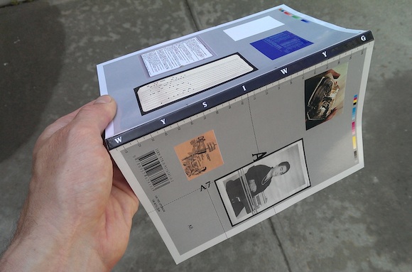
Marialaura Ghidini, ed. On the Upgrade: WYSIWYG (or-bits.com, 2013).
One of the most intriguing things about On the Upgrade, a series of publications resulting from the activities on online exhibition platform or-bits.com, is the way it considers shifts in formats. At first look, the book series seems like a kind of flexible archive. The web-based projects of or-bits.com are reflected in printed form in the books: artists who contribute to the publication are those who participated in the various online projects of or-bits.com. And the book is used as a way to disseminate, document, or expand the work within a different scheme.
But the transition from online to print is not always seamless. In the introduction to WYSIWYG, the latest On the Upgrade publication which came out in May, the book is described as "a new configuration of the works." While some of the online pieces are more amenable to the book format (Julia Tcharfas’s research, presented in typewriter typeface, looks natural in print in a way that would always look precious online), others are distant cousins of their online iterations (a transcription of a live online radio piece by Sara Nunes Fernandes).
A book is a more stable format than a webpage, for sure, which is one of the reasons why a lot of online publications publish physical books as well. But if considered purely as an archive—and especially as a way of archiving, or even simply documenting artworks—a book also introduces a number of new problems in relation to other iterations of any given project online. For example, in WYSIWYG, the footnotes to artist David Horvitz's contribution include multiple references to Wikipedia—content that is subject to change over time in a way that a book is not. In comparison with online publishing, the book format is not just stable, it is also rigid, unable to reflect shifts in circumstances or any other development.
The real contribution of or-bits.com’s publishing initiative is the way in which it considers the book as an interface. In the case of WYSIWYG, this concept led to a series of guidelines sent to the artists (the book will be an A5 size bound book, the work should be presented linearly across five pages, etc.) in preparation for their contribution. Thinking about the physical form of the book and referring to it as an interface seems pretty radical, especially for an organization that publishes online. The transition from the internet to the offline, printed book shouldn’t be seamless and mindless, it should be considered—and it so rarely is.
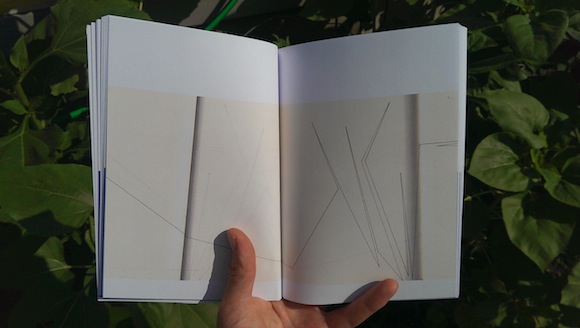
The materiality of the interface is a great guideline. WYSIWYG needs to be held vertically and horizontally, which would be a problematic exercise on a device that automatically rotates the page to keep it upright at all times. It has certain contributions (like Renee Carmichael’s and Maria Theodoraki’s pieces) that extend across the width of a two-page spread. These don’t translate well in a PDF format, but look natural and graphically enticing on the page.

Excerpt of Maria Theodoraki, the line (2010-) as published in On the Upgrade: WYSIWYG.
The more we use the internet for experiments with ways of displaying and disseminating art, the more discussions will be generated about how contemporary art is communicated online. WYSIWYG is conceived as a book exhibition (or an exhibition bound in a book) and it’s a good example of an offline translation of or-bits.com’s particular exhibition structure. We should support such structures that work beyond the binary division between offline and online presentation, because bringing these spheres into dialogue reveals new possibilities and impediments for artists and publishers.
These questions are relevant to Rhizome’s own activities. Could The Download program, which offered digital artworks to be downloaded and experienced on individual users’ computers, somehow be translated to an offline publication? Would that be valuable? Why should we want to move it offline? On the Upgrade doesn’t provide an answer to these questions, only one good example as to why we should be thinking in these terms—because the result can be an inventive, yet still self-reflexive space in which to consider formats of presentation and dissemination of work.

