Image from CMD SHIFT 3 .NET by Emilio Gomeriz
Everyday we use digital tools to create, edit, and document our work. We click fastidiously into the graphical user interface (GUI) of applications, seeing expected results while trying to ignore the friction of bad design, failed UX, and glitches. Most actions are conducted successfully and the interface holds its transparent position. But despite the GUI’s seemingly innocuous presence, its aesthetic leaches its way into our own. How we view our creative process and documentation is minutely and incrementally shifted by the frame of the interfaces we routinely use.
Douglas Engelbart's 1968 demo of NLS (online system)
The current paradigm of the user interface had its first introduction on December 9th in 1968 when Douglas Engelbart demoed his famous NLS (online system) at the Fall Joint Computer Conference in held at the Convention Center in San Francisco, CA. Engelbart and his team at Stanford had an innovative vision driven by desires to improve the ways people communicate and interact with each other and computers. It was the public debut of the mouse. The work produced by his group went on to inspire the most basic interactions used in Xerox’s Star graphical user interface and almost every operating system since.
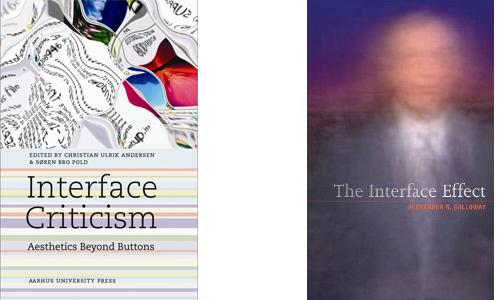
Critical inquiry around the implications of interface aesthetics has been around since 2004 when Søren Pold organized the research project Aesthetics of Interface Culture. In an essay titled Interface Realisms: The Interface as Aesthetic Form published in 2005, Pold declared that we should “... start seeing the interface as an aesthetic form in itself that offers a new way to understand digital art in its various guises...” His essay, extending to 43 sections, lays the groundwork for deeper explorations. More recently, critical research around the interface has resurfaced in two books; one edited by Søren Pold and Christian Ulrik Andersen published last May titled Interface Criticism: Aesthetics Beyond Buttons, and a second coming out this October written by Alex Galloway titled The Interface Effect.

(Left) Interface Criticism: Aesthetics Beyond Buttons, 2011, edited by Christian Ulrik Andersen and Søren Bro Pold, (Right) The Interface Effect, 2012, written by Alex Galloway
Denying the effect of the interface on the digital artist, or frankly any artist, is impossible. From the collection of artists’ desktops in Alexi Shulgin’s Desktop Is project, created in 1997, all the way to Adam Cruces reinterpretation, Desktop Views, completed earlier this year. In the time between artists like JODI produced works (GeoGoo, for example) that turned the interface into a material for autonomous performative experimentation and spectacle.
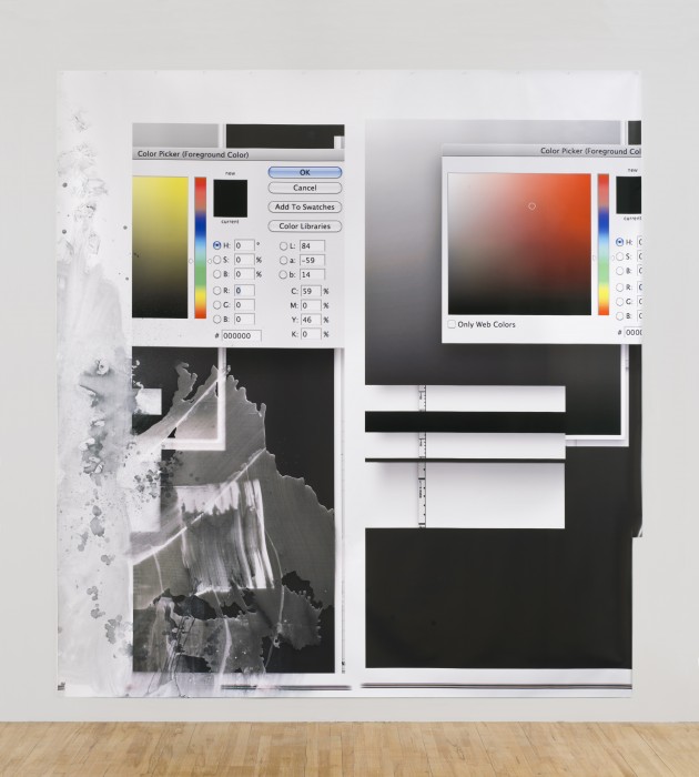
The interface has become a stock material for appropriation and defamiliarization. In Constant Dullaart’s TOS, the search interface is decoupled from its function only to become a literal mouthpiece reading Google’s own terms of service, which are infrequently, if ever, read by the site’s users. Anders Clausen collages and prints the graphical user interface of OS X at scales that shift the blue gel scrollbar pieces into images of giant pool-like pills. Emilio Gomariz continues a similar type of exploration on screen in his series of works title Macintosh / Lab. His video work in the same series takes a different direction by highlighting the aesthetic experience of interaction - setting up banal, but beautiful performances of windows transitioning from a minimized icon to their original size, slowly becoming an extruded cube.
Spectrum Cube, 2012 by Emilio Gomariz
It seems there has always been a through-line of creative acknowledgment between the artist and the interface, perhaps due to their uniquely tight relationship. The interface accommodates the creative needs of the artist from production to presentation to archive. Nevertheless, the interface pushes back with its prescribed methodologies, workflows, and limitations. Interface and artist are an antagonistic pair. Perhaps the best description of the polemic between the two is one of productive cannibalism. Just as the interface evolves under the pressure of innovation to accommodate new pragmatic uses, the artists’ will continue to deconstruct and push its aesthetic and behavioral properties to their limits.

Color Picker, 2012 by Anders Clausen via Triangulation Blog

