The Data Dimension at FutureEverything 2011 (Manchester, UK) features an eclectic mix of design and art projects which gesture towards a data-driven culture. The first microscope was designed by Galileo Galilei (1564–1642). The microscope, like the telescope, revealed entirely new worlds, at scales impossible for humans to perceive. Today, like their predecessor, scientists, artists, academics and amateurs, re-purpose, extend, and invent new technologies to observe and comprehend the things no one has seen or understood before. This not only reveals a previously unimagined realm, more than this it constructs a new reality, giving shape and life to a new dimension. The artworks featured in The Data Dimension are an example of the type of experiments taking place. They are spyglasses to study the microscopic, immaterial and infinitely complex. This is about illuminating a future, and creating a new perspective, on a world that is only beginning to emerge. The Data Dimension presents a selection of these Digital Microscopes; artworks that nurture new insights into the invisible infrastructures that make up our world. Here designers and artists visualise the invisible layer of complex data that surrounds our daily lives, making data come alive.
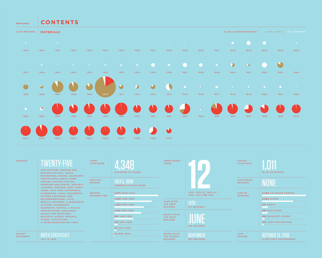
Before we can do anything with data, we first need to gather the information. The devices and applications we daily use automatically capture data on the electronic interactions in our everyday lives. Some people voluntarily record everyday data, in some cases as a performative act, recording their daily routines and habits. One such data obsessive is Nicholas Felton, whose Annual Reports transform the minutiae of his daily interactions into graphic design. Seemingly mundane happenings such as his conversations with friends accumulate over time to reveal startling new dimensions on the everyday. Felton has released an app, Daytum, which enables all of us to similarly become hoarders of the everyday and to discover new dimensions on our own lives. New social realities emerge through capturing and making sense of everyday data. How do we come to know, or see, or experience something which has no physical form? To make sense of it we need to turn it into something we can understand. One way to do this is through visualisation. To visualise is to give form to something not yet known as a visual image; to turn it into something we can make sense of with sight. A commissioned artwork, FlavourCollider by Marcos Lutyens, gives visual form to the sense of taste. Located in a bar within the art space, users drink cocktails while wearing a EEG headset and their brain activity is translated into a real-time visualisation. The work explores the neurological condition of synesthesia, and the connection between taste and shape.
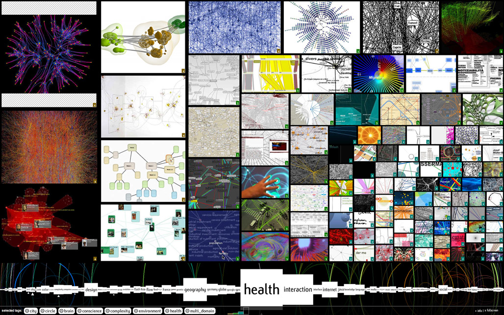
Complexity is the consequence of our increased capacity to measure more accurately the world around us. The more we discover, the more complex the world becomes. reMap from Bestario, is a meta-visualisation; a visualisation of visualisations and, as such, serves as an excellent introduction to this domain. Curated by Manual Lima, this is a comprehensive review of visualisation projects that relate to complex systems. Bestiario pushes forward the technical display of world class data visualizations and allows audiences to instinctively search a huge database of visualizations using tags and keywords, allowing navigation using a semantic approach and depicting relations among them. This brings to life the way it is possible to search and navigate the new data domains. A regular collaborator in FutureEverything, Aaron Koblin, now heads the Google Data Arts department. Search is also an issue for the media industries and the BBC. Bill Thompson is part of a team working on the BBC Archive and building a Digital Public Space. Increasingly, we need more innovative ways with which to navigate this data terrain. BBC Data Art for example offer a glimpse of the future of television. We are still in search era, in which we are all just looking for things. A trio of projects, Political Atmospherics, NewsTraces and TV Related Content: News 24 suggest that in the future, we will have more systems that will do more for us, in ways that we can't yet comprehend. Berg, with Timo Arnall and Dentsu London, document real-time material representations that grow from an originating data source in Making Future Magic. This is a video sketch of an inventive technique for creating three-dimensional forms in light by moving an iPad through space. It is one of a series of experiments in giving tangible form to 'Immaterials' (Matt Jones), formless dimensions in our daily environments such as data and wifi clouds. The data dimension is immaterial, it affects everything, and yet we cannot reach out and touch it. Its physical reality is in the server farms, vast rooms full of computers hosting the data and applications. We make sense of it through metaphors such as the cloud, the domain of remote services and applications we access from any point in space. By transposing it from the confines of the screen and into the physical world, focus is drawn to the materiality of the data itself.
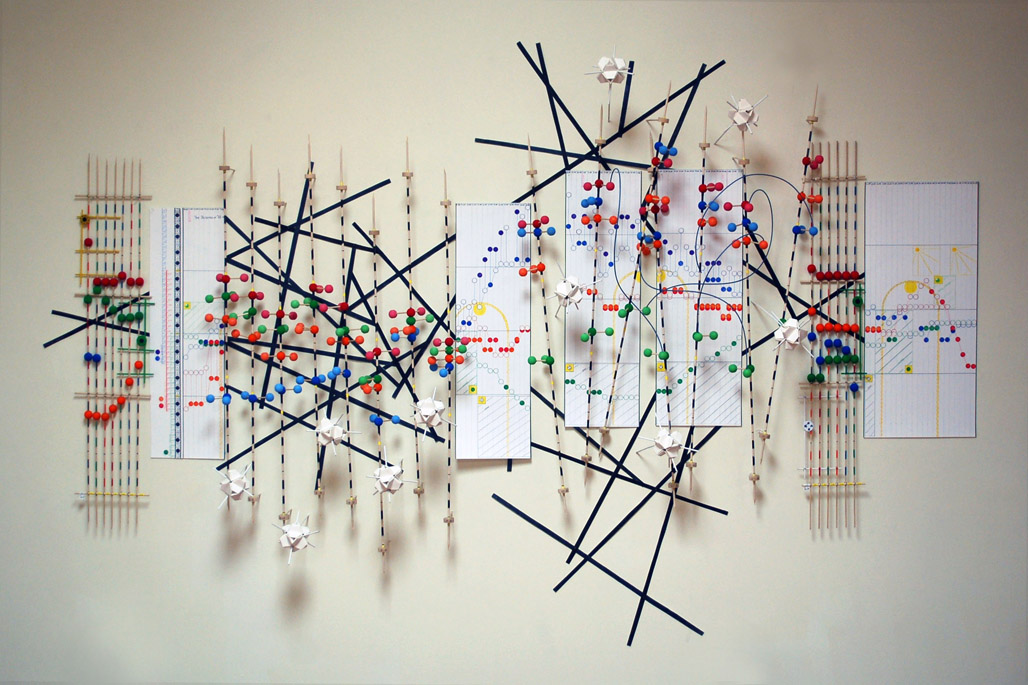
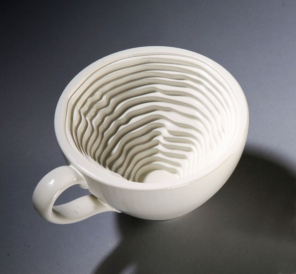
There is potential for us to do more than simply paint space with data. Art works include Form Follows Data, a data sculpture project in which Iohanna Pani presents her quantified self and her domestic encounters in the form of everyday objects, such as a cup which physically reflects the volume consumed each day, making tangible the language of personal statistical data. Capturing obscure weather data using very simple data-collecting devices and transforming it into abstract sculptures, Nathalie Miebach creates intricate wall pieces that function both as musical scores and weather almanacs. In Food of Art, Nadeem Haidary conducts data analytics on still life paintings, analysing twelve masterpieces for their nutritional content, breaking down food values from Frans Snyders' 39,851 calorie feast to Vincent Van Gogh's four meager onions. Presenting a witty analogue take on digital metrics in physical space, Hit Counter by Zach Gage is an interactive piece which narcissistically counts its own visitors and proudly presents this number as the art work itself.
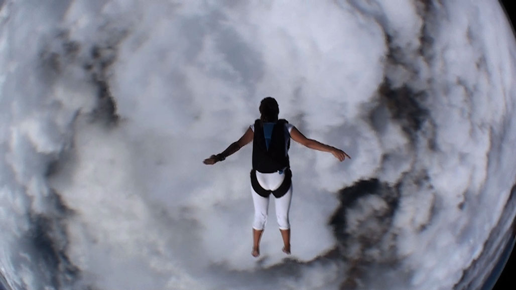
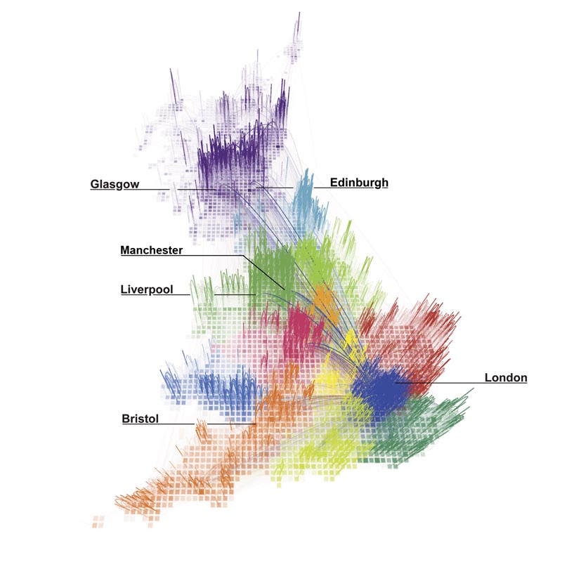
New forms of narrative and personalisation are also possible. Chris Milk and Aaron Koblin's groundbreaking music video experiment for Arcade Fire, The Wilderness Downtown, shows a user her childhood streets after submitting postcode data. Search and mass participation strike a deeply cinematic note in a preview of 'The YouTube movie', a Kevin MacDonald directed feature film Life In A Day, edited together using thousands of YouTube clips uploaded in a single day, July 24, 2011. From intimate moments of personal experience, to vast themes of birth and death, an epic self-portrait emerges via mass participation, as editor Joe Walker creates a kaleidoscopic compilation from 4,500 hours of footage in 80,000 submissions from 140 nations. Upon viewing Borderline, from MIT SENSEable City Labs, we realise that lines on a map are in fact meaningful connections — a multitude of human interactions, unfolding before you in real time. Borderline redraws the map of Great Britain based on the complexity of billions of human connections, and asks if regional boundaries defined by governments respect the more natural ways that people interact across space. It reveals for instance that the effects of a possible secession of Wales from Great Britain would be twice as disruptive for the human network as that of Scotland.
The Data Dimension also imagines a future beyond the computer screen. In the Media Surfaces video sketch, Berg present data in physical context. Travellers in a train station are able to interact with a panoply of screens and smart surfaces reflect our data back to us. Here, we imagine the built environment as interface, in what could be described as a form of data signage. A useful analogy to help explain this idea is to think of the world as a computer, with these signs playing the same role icons or menus do on a computer desktop, indicating objects and their operations; a graphical user interface for interaction with the world. Combine this characteristic with innovation in touch-screen display, which includes 'shape-memory' layers that when activated lend the displayed image physical texture. It is possible to imagine a future where data really is without boundaries and it shapes the physical world around us. Dr. Drew Hemment is an artist, curator and writer based in Manchester England. He is Founder and Director of FutureEverything (formerly Futuresonic, est. 1995), and is Associate Director of ImaginationLancaster at Lancaster University. Winner of the Lever Prize 2010, Shortlisted for the Big Chip International Award for Innovation 2010 and the Arts & Business Award 2010, Runner Up Lever Prize 2009, Honorary Mention for Director at Prix Ars Electronica 2008. His work has been covered prominently by New York Times, BBC and NBC, and he has served on many prominent international Art Juries including UNESCO DigiArts. In 1999, awarded a PhD at Lancaster University, in 2009 elected a Fellow of the Royal Society of the Arts (UK), and in 2010 an Eyebeam resident (USA).
Kevin Smith is an academic at HighWire, Lancaster University. His research focuses on the concept of Adaptive Signs- an entity that signifies the change in state of another entity by adapting accordingly. His research sits at the intersection of Information Design, Data Visualisation, Context Aware Computing and Organic User Interfaces.

