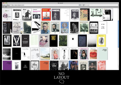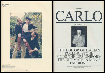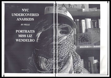
No Layout is a new online platform for independent art and fashion publishers. While mainstream print publishers are struggling to address online content, making their magazines available through clunky PDF apps like Exactly or posting limited articles to their websites, no one has yet come up with a solution for the relatively niche market of independent art publications and zines. No Layout, started by Daniel Pianetti, provides a fully readable library of this print material. So far, their roster rivals that of a well curated museum bookstore or specialty shop, including gallerist Javier Peres' art mag Daddy, Swiss contemporary art journal der:die:das:, urbanism magazine Monu, small art zines like FPCF, and even historical publications like the avant garde journal 291 from 1915, to name a few of the 100 or so publishers available through the site. I spoke with Pianetti to find out more about the project.

How did you come up with the idea for No Layout? Did you see a need for this sort of platform in independent publishing?
I think there is a lack of digital quality presence for a lot of the art and independent publishers, due to a certain skepticism towards the big e-book platforms and the fear of losing the preciousness of the printed matter. The goal was to create an online point of reference for this large niche. Of course it is thought as a complement for the real books, not as a substitution.
Can you name a few of the publications available on No Layout so far?
Fantastic Man, Seems, Piktogram, Asher Penn, JSJB...

You are one of the editors behind Faund, a magazine that assembles themed photo albums of images found on the internet. I'm wondering how this experience may have informed No Layout.
There is no direct relation between the two projects but with Faund, Renato and I always had a light and liberal approach, we believe that too many publishers take their field too seriously. I guess No Layout shares some of this simple and playful background.
How do you select which publishers to work with?
I started by filling the archive with publications I have or I wish I had, keeping a certain diversification. Now I'm starting to build more collaborative partnerships with the publishers thinking what could better fit in an online library.

What will those collaborative partnerships look like? Can you tell us more about them?
We agreed with some publishers that in the process of producing the new issues, they will make a parallel version for No Layout and screen visualisation. The content won't necessarily change but the form would be different.
Right now all the publications are presented as flip throughs, in the future, do you see the display becoming more dynamic? Would you ever work with a publisher to develop a custom display or even an issue? Are there any other changes or modifications you hope to see on No Layout?
Yes, soon the new entries are all going to be online exclusively, edited or produced for screen, with some exceptions for sold out issues. We want to keep the minimal visualisation adding some technical features to improve the reading and dynamic experience, it also depends on the readers response and resources we'll have during the next months.
Thanks for taking the time to speak with me, Daniel!

