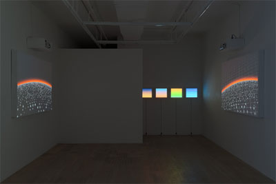
The title of the show is "Bouncing Lights Forever". In your work, the viewer feels suspended in infinite motion, a quality aptly captured by the title for your exhibition. I think your work proposes a meditative loop in relationship to historiographer Hayden White's idea of a "modernist event", a term which refers to the contemporary convergence of the event, its representation, and the dissemination of that representation into one moment. I would like to know what your thoughts are on the acceleration of these kind of events in time, and if you feel this is represented in your aesthetic.
I think of this "meditative loop" more in terms of moments frozen in time, excerpts of a larger narrative or system that we can focus in on and break apart. It's hard for me to tie that into the idea of a modernist event, as I see this work as pretty far removed from a real-world referent, from an original event. I think what's more at play for me, is not the acceleration of this representation and dissemination, but the displacement - that these various references are floating around, bouncing off each other and multiplying.
Is there a larger narrative or system at play in the work? You describe displacement, and I wonder if this is a result of an overflow of multiple representations, rather than the dismantling of one larger narrative. That's what I was getting at when I asked about the "modernist event". Why do you think your work is removed from a real-world referent? How do you make that distinction?
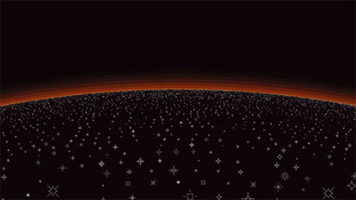
You're right - it's not a singular thing, it's the various systems and narratives of visual culture: movies, the Internet, television, advertising, video games, art history, etc. But there's also a way in which all these separate things are blurred together - I think this is what you're getting at. Works like "Starfields 1" and "Starfields 2," there's different entry points: is it Star Trek, a screensaver, a video game, an advertisement, the act of flying through space itself, or just a bunch of white squares moving out from a center point? This is what I meant by being removed from a real world referent - that for me these pieces fit more in this realm of messy references, than one where you can trace things back to an original event.

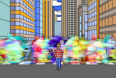
There's a pictorial completeness in Self Portrait, NYC and Continue: 2000 - a foreground and a background which add up to a picture, suggest a situation, etc. With the work in this show, I wasn't interested in complete pictures as much as the elements we use to construct them. The lack of figures is my way of focusing on the backgrounds, making it more about these pieces and how we use them, than about full compositions.
There's an aspect of the larger scale of the works- as far as physical size is concerned- which is simply about putting the works on an experiential par with paintings and other large scale pictures. I didn't want the digital-ness of the pieces so tied to the experience of a personal computer, because ultimately the ways in which technology affects the way we view and process images- my main interest- extend way beyond the computer screen. So the scale is partially a gesture towards saying this is about more than personal computers, the internet, or video games.
I often aim to make work that while immersive, also foregrounds the simplicity of it's structure, offering a counterpoint to that seduction. With Glitter Bend and Building Across from Glitter Bend, especially, I think the larger scale helps to serve that duality- blown up, they're simultaneously more immersive, and easier to pick apart.

The structure of the work itself, the way it's been constructed - the pixels, the different elements, the layers, the composition, etc. I want people to be able to look at a work like Glitter Bend, and on one hand say "wow," but on the other, be able to say "it's just a bunch of shapes; I can see the individual pixels; I can see how each piece loops; I can see how he constructs perspective; I can see how he suggests scale; etc." They may have no sense of the technology behind it - the software I use, etc. - but on that certain level, they know how I made it. It's the opposite of the way these things usually work: while most digital images are designed to hide their construction, I want it up front.

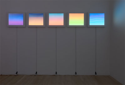
I had certainly thought about James Turrell with those pieces (as well as Donald Judd, Sol Lewitt and Mark Rothko, etc.), but his work is so much about experiencing these controlled environments, while to me, those panels are mostly pictures, or things. Bringing in the experience of sitting at a computer isn't intentional. I was more interested in creating a setting where these digital images could employ the forms of minimalism, or the physical presence of framed pictures. Again, it's a tactic to have the work read in relationship to concerns broader than the computer itself. For me, one aspect of the piece is computer-centric: the idea of quantization, that in order to represent something digitally, one needs to chop it into pieces. The reduced palette and pixilated dithering are gestures towards this idea. Again, it's emphasizing that which is normally hidden. But that idea is coupled with something broader- the color gradient and the connotations it carries in visual culture. While gradients are simple systems, they're also used as shorthand for big sophisticated things like skys and sunsets, a starting point in the creation of this piece. In one sense the work is a series of quantized sunsets- a gesture that is as much about representation, language and the sublime as it is about technology.

