THE BEST OF THE WEB 2006
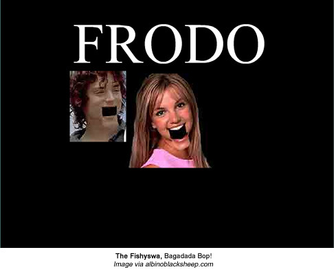
10. The Fishyawa - Bagagaga Bop!
At the end of August the Toronto Star ran a great article (* no longer available) on Animutation a form of flash animation that embraces the nastiest of graphics, and mutates the faces of pop stars. Probably the best of the videos I've seen in this genre, Bagagaga Bop represents an art form that developed naturally as a result of working with web tools and assets. No deep meaning can be found in this work, which is completely the point. Why struggle to find thought in a McGraphic? Deface a popstar, add a few babies, aliens and boats to a video, and back it with a song written in a language you don't understand. I've heard some grumbling that this form of animation is problematic because it exotifies Japanese music, and while I can't wholly dismiss the argument, I figure if I'm not bothered by the fact that somebodies face is being disfigured in the name of comedy, I might as well let this one go too.
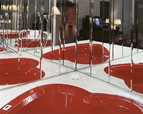
Alec Soth, Candlelight Hotel 2004
Photo copyright Alec Soth
Photo copyright Alec Soth
9. Alec Soth
Launched in September 2006, Alec Soth has quickly become the author of one of the most popular art blogs today. I suppose it helps that he's an art superstar, but let's be honest -- Wil Wheaton not withstanding -- most people don't read famous people's blogs if they suck. I subscribe to his feed because he's always writing about some really interesting subject I would not thought to write about. Most recent example: Photography used in book covers.


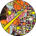
8. Pogs
What is a digital pog? I had no idea what this Michael Bell-Smith project was about until I read Tom Moody's description "Briefly, pogs started as illustrated milk bottle caps in Hawaii and grew into a kid-collectibles crazelet in the '90s. Digital pogs are 177-pixels-in-diameter GIF files that exist and can be "bartered" mainly via the Internet and web browsers."
Since the project's inception, there have been hundreds of submissions by artists, many of them hypnotic, and very desirable. Nobody, to my knowledge, has figured out a way to trade them though, which I think would ultimately make them a little more viral. (Some discussion already occurred on the top of competition which resulted in artist Guthrie Lonergan's pog marquee battle.) Really, I just want a way to feature a daily pog in my sidebar.
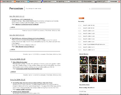
Personism
Screengrab AFC
7. List of women for your conference
For some reason, don't ask me why, I've managed to resist the urge to place a giant picture of myself as a representation of Jen Bekman's list of women in the arts on Personism. The title of her post pretty much explains what it is. It's not like this is the first time anyone's ever made a list of professional women working in the arts, but post has a permanent place in my sidebar under resources, because it's current, and is copy and pasteable.
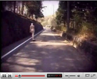
Image via youtube
6. Mannequins on skateboards fall over
This short video featuring a mannequins on skateboard competition first appeared on Boing Boing this fall. I particularly like the sound design of this piece.
Screengrab AFC
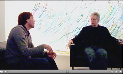
5. David Cronenberg Interview on Rocketboom
In July of 2006, Andrew Baron interviewed director David Cronenberg about, Supernova, the Andy Warhol exhibition he curated for the Art Gallery of Ontario. The discussion began with a discussion about film and Warhol, and ended up discussing the future of film in the wake of Internet distribution. I talked about this video endlessly for weeks after I saw it.

Screengrab AFC
4. Tom Moody
I imagine Tom Moody is on virtually every net artists "best of list", but I think he deserves a lot more credit amongst the larger art community, (as does the net art community generally.) He's one of the few critics who talks about what he likes and dislikes in equal proportion, always giving the artist the courtesy of actually thoroughly considering the work before discussing it. Also, his animated gif show up at artMovingProjects last spring was excellent, and very much overlooked.
Screengrab AFC
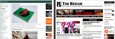
3. ArtCal and The Reeler These two Internet start-up companies have the fact that I work for them in common. I also happen to think they are amongst the best sites on the web.
On ArtCal: If you like to attend openings, but find you can't keep track of what's going on, then subscribing to ArtCal's weekly mailer is probably the best favor you'll ever do yourself (simply enter your email in the box above the subscribe button and you're done.) The opening listings are selective, which means you don't have to wade through endless listings of shows you'll never attend, and Barry and James even pick out a few of their favorite exhibitions for you. Since these guys see at least twice as many shows as the average reviewer, I find their picks to be more reliable than ArtForum.
On The Reeler: If you are a cinema buff and live in New York city, you probably read this site every day already. If you aren't, there is a good possibility you will become one after visiting. That's what happened to me. What can I say? I like well thought out criticism and everything published on that site is opinionated, well written, and thoroughly researched. Also, I have noticed my writing benefits when working with an editor. Some of my best work has appeared on that site.
Hasselhoffian-Recursion
Image via: Post Literate.com
2. The Year In the Internet 2005Image via: Post Literate.com
Spearheaded by Michael Bell-Smith and Cory Arcangel, these artists invited 11 Internet mavericks to provide their top ten lists of great websites and web ephemera from 2005. It's all fantastic stuff but standout contributers include Brett O'connor's gif find titled Hasselhoffian-Recursion, and Gutherie Lonergan's link to FunFoodsUSA.com, which features a three layered rollover. Sadly, it looks like that feature is now gone...though it's still one of the ugliest sites I've seen. My own uninvited 2006 contribution to this project is this toilet gif. I guess I just share the Bemis.com belief that no bathroom graphic is complete without several toilet seats circling a globe. [Editors note: The company's slogan is one of the odder marketing choices I've observed in a while.]
Screengrab AFC
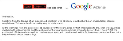
1. Cory Arcangel's Kurt Cobain vrs Google Adsense.Hands down the best Internet art of the year. If you're not already aware of "punk rock 101", Cory Arcangel published Kurt Cobain's suicide letter word for word, and then set up Google adsense on the page. This is quite possibly the most brilliant subversion of the medium I have seen. The artist uses the death of a superstar, which is caused in part by the pressures of media , and couples it with Internet commerce. It's a good joke, but of course it's also a profoundly sad gesture that Cobain's death would later serve to increase ringtone sales. Presumably a result of being listed on the front page of Digg last year, Google got wind of the project, and forced him to remove the ads.

Screengrab AFC
It's not really fair to put together a list of great art related material on the web, without mentioning the most important institutional web supporter working today: Rhizome.org. Rhizome typically doesn't host net art themselves, but they do sponsor it. Given that commercial galleries have not proven to be the best venues for artists working in this medium, Rhizome, has an importance to the development of net art that can not be understated.
Coming up next: The worst of the web 2006
